8.1. Simple regression: Don’t think too hard!
8.1.1. Web traffic data: Load & Clean
We load some data tracking the number of hits per hour on a fictional website.
Is our fictional start up web service taking off?
import os.path
import scipy as sp
import matplotlib.pyplot as plt

# os.getcwd() returns the value of the 'current directory', the one you started your notebook in.
# You shd have the data file in your notebook directory.  But you can place
# it somewhere else if you like, and change the value of data_dir
data_dir = os.getcwd()
data = sp.genfromtxt(os.path.join(data_dir, "web_traffic.tsv"), delimiter="\t")
print(data[:10])

x_init = data[:, 0]
y_init = data[:, 1]
print "Number of invalid entries:", sp.sum(sp.isnan(y_init))
x = x_init[~sp.isnan(y_init)]
y = y_init[~sp.isnan(y_init)]

default_title = "Web traffic over the last month"
[[  1.00000000e+00   2.27200000e+03]
 [  2.00000000e+00              nan]
 [  3.00000000e+00   1.38600000e+03]
 [  4.00000000e+00   1.36500000e+03]
 [  5.00000000e+00   1.48800000e+03]
 [  6.00000000e+00   1.33700000e+03]
 [  7.00000000e+00   1.88300000e+03]
 [  8.00000000e+00   2.28300000e+03]
 [  9.00000000e+00   1.33500000e+03]
 [  1.00000000e+01   1.02500000e+03]]
Number of invalid entries: 8
The data is pretty simple, a table with two columns. The first column is
the hour number, counting hours from the moment our fictional startup
fictionally started up. The second column is the number of hits for that
hour. Note that some of the entries in the second column are not a
number. They are nan, for instance, for hour number 2. The label
nan stands for “not a number”. This is a standard return value for
operations which are supposed to return a number, which, for some
reason, cannot do so. In this case the most likely explanation is that
there was an internet glitch, and the website was not in operation for
that hour.
This code prints the number of nan entries in the second column and then removes the nan entries from both the fist and second column.
Based on what you learned about indexing arrays, say what parts of the
data x and y are:
x = data[:, 0]
y = data[:, 1]
If you said x is the first column and y is the second, gold
star. Notice that x and y are both just 1D arrays. Nothing about
them tells whether they came from columns or rows.
print "Number of invalid entries:", sp.sum(sp.isnan(y))
x = x[~sp.isnan(y)]
y = y[~sp.isnan(y)]
Look at the output of the code below and note that sp.isnan(y)
returns an array of truth values (Booleans).
Notice that ~ (read as not) flips the truth values. So we have
an array exactly the same length as y_init which is True
wherever y_init has a number and False wherever it has a
nan. Finally we set the variable mask to that array.
nan_array = sp.isnan(y_init)
print 'nan_array is a 1D array of length', nan_array.shape[0]
print nan_array[:10]

mask = ~nan_array
print mask[:10]
print y_init[:10]
nan_array is a 1D array of length 743
[False  True False False False False False False False False]
[ True False  True  True  True  True  True  True  True  True]
[ 2272.    nan  1386.  1365.  1488.  1337.  1883.  2283.  1335.  1025.]
Next observe that we can use mask to index y_init. Think of
this as an exotic splice. It returns whatever values in y_init
correspond to True values in mask. So it returns just the
numbers.
y_filtered =  y_init[mask]
y_filtered[:10]
array([ 2272.,  1386.,  1365.,  1488.,  1337.,  1883.,  2283.,  1335.,
        1025.,  1139.])
8.1.2. Looking at the data
Having loaded the data we will do a scatterplot. That is we will plot the number of hits versus the hour number. What this means is that we will plot points the way we usually do, but we won’t try to draw a line between them. We just tap out a set of points, like Georges Seurat.
We won’t discuss the details of the function defined below now. It’s a plotting function, which draws a picture of our data, and, optionally, the model we’re going to use to account for the data. It also optionally saves the plot in an image file. In our first picture, there will be no model, and we will save the picture, so you should be able to find that file in your notebook directory after running this code.
%matplotlib inline

colors = ['g', 'r', 'k', 'm', 'b']
linestyles = ['-', '-', '-', '--', '-']

def plot_models(x, y, models, mx=None, ymax=None, xmin=None,
                plot_title = None, write_file=None):
    # Clear the current figure, in case any old drawings remain.
    plt.clf()
    # Plot the y-vector against the x-vector as a scatter plot
    # make the point size small (10).  Make the points a little transparent
    # (alpha = .3) so that other stuff we add to the figure later will show up
    # better.

    plt.scatter(x, y, s=10, alpha=.3)
    if plot_title is None:
        plot_title = default_title
    plt.title(plot_title)
    plt.xlabel("Time")
    plt.ylabel("Hits/hour")
    # We give plt.xticks two lists, a set of x-values where we want a label, and the set of
    # of labels we want to use. The first list will be numbers.  The second will be strings.
    # The two lists must be the same length. In this case
    # we want labels for each of 10 weeks, and since our data is in hours, that's one label
    # every 7 * 24 hours
    plt.xticks(
        [w * 7 * 24 for w in range(10)], ['week %i' % w for w in range(10)])

    if models:
        # We're going to draw multiple lines on the plot, NOT scatterplots
        # one for each model we were given.
        if mx is None:
            mx = sp.linspace(0, x[-1], 1000)
        for model, style, color in zip(models, linestyles, colors):
            # print "Model:",model
            # print "Coeffs:",model.coeff
            mxm = model(mx)
            plt.plot(mx, mxm, linestyle=style, linewidth=2, c=color)
        plt.legend(["d=%i" % m.order for m in models], loc="upper left")

    plt.autoscale(tight=True)
    plt.ylim(ymin=0)
    if ymax:
        plt.ylim(ymax=ymax)
    if xmin:
        plt.xlim(xmin=xmin)
    # Add in some grid lines, not just just cause they're cool, but because they help
    # count up points in uniformly spaced regions and identify densely/sparsely populated regions.
    plt.grid(True, linestyle='-', color='0.75')
    if write_file:
       plt.savefig(write_file)
The cell above defines the plot_models function. The next
cell actuall executes the function on the x and y we
defined before.
Now RUN the darn thing on our data.
plot_models(x, y, None, write_file = "1400_01_01.png")
Here’s the picture we got.
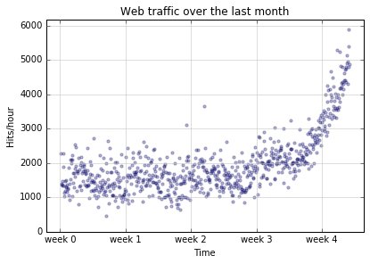
And here’s the good news. There’s an upward trend.
But can we rely on it? More importantly, can we argue to our potential investors that within a predictable period of time, they will have an adequate return on their investment.
8.1.3. Modeling the data
What’s a data model? We’re about to find out. But very roughly a model is an equation we use to try to predict the behavior of something real in the world. We plug in a bunch of observable values (and that sets the independent variables of our model) and out come a bunch of predicted values (and those are values of the dependent variables in our model).
For the web traffic we’re going to have one observable value (What hour
is it?) and one predicted value (How many hits will there be on our
website?). So one independent variable, which we usually like to call
x, for the hour, and one dependent variable, which we like to call
y, for the number of hits.
Now it stands to reason that you can’t predict the number of hits on a website just by knowing what hour it is. It’s got to be more complicated than that. So our model won’t be getting enough information to make truly accurate predictions. But let’s try anyway. You can sometimes be surprised by how well an underinformed model does.
The next cell executes code that builds four different models,
called f1, f2, f3, and f10. We’ll
explain the names below, but the f stands for function.
Each of these models is a slightly different kind of mathematical
function. Below we’ll use our plotting function to darw pictures of
what the different models do.
# create and plot models
fp1, res, rank, sv, rcond = sp.polyfit(x, y, 1, full=True)
print("Model parameters: %s" % fp1)
print("Error of the model:", res)
# Each of f1,f2,f3,f10 is a function that will take an array of observed values (x-values)
# and return an array of predicted value (y-values)
f1 = sp.poly1d(fp1)
f2 = sp.poly1d(sp.polyfit(x, y, 2))
f3 = sp.poly1d(sp.polyfit(x, y, 3))
f10 = sp.poly1d(sp.polyfit(x, y, 10))
Here’s some information about the first model. First we get two numbers that completely determine the model. It only takes two numbers to specify the model because we’ve got a very simple kind of model, a straight line (as we’ll see below). The important point here is that all our models are going be sequences of numbers. As they get more complicated, it’ll take more than 2 numbers, but they’ll all be numbers.
Model parameters: [   2.59619213  989.02487106]
('Error of the model:', array([  3.17389767e+08]))
Here’s the picture of the data again, except this time
we add a model in to the picture (the f1).
plot_models(x, y, [f1], write_file = os.path.join("1400_01_02.png"),
            plot_title='Order 1 model')
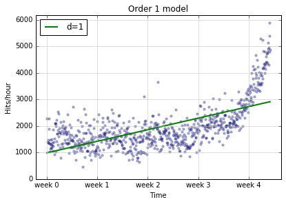
The green line is our line of predicted values. The blue dots are what they were before, reality. So every time a dot lands off the green line, that’s an error. We can say more. The distance of the dot from the line is the magnitude of our error. So there are a lot of dots pretty far off the line, especially as we move to the right. Our model isn’t doing a good job of capturing the first thing that caught our eye, that’s a strong upward trend, improving in time.
Well, unfortunately we aren’t being surprised. This model looks pretty bad. Why is that? One reason is that we built it with the following line of code.
fp1, res, rank, sv, rcond = sp.polyfit(x, y, 1, full=True)
That 1 means Build an order 1 model and an order 1 model is a
straight line. So what we’re trying to do when we build our model is to
find the best straight line to fit our points, and mathematically,
there’s a pretty good argument that we did. The problem is that no
straight line will fit the set of points we’ve got.
So it’s back to the drawing board.
We built three other models besides the straight line model, and we
display the results with those models below. Before we do that, let’s
note that the line of code that computed the model returned 5 things,
one of which, fp1, was used to build f1, the function we use for
plotting. Basically, fp1 is an array of two numbers that define a
straight line:
fp1
array([ 2.59619213, 989.02487106])
and we turn those into a function we can use for plotting in this line of code
f1 = sp.poly1d(fp1)
Let’s try using f1 just to see what it is.
print f1(1)
print f1(2)
print f1(3)
991.621063188
994.217255316
996.813447444
Then f is a function that returns gradually increasing values. Give
it an x (an hour) and it returns a y (a predicted number of
hits). It also works on arrays:
f1([1.,2.,3.])
array([ 991.62106319, 994.21725532, 996.81344744])
In what follows we are going to try new models (higher order than 1),
each of which will be a function that returns a more complicated shape.
We built functions for those those higher-order models (orders 2, 3, and
10) in the following lines of code. Note that in this case we build each
model in one step by calling sp.poly1d on the result returned by
sp.polyfit.
f2 = sp.poly1d(sp.polyfit(x, y, 2))
f3 = sp.poly1d(sp.polyfit(x, y, 3))
f10 = sp.poly1d(sp.polyfit(x, y, 10))
plot_models(x, y, [f1, f2, f10], write_file = "1400_01_03A.png",plot_title='Order 1 & 2 & 10 models')
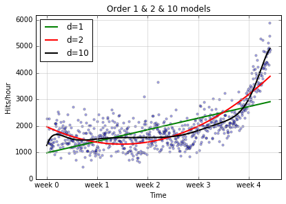
The d=10 model certainly does a better job of following the curvy
spine of the data points, but maybe we could do better with an even
higher order model:
f100 = sp.poly1d(sp.polyfit(x, y, 100))
plot_models(x, y, [f1, f2, f100],  write_file = "1400_01_03B.png",plot_title='Order 1 & 2 & 100 models')
/Users/gawron/Library/Enthought/Canopy_64bit/User/lib/python2.7/site-packages/numpy/lib/polynomial.py:586: RuntimeWarning: overflow encountered in multiply
  scale = NX.sqrt((lhs*lhs).sum(axis=0))
/Users/gawron/Library/Enthought/Canopy_64bit/User/lib/python2.7/site-packages/numpy/lib/polynomial.py:594: RankWarning: Polyfit may be poorly conditioned
  warnings.warn(msg, RankWarning)
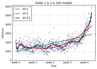
Actually, although we asked for an order 100 model, we didn’t have
anywhere near enough data to support it; numpy knew this and gave us
a warning message. In addition, it gave us a lower order model than we
asked for (look at the legend for the squiggly line), because it just
didnt’ make sense to make an order 100 model with the data we had.
We can check the actual order of the model we get in the code ourselves as follows:
f100.order
53
Thus f100 is actually an order 53 model, which is still pretty high
order, as the squiggliness of the above graph attests. The next question
is: Is this a good thing?
8.1.4. Evaluating the prediction success of a model
The main point of this section is very easy to state: If you want to evaluate the prediction performance of a model, test it on some data it never saw. So we pass in a set of points to estimate the model: We call this set of points the training data. But we don’t let the model see all our data. We hold some out for the test, and that set is called the test data. This is one of the key ideas of the machine learning paradigm. Separate training and test; don’t let the model in training have any access to information about the test data while it’s being trained.
Why do we do this? We are checking tosee whether the model learned any useful generalizations during training, generalizations that apply to data it never saw, or whether it just memorized the data,
We implement this idea as follows:
# We're going to some random sampling.  To make this code always use the same
# random sample in each run, set the random seed to a known value.
sp.random.seed(7)
frac = 0.1
split_idx = int(frac * len(x))
shuffled = sp.random.permutation(list(range(len(x))),)
test = sorted(shuffled[:split_idx])
train = sorted(shuffled[split_idx:])
fbt1 = sp.poly1d(sp.polyfit(x[train], y[train], 1))
fbt2 = sp.poly1d(sp.polyfit(x[train], y[train], 2))
fbt3 = sp.poly1d(sp.polyfit(x[train], y[train], 3))
fbt10 = sp.poly1d(sp.polyfit(x[train], y[train], 10))
fbt100 = sp.poly1d(sp.polyfit(x[train], y[train], 100))
/Users/gawron/Library/Enthought/Canopy_64bit/User/lib/python2.7/site-packages/numpy/lib/polynomial.py:594: RankWarning: Polyfit may be poorly conditioned
  warnings.warn(msg, RankWarning)
Next idea: We need a way of evaluating a model. We have to be able to score the test results. In this case, that’s pretty easy. We’ll just sum up the differences of what the model predicts for a given hour from what actually happened at that hour. The higher this score, the worse the model. One fine point here: any difference between prediction and reality should increase the error score; in particular we want negative differences (predictions that are too low) to be just as bad as those as positive differences (predictions that are too high), so we’ll sum up the squared differences between predicted values and actual values. Here’s the code.
def error(f, x, y):
    return sp.sum((f(x) - y) ** 2)

for f in [fbt1, fbt2, fbt3, fbt10, fbt100]:
    print("Error d=%i: %f" % (f.order, error(f, x[test], y[test])))
Error d=1: 38634038.655188
Error d=2: 17116769.977369
Error d=3: 10651277.698530
Error d=10: 8720794.977470
Error d=53: 10113992.930632
So what is the best model according to this test?
8.1.5. Regression
The task our models have been performing for us is called regression.
We take one or more numerical independent variables and try to predict
the value of one or more numerical dependent variables. In this case we
used one independent variable (the hour, called x) to try to predict
one dependent variable (the number of website hits, called y).
For the first-order model in the first graph we considered only straight line models, and because our data had a very pronounced curved spine, we didn’t do a very good job of predicting; in fact, our performance grew worse over time.
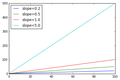
Let’s introduce some terminology which will be helpful later. A straight line has a constant slope. The slope of a line is the speed with which its y-values increase as we move from left to right.
x = sp.arange(100)
slopes = [.2,.5,1.0,5.0]
for s in slopes:
    y = s * x + 1
    plt.plot(x,y)
plt.legend(["slope=%.1f" % s for s in slopes], loc="upper left")
A linear model can model increase but the increase must be at a constant rate. That rate is the slope of the line. But what if the rate of increase is increasing (that’s the curve in our data spine)? In the next plot, the blue line labeled nonlin has an increasing rate of increase. In fact it’s an order 2 (quadratic) model. None of the linear models can capture what the blue model is doing, simply because the order 2 model increases at a faster rate. No matter how high you set the rate of change ion a linear model, sooner or later a quadratic model will catch up.
x = sp.arange(100)
slopes = [.2,1.0,5.0]
for s in slopes:
    y = s * x + 1
    plt.plot(x,y)
plt.xlim([0,20])
plt.ylim([0,200])
plt.plot(x,x**2)
legs = ["slope=%.1f" % s for s in slopes]
legs += ["slope = nonlin"]
plt.legend(legs, loc="upper left")
<matplotlib.legend.Legend at 0x11fa74990>
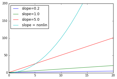
The curves in higher order models don’t have a constant slope, so they can do a little better at modeling the increasing rate of increase in order web site traffic data.
8.1.6. Homework questions
How many rows and columns are there in the web traffic data? How many
nanvalues are there in the hit counts column?What is the difference between
y_initandy_filtered? What is the arraymaskused for?What does the function
errordo?What is the difference between a linear model and a higher-order model? Why do the higher-order models do better on the web-site traffic data?
What is the actual order of the highest order model that was run on the web-site traffic data in the code above?
Here is some more web traffic data.
data_file = os.path.join(data_dir, "web_traffic2.tsv")
Write some code to read in this data and do a scatter plot of the data. You do not have to create any models. Put the code in the cell below. Do not import any modules that have already been imported in the code above.
Now look at the plot. What is happening around Week 3 that might be worthy of notice?