8.2. Regression Examples
First, let’s import a few common modules, ensure MatplotLib plots figures inline and prepare a function to save the figures:
%matplotlib inline

# Numpy
import numpy as np
import numpy.random as rnd

#  Pandas
import pandas as pd

# Scikit learn imports for this NB (regression tools,linear and nonlinear)
from sklearn import preprocessing
from sklearn import pipeline
from sklearn import linear_model
from sklearn.metrics import mean_squared_error, r2_score

#  Basic python modules
import os
import requests
import codecs
import io

# to make this notebook's output stable across runs
rnd.seed(42)

# To plot pretty figure

import matplotlib
import matplotlib.pyplot as plt
plt.rcParams['axes.labelsize'] = 14
plt.rcParams['xtick.labelsize'] = 12
plt.rcParams['ytick.labelsize'] = 12

def url_to_content (url,encoding='utf-8',bufferize=False):
    r = requests.get(url)
    content_raw = r.content
    # Content downloaded by request is a byte string.  We're pretty sure this one has this encoding
    content = codecs.decode(content_raw,encoding=encoding)
    if bufferize:
        return io.StringIO(content)
    else:
        return content
8.2.1. Loading data
8.2.1.1. Life Satisfaction data
Before starting this exercise you should create a folder called
datasets in the folder where this notebook is stored. We will be
placing various data files in that folder, and the code below is written
so as to look there. We will be making various subfolders in the
datasets folder, and if you want, you can start by creating the
first one right away. It’s called lifesat.
The Organization for Economic Cooperation and Development (OECD) stats website contains all kinds if economic statistics on countries in downloadable form, in particular in a very popular stripped-down spreadsheet format call “.csv” (for comma-separated values). You will get a local copy. The particular dataset we want is the BLI data (“Better Life Index”).
notebook_lifesat_url0 = 'https://github.com/gawron/python-for-social-science/blob/master/pandas/datasets/lifesat/'
lifesat_url = notebook_lifesat_url0.replace('github', 'raw.githubusercontent')
lifesat_url = lifesat_url.replace('blob/','')

def load_lifesat_data (lifesat_url):
    oecd_file = 'oecd_bli_2015.csv'
    oecd_url= f'{lifesat_url}{oecd_file}'
    return pd.read_csv(oecd_url, thousands=',',encoding='utf-8')

oecd_bli = load_lifesat_data(lifesat_url)
print(len(oecd_bli))
oecd_bli = oecd_bli[oecd_bli["INEQUALITY"]=="TOT"]
print(len(oecd_bli))
oecd_bli = oecd_bli.pivot(index="Country", columns="Indicator", values="Value")
3292
888
oecd_bli.columns
Index(['Air pollution', 'Assault rate', 'Consultation on rule-making',
       'Dwellings without basic facilities', 'Educational attainment',
       'Employees working very long hours', 'Employment rate', 'Homicide rate',
       'Household net adjusted disposable income',
       'Household net financial wealth', 'Housing expenditure', 'Job security',
       'Life expectancy', 'Life satisfaction', 'Long-term unemployment rate',
       'Personal earnings', 'Quality of support network', 'Rooms per person',
       'Self-reported health', 'Student skills',
       'Time devoted to leisure and personal care', 'Voter turnout',
       'Water quality', 'Years in education'],
      dtype='object', name='Indicator')
In the next cell we go through exactly the same processing steps we discussed for the data in the pandas module introduction part II notebook. To review the data, and the motivations for these steps, please visit that notebook.
In the exercise ahead, we’re going to take particular interest in the
Life satisfaction score, a kind of general “quality of life” or
“happiness” score computed from a formula combining many of the
indicators in this data.
Since 2002, the World Happiness Report has used statistical analysis to determine the world’s happiest countries. In its 2021 update, the report concluded that Finland is the happiest country in the world. To determine the world’s happiest country, researchers analyzed comprehensive Gallup polling data from 149 countries for the past three years, specifically monitoring performance in six particular categories: gross domestic product per capita, social support, healthy life expectancy, freedom to make your own life choices, generosity of the general population, and perceptions of internal and external corruption levels.
8.2.1.2. Load, prepare, and merge the GDP per capita data
Elsewhere, on the world wide web, with help from Google, we find data about GDP (“gross domestic product”) here. Hit the download butten and place another csv file in the same directory as the last data.
# Downloaded data from http://goo.gl/j1MSKe (=> imf.org) to github
def load_gdp_data ():
    gdp_file = "gdp_per_capita.csv"
    gdp_url = f'{lifesat_url}{gdp_file}'
    return pd.read_csv(gdp_url, thousands=',', delimiter='\t',
                                 encoding='latin1', na_values="n/a")

gdp_per_capita = load_gdp_data()
gdp_per_capita.rename(columns={"2015": "GDP per capita"}, inplace=True)
# Make "Country" the index column.  We are going to merge data on this column.
gdp_per_capita.set_index("Country", inplace=True)
full_country_stats = pd.merge(left=oecd_bli, right=gdp_per_capita,
                              left_index=True, right_index=True)
full_country_stats.sort_values(by="GDP per capita", inplace=True)
full_country_stats
| Air pollution | Assault rate | Consultation on rule-making | Dwellings without basic facilities | Educational attainment | Employees working very long hours | Employment rate | Homicide rate | Household net adjusted disposable income | Household net financial wealth | ... | Time devoted to leisure and personal care | Voter turnout | Water quality | Years in education | Subject Descriptor | Units | Scale | Country/Series-specific Notes | GDP per capita | Estimates Start After | |
|---|---|---|---|---|---|---|---|---|---|---|---|---|---|---|---|---|---|---|---|---|---|
| Country | |||||||||||||||||||||
| Brazil | 18.0 | 7.9 | 4.0 | 6.7 | 45.0 | 10.41 | 67.0 | 25.5 | 11664.0 | 6844.0 | ... | 14.97 | 79.0 | 72.0 | 16.3 | Gross domestic product per capita, current prices | U.S. dollars | Units | See notes for: Gross domestic product, curren... | 8669.998 | 2014.0 |
| Mexico | 30.0 | 12.8 | 9.0 | 4.2 | 37.0 | 28.83 | 61.0 | 23.4 | 13085.0 | 9056.0 | ... | 13.89 | 63.0 | 67.0 | 14.4 | Gross domestic product per capita, current prices | U.S. dollars | Units | See notes for: Gross domestic product, curren... | 9009.280 | 2015.0 |
| Russia | 15.0 | 3.8 | 2.5 | 15.1 | 94.0 | 0.16 | 69.0 | 12.8 | 19292.0 | 3412.0 | ... | 14.97 | 65.0 | 56.0 | 16.0 | Gross domestic product per capita, current prices | U.S. dollars | Units | See notes for: Gross domestic product, curren... | 9054.914 | 2015.0 |
| Turkey | 35.0 | 5.0 | 5.5 | 12.7 | 34.0 | 40.86 | 50.0 | 1.2 | 14095.0 | 3251.0 | ... | 13.42 | 88.0 | 62.0 | 16.4 | Gross domestic product per capita, current prices | U.S. dollars | Units | See notes for: Gross domestic product, curren... | 9437.372 | 2013.0 |
| Hungary | 15.0 | 3.6 | 7.9 | 4.8 | 82.0 | 3.19 | 58.0 | 1.3 | 15442.0 | 13277.0 | ... | 15.04 | 62.0 | 77.0 | 17.6 | Gross domestic product per capita, current prices | U.S. dollars | Units | See notes for: Gross domestic product, curren... | 12239.894 | 2015.0 |
| Poland | 33.0 | 1.4 | 10.8 | 3.2 | 90.0 | 7.41 | 60.0 | 0.9 | 17852.0 | 10919.0 | ... | 14.20 | 55.0 | 79.0 | 18.4 | Gross domestic product per capita, current prices | U.S. dollars | Units | See notes for: Gross domestic product, curren... | 12495.334 | 2014.0 |
| Chile | 46.0 | 6.9 | 2.0 | 9.4 | 57.0 | 15.42 | 62.0 | 4.4 | 14533.0 | 17733.0 | ... | 14.41 | 49.0 | 73.0 | 16.5 | Gross domestic product per capita, current prices | U.S. dollars | Units | See notes for: Gross domestic product, curren... | 13340.905 | 2014.0 |
| Slovak Republic | 13.0 | 3.0 | 6.6 | 0.6 | 92.0 | 7.02 | 60.0 | 1.2 | 17503.0 | 8663.0 | ... | 14.99 | 59.0 | 81.0 | 16.3 | Gross domestic product per capita, current prices | U.S. dollars | Units | See notes for: Gross domestic product, curren... | 15991.736 | 2015.0 |
| Czech Republic | 16.0 | 2.8 | 6.8 | 0.9 | 92.0 | 6.98 | 68.0 | 0.8 | 18404.0 | 17299.0 | ... | 14.98 | 59.0 | 85.0 | 18.1 | Gross domestic product per capita, current prices | U.S. dollars | Units | See notes for: Gross domestic product, curren... | 17256.918 | 2015.0 |
| Estonia | 9.0 | 5.5 | 3.3 | 8.1 | 90.0 | 3.30 | 68.0 | 4.8 | 15167.0 | 7680.0 | ... | 14.90 | 64.0 | 79.0 | 17.5 | Gross domestic product per capita, current prices | U.S. dollars | Units | See notes for: Gross domestic product, curren... | 17288.083 | 2014.0 |
| Greece | 27.0 | 3.7 | 6.5 | 0.7 | 68.0 | 6.16 | 49.0 | 1.6 | 18575.0 | 14579.0 | ... | 14.91 | 64.0 | 69.0 | 18.6 | Gross domestic product per capita, current prices | U.S. dollars | Units | See notes for: Gross domestic product, curren... | 18064.288 | 2014.0 |
| Portugal | 18.0 | 5.7 | 6.5 | 0.9 | 38.0 | 9.62 | 61.0 | 1.1 | 20086.0 | 31245.0 | ... | 14.95 | 58.0 | 86.0 | 17.6 | Gross domestic product per capita, current prices | U.S. dollars | Units | See notes for: Gross domestic product, curren... | 19121.592 | 2014.0 |
| Slovenia | 26.0 | 3.9 | 10.3 | 0.5 | 85.0 | 5.63 | 63.0 | 0.4 | 19326.0 | 18465.0 | ... | 14.62 | 52.0 | 88.0 | 18.4 | Gross domestic product per capita, current prices | U.S. dollars | Units | See notes for: Gross domestic product, curren... | 20732.482 | 2015.0 |
| Spain | 24.0 | 4.2 | 7.3 | 0.1 | 55.0 | 5.89 | 56.0 | 0.6 | 22477.0 | 24774.0 | ... | 16.06 | 69.0 | 71.0 | 17.6 | Gross domestic product per capita, current prices | U.S. dollars | Units | See notes for: Gross domestic product, curren... | 25864.721 | 2014.0 |
| Korea | 30.0 | 2.1 | 10.4 | 4.2 | 82.0 | 18.72 | 64.0 | 1.1 | 19510.0 | 29091.0 | ... | 14.63 | 76.0 | 78.0 | 17.5 | Gross domestic product per capita, current prices | U.S. dollars | Units | See notes for: Gross domestic product, curren... | 27195.197 | 2014.0 |
| Italy | 21.0 | 4.7 | 5.0 | 1.1 | 57.0 | 3.66 | 56.0 | 0.7 | 25166.0 | 54987.0 | ... | 14.98 | 75.0 | 71.0 | 16.8 | Gross domestic product per capita, current prices | U.S. dollars | Units | See notes for: Gross domestic product, curren... | 29866.581 | 2015.0 |
| Japan | 24.0 | 1.4 | 7.3 | 6.4 | 94.0 | 22.26 | 72.0 | 0.3 | 26111.0 | 86764.0 | ... | 14.93 | 53.0 | 85.0 | 16.3 | Gross domestic product per capita, current prices | U.S. dollars | Units | See notes for: Gross domestic product, curren... | 32485.545 | 2015.0 |
| Israel | 21.0 | 6.4 | 2.5 | 3.7 | 85.0 | 16.03 | 67.0 | 2.3 | 22104.0 | 52933.0 | ... | 14.48 | 68.0 | 68.0 | 15.8 | Gross domestic product per capita, current prices | U.S. dollars | Units | See notes for: Gross domestic product, curren... | 35343.336 | 2015.0 |
| New Zealand | 11.0 | 2.2 | 10.3 | 0.2 | 74.0 | 13.87 | 73.0 | 1.2 | 23815.0 | 28290.0 | ... | 14.87 | 77.0 | 89.0 | 18.1 | Gross domestic product per capita, current prices | U.S. dollars | Units | See notes for: Gross domestic product, curren... | 37044.891 | 2015.0 |
| France | 12.0 | 5.0 | 3.5 | 0.5 | 73.0 | 8.15 | 64.0 | 0.6 | 28799.0 | 48741.0 | ... | 15.33 | 80.0 | 82.0 | 16.4 | Gross domestic product per capita, current prices | U.S. dollars | Units | See notes for: Gross domestic product, curren... | 37675.006 | 2015.0 |
| Belgium | 21.0 | 6.6 | 4.5 | 2.0 | 72.0 | 4.57 | 62.0 | 1.1 | 28307.0 | 83876.0 | ... | 15.71 | 89.0 | 87.0 | 18.9 | Gross domestic product per capita, current prices | U.S. dollars | Units | See notes for: Gross domestic product, curren... | 40106.632 | 2014.0 |
| Germany | 16.0 | 3.6 | 4.5 | 0.1 | 86.0 | 5.25 | 73.0 | 0.5 | 31252.0 | 50394.0 | ... | 15.31 | 72.0 | 95.0 | 18.2 | Gross domestic product per capita, current prices | U.S. dollars | Units | See notes for: Gross domestic product, curren... | 40996.511 | 2014.0 |
| Finland | 15.0 | 2.4 | 9.0 | 0.6 | 85.0 | 3.58 | 69.0 | 1.4 | 27927.0 | 18761.0 | ... | 14.89 | 69.0 | 94.0 | 19.7 | Gross domestic product per capita, current prices | U.S. dollars | Units | See notes for: Gross domestic product, curren... | 41973.988 | 2014.0 |
| Canada | 15.0 | 1.3 | 10.5 | 0.2 | 89.0 | 3.94 | 72.0 | 1.5 | 29365.0 | 67913.0 | ... | 14.25 | 61.0 | 91.0 | 17.2 | Gross domestic product per capita, current prices | U.S. dollars | Units | See notes for: Gross domestic product, curren... | 43331.961 | 2015.0 |
| Netherlands | 30.0 | 4.9 | 6.1 | 0.0 | 73.0 | 0.45 | 74.0 | 0.9 | 27888.0 | 77961.0 | ... | 15.44 | 75.0 | 92.0 | 18.7 | Gross domestic product per capita, current prices | U.S. dollars | Units | See notes for: Gross domestic product, curren... | 43603.115 | 2014.0 |
| Austria | 27.0 | 3.4 | 7.1 | 1.0 | 83.0 | 7.61 | 72.0 | 0.4 | 31173.0 | 49887.0 | ... | 14.46 | 75.0 | 94.0 | 17.0 | Gross domestic product per capita, current prices | U.S. dollars | Units | See notes for: Gross domestic product, curren... | 43724.031 | 2015.0 |
| United Kingdom | 13.0 | 1.9 | 11.5 | 0.2 | 78.0 | 12.70 | 71.0 | 0.3 | 27029.0 | 60778.0 | ... | 14.83 | 66.0 | 88.0 | 16.4 | Gross domestic product per capita, current prices | U.S. dollars | Units | See notes for: Gross domestic product, curren... | 43770.688 | 2015.0 |
| Sweden | 10.0 | 5.1 | 10.9 | 0.0 | 88.0 | 1.13 | 74.0 | 0.7 | 29185.0 | 60328.0 | ... | 15.11 | 86.0 | 95.0 | 19.3 | Gross domestic product per capita, current prices | U.S. dollars | Units | See notes for: Gross domestic product, curren... | 49866.266 | 2014.0 |
| Iceland | 18.0 | 2.7 | 5.1 | 0.4 | 71.0 | 12.25 | 82.0 | 0.3 | 23965.0 | 43045.0 | ... | 14.61 | 81.0 | 97.0 | 19.8 | Gross domestic product per capita, current prices | U.S. dollars | Units | See notes for: Gross domestic product, curren... | 50854.583 | 2014.0 |
| Australia | 13.0 | 2.1 | 10.5 | 1.1 | 76.0 | 14.02 | 72.0 | 0.8 | 31588.0 | 47657.0 | ... | 14.41 | 93.0 | 91.0 | 19.4 | Gross domestic product per capita, current prices | U.S. dollars | Units | See notes for: Gross domestic product, curren... | 50961.865 | 2014.0 |
| Ireland | 13.0 | 2.6 | 9.0 | 0.2 | 75.0 | 4.20 | 60.0 | 0.8 | 23917.0 | 31580.0 | ... | 15.19 | 70.0 | 80.0 | 17.6 | Gross domestic product per capita, current prices | U.S. dollars | Units | See notes for: Gross domestic product, curren... | 51350.744 | 2014.0 |
| Denmark | 15.0 | 3.9 | 7.0 | 0.9 | 78.0 | 2.03 | 73.0 | 0.3 | 26491.0 | 44488.0 | ... | 16.06 | 88.0 | 94.0 | 19.4 | Gross domestic product per capita, current prices | U.S. dollars | Units | See notes for: Gross domestic product, curren... | 52114.165 | 2015.0 |
| United States | 18.0 | 1.5 | 8.3 | 0.1 | 89.0 | 11.30 | 67.0 | 5.2 | 41355.0 | 145769.0 | ... | 14.27 | 68.0 | 85.0 | 17.2 | Gross domestic product per capita, current prices | U.S. dollars | Units | See notes for: Gross domestic product, curren... | 55805.204 | 2015.0 |
| Norway | 16.0 | 3.3 | 8.1 | 0.3 | 82.0 | 2.82 | 75.0 | 0.6 | 33492.0 | 8797.0 | ... | 15.56 | 78.0 | 94.0 | 17.9 | Gross domestic product per capita, current prices | U.S. dollars | Units | See notes for: Gross domestic product, curren... | 74822.106 | 2015.0 |
| Switzerland | 20.0 | 4.2 | 8.4 | 0.0 | 86.0 | 6.72 | 80.0 | 0.5 | 33491.0 | 108823.0 | ... | 14.98 | 49.0 | 96.0 | 17.3 | Gross domestic product per capita, current prices | U.S. dollars | Units | See notes for: Gross domestic product, curren... | 80675.308 | 2015.0 |
| Luxembourg | 12.0 | 4.3 | 6.0 | 0.1 | 78.0 | 3.47 | 66.0 | 0.4 | 38951.0 | 61765.0 | ... | 15.12 | 91.0 | 86.0 | 15.1 | Gross domestic product per capita, current prices | U.S. dollars | Units | See notes for: Gross domestic product, curren... | 101994.093 | 2014.0 |
36 rows × 30 columns
Notice that when we did this merge, we lost some rows, in particular, countries for which we have GDP information, but no happiness stats. Consider Cypress.
cyprus_gdp_per_capita  = gdp_per_capita.loc["Cyprus"][["GDP per capita"]]
cyprus_gdp_per_capita
GDP per capita    22587.49
Name: Cyprus, dtype: object
But when we try to look up Cypress in the merged data, we get an error. So as things stand now, we can’t find out the quality of life score for Cypress. We return to this problem below.
# This is a KeyError!
#full_country_stats.loc['Cyprus']
8.2.2. Make a linear regression model
We are going to try to build a model that predicts life satisfaction from GDP. The kind of model we’re going to use is called a LInear Regression model.
To start with, we are going to separate our country data into two sets, one set of countries which we use to train our model, and the other set which will be held back during training. We call this second part of the data the test set. We are going to ask our model to try to predict the life satisfaction of the test countries. Let’s choose 7 countries for the test, and since we have our countries sorted by GDP, let’s pick 3 countries from the low end and 3 countries from the high end to test on.
remove_indices = [0, 1, 6, 8, 33, 34, 35]
keep_indices = list(set(range(36)) - set(remove_indices))

#Train on this!
sample_data = full_country_stats[["GDP per capita", 'Life satisfaction']].iloc[keep_indices]
#Test on this!
missing_data = full_country_stats[["GDP per capita", 'Life satisfaction']].iloc[remove_indices]
sample_data.head()
| GDP per capita | Life satisfaction | |
|---|---|---|
| Country | ||
| Russia | 9054.914 | 6.0 |
| Turkey | 9437.372 | 5.6 |
| Hungary | 12239.894 | 4.9 |
| Poland | 12495.334 | 5.8 |
| Slovak Republic | 15991.736 | 6.1 |
missing_data
| GDP per capita | Life satisfaction | |
|---|---|---|
| Country | ||
| Brazil | 8669.998 | 7.0 |
| Mexico | 9009.280 | 6.7 |
| Chile | 13340.905 | 6.7 |
| Czech Republic | 17256.918 | 6.5 |
| Norway | 74822.106 | 7.4 |
| Switzerland | 80675.308 | 7.5 |
| Luxembourg | 101994.093 | 6.9 |
It’s pretty easy to show that data like this has some potential for making accurate predictions.
# Scatter all the points, using the pandas DF plot method.
sample_data.plot(kind='scatter', x="GDP per capita", y='Life satisfaction', figsize=(5,3))
# GDP 0-60K X-axis. LifeSat 0-10 Y-axis
plt.axis([0, 60000, 0, 10])
# Text positions need some eyeballing, and so are entered by hand. x = left edge of text
position_text = {
    "Hungary": (5000, 1),
    "Korea": (18000, 1.7),
    "France": (29000, 2.4),
    "Australia": (40000, 3.0),
    "United States": (52000, 3.8),
}
for country, pos_text in position_text.items():
    pos_data_x, pos_data_y = sample_data.loc[country]
    country = "U.S." if country == "United States" else country
    plt.annotate(country, xy=(pos_data_x, pos_data_y), xytext=pos_text,
            arrowprops=dict(facecolor='black', width=0.5, shrink=0.1, headwidth=5))
    # Make these points red circles
    plt.plot(pos_data_x, pos_data_y, "ro")
plt.show()
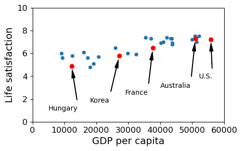
As the GDP grows the Life satisfaction grows. Over on the right, the life satisfaction of the US isn’t quite where we’d expect it to be. Although the US has a higher GDP than Australia, its life satisfaction trails behind. But all in all, it’s a pretty strong trend. More money equals more happiness.
sample_data.loc[list(position_text.keys())]
| GDP per capita | Life satisfaction | |
|---|---|---|
| Country | ||
| Hungary | 12239.894 | 4.9 |
| Korea | 27195.197 | 5.8 |
| France | 37675.006 | 6.5 |
| Australia | 50961.865 | 7.3 |
| United States | 55805.204 | 7.2 |
8.2.3. Doing it by hand
In this notebook, we’re looking at linear regression models. A regression model is a kind of model that tries to predict some dependent variable on the basis of one or more independent variables. Sometimes we say the model attempts to explain the dependent variable in terms of the independent variables. A linear regression model tries to predict with a linear model, a model that can actually be represented as a line or a plane or a hyperplane on a plot. In this notebook we’ll study the simplest case, trying to predict one dependent variable with one independent variable. In that case the line that represents the model can be drawn on a 2D plot. For our dependent variable we’ll use life satisfaction and for our independent variable we’ll use GDP. So we’re trying to explain life satisfaction in terms of GDP with a linear model.
 and
an intercept value
and
an intercept value  ; is y-value
at which the line intersects the y-axis; is the
slope. In the plot we draw the lines determined by some candidate
linear regression models (some guesses at and
), together with a sample of points to evaluate the
guesses. The closer the lines are to the points, the better the model.
; is y-value
at which the line intersects the y-axis; is the
slope. In the plot we draw the lines determined by some candidate
linear regression models (some guesses at and
), together with a sample of points to evaluate the
guesses. The closer the lines are to the points, the better the model.#import numpy as np
# The data
sample_data.plot(kind='scatter', x="GDP per capita", y='Life satisfaction', figsize=(5,3))
plt.axis([0, 60000, 0, 10])
X=np.linspace(0, 60000, 1000)
# red line
plt.plot(X, 2*X/100000, "r")
plt.text(40000, 2.7, r"$\theta_0 = 0$", fontsize=14, color="r")
plt.text(40000, 1.8, r"$\theta_1 = 2 \times 10^{-5}$", fontsize=14, color="r")
# green line
plt.plot(X, 8 - 5*X/100000, "g")
plt.text(5000, 9.1, r"$\theta_0 = 8$", fontsize=14, color="g")
plt.text(5000, 8.2, r"$\theta_1 = -5 \times 10^{-5}$", fontsize=14, color="g")
# blue line
plt.plot(X, 4 + 5*X/100000, "b")
plt.text(5000, 3.5, r"$\theta_0 = 4$", fontsize=14, color="b")
plt.text(5000, 2.6, r"$\theta_1 = 5 \times 10^{-5}$", fontsize=14, color="b")
# Let's have this cell return nothing. Just a display cell.
None
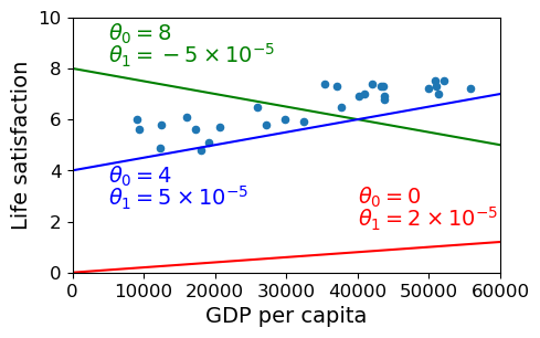
The blue line isn’t bad. Maybe we can do better if we use some math.
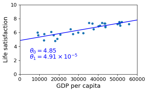
8.2.4. The scitkit_learn (aka sklearn) linear regression module
We load up the sklearn linear regression module and ask it to find
the line that best fits our sample data.
from sklearn import linear_model

#Data
# Independent variable Must be DataFrame
Xsample = sample_data[["GDP per capita"]]
# Dependent variable (can be Series)
ysample = sample_data["Life satisfaction"]
#Create model
lin1 = linear_model.LinearRegression()
#Train model on data
lin1.fit(Xsample, ysample)
print(f"Training R2: {lin1.score(Xsample,ysample):.2f}")
# Here's the result of the learning.  In more dimensions, there will be more coefficients
theta0, theta1 = lin1.intercept_, lin1.coef_[0]
theta0, theta1
Training R2: 0.73
(4.853052800266436, 4.911544589158484e-05)
We will talk about the training R2 score below. It looks promising but in this case is quite misleading.
#from sklearn import linear_model

#Data
# Independent variable
#Xsample = sample_data[["GDP per capita"]]
# Dependent variable
#ysample = sample_data[["Life satisfaction"]]
#Create model
#lin1 = linear_model.LinearRegression()
#Train model on data
#lin1.fit(Xsample, ysample)

# Here's the result of the learning.
#theta0, theta1 = lin1.intercept_[0], lin1.coef_[0][0]
#theta0, theta1
Notice creating a linear_model produced a python object called
lin1. That’s what we run the fit method on. This method “fits”
the model to the data. After fitting, the lin1 object has learned
two numbers called the intercept and the coefficient. These are
the slope and intercept of the regression line.
Note that sklearn is fully integrated with pandas, but the training data
passed in must be a DataFrame. This is why the line defining
Xsamples must have two square brackets instead of just one:
type(sample_data[["GDP per capita"]]),type(sample_data["GDP per capita"])
(pandas.core.frame.DataFrame, pandas.core.series.Series)
Essentially the independent varuable data must be 2-dimensional. The same would hold true if we were passing in numpy arrays with one feature. In place of training data with shape (n,), we would pass in data with shape (n,1), reshaping the data if necessary.
We draw our data again with the line defined by the slope and intercept. Pretty good fit, eyeballing it.
sample_data.plot(kind='scatter', x="GDP per capita", y='Life satisfaction', figsize=(5,3))
plt.axis([0, 60000, 0, 10])
X=np.linspace(0, 60000, 1000)
plt.plot(X, theta0 + theta1*X, "b")
plt.text(5000, 3.1, r"$\theta_0 = 4.85$", fontsize=14, color="b")
plt.text(5000, 2.2, r"$\theta_1 = 4.91 \times 10^{-5}$", fontsize=14, color="b")
None
8.2.4.1. Predicting the Life Satisfaction Score for Cypress
First, let’s try to predict the Life Satisfaction for a country we
know the GDP of, which is missing from our quality of life data,
Cypress.
What we do is plug the GDP for Cypress into the model using the
predict method, and it returns the Life Satisfaction score
predicted by the scikit_learn model, which is 5.96 or so.
cyprus_gdp_per_capita = gdp_per_capita.loc["Cyprus"][["GDP per capita"]]
# What we plug into the model
print(f"{'Model input GDP val:':<30} {cyprus_gdp_per_capita['GDP per capita']:>9,}")
cyprus_predicted_life_satisfaction = lin1.predict(pd.DataFrame({"GDP per capita":
                                                                cyprus_gdp_per_capita}))[0]
# What we get out
print(f"{'Model output lifesat score:':<30} {cyprus_predicted_life_satisfaction:>9.2f}")
Model input GDP val:           22,587.49
Model output lifesat score:         5.96
from matplotlib import pyplot as plt

fig, ax = plt.subplots(1,1,figsize=(6,4))
sample_data.plot(kind='scatter', x="GDP per capita", y='Life satisfaction', ax=ax,s=1)
X=np.linspace(0, 60000, 1000)

# Plot the line our linear regression model learned.
ax.set_title("Predicting the Life-Satisfaction of Cypress")
ax.plot(X, theta0 + theta1*X, "b")
ax.axis([0, 60000, 0, 10])
ax.text(5000, 7.5, r"$\theta_0 = 4.85$", fontsize=14, color="b")
ax.text(5000, 6.6, r"$\theta_1 = 4.91 \times 10^{-5}$", fontsize=14, color="b")

# Plot a vertical red dashed line where the GDP of CYPRESS is.
# It goes from the x axis right up to where our predicted happiness is.
ax.plot([cyprus_gdp_per_capita, cyprus_gdp_per_capita], [0, cyprus_predicted_life_satisfaction], "r--")

ax.text(25000, 5.0, r"Prediction = 5.96", fontsize=14, color="b")
# Plot a fat red dot right where our predicted happiness is
# Notice it lands right on the line, and it has to, because our model just is the line.
ax.plot(cyprus_gdp_per_capita, cyprus_predicted_life_satisfaction, "ro")
#plt.show()
[<matplotlib.lines.Line2D at 0x7ff1f06ab8b0>]
Look at the sample data that has around the same GDP as Cypress.
sample_data[7:10]
| GDP per capita | Life satisfaction | |
|---|---|---|
| Country | ||
| Portugal | 19121.592 | 5.1 |
| Slovenia | 20732.482 | 5.7 |
| Spain | 25864.721 | 6.5 |
cyprus_gdp_per_capita
GDP per capita    22587.49
Name: Cyprus, dtype: object
Suppose we try to predict our life satisfaction by taking the average of these 3 points.
(5.1+5.7+6.5)/3
5.766666666666667
So you can see this estimate is lower than the 5.96 estimated by our model. This is because the linear model tries for the best line that fits all the points, so it responds to the fact that there is a steady upward trend with a particular slope, and because Spain falls below that line, it is treated as a point whose value has been reduced by noise.
So far, so good. But what we really need to do is TEST our model on some data it didn’t see during training, but for which we know the answers. That was the point of setting aside some test data.
missing_data
| GDP per capita | Life satisfaction | |
|---|---|---|
| Country | ||
| Brazil | 8669.998 | 7.0 |
| Mexico | 9009.280 | 6.7 |
| Chile | 13340.905 | 6.7 |
| Czech Republic | 17256.918 | 6.5 |
| Norway | 74822.106 | 7.4 |
| Switzerland | 80675.308 | 7.5 |
| Luxembourg | 101994.093 | 6.9 |
position_text2 = {
    "Brazil": (1000, 9.0),
    "Mexico": (11000, 9.0),
    "Chile": (25000, 9.0),
    "Czech Republic": (35000, 9.0),
    "Norway": (60000, 3),
    "Switzerland": (72000, 3.0),
    "Luxembourg": (90000, 3.0),
}
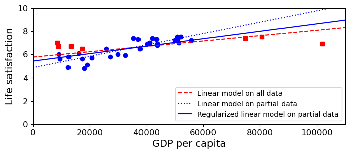
The cell below compares two models, the one we used before (the dotted blue line), trained on our data sample, and another model trained on all the data (the solid black line). The significant difference between these models migfht be explained in three different ways, not necessarily mutually exclusive: (a) the points we trained on before are not all that representative of the entire data set or (b) our test points are outliers (they sort of are if you look back at how we chose them); or (c) the behavior of the data cannot be captured by a linear model. The fact that the model trained on all the data is still significantly off suggests that some of the error is because of (c), although it does not eliminate the possibility that noise plays a role.
Mark |
Model trained on |
Act/Pred |
|---|---|---|
black line |
train + test |
Pred |
dotted blue line |
train |
Pred |
red squares |
Act test |
|
big blue dots |
Act train |
The red squares are the actual locations of our test points. The dot on the dotted blue line that lies directly above or below the red square is its predicted value according to the model we trained before. If the red square lands directly on the dotted blue line, the model got it it exactly right. If the red square is some distance above the line (like “Brazil”), the model’s estimate is low; if the red square is some distance below the blue line (like “Luxembourg”), the model’s estimate is high.
Which of the following statements about the dotted blue line do the red dots provide evidence for?
Does the blue model underestimate or overestimate the happiness of poor countries?
Does the blue model underestimate or overestimate the happiness of rich countries?
sample_data.plot(kind='scatter', x="GDP per capita", y='Life satisfaction', figsize=(8,3))
plt.axis([0, 110000, 0, 10])

for country, pos_text in position_text2.items():
    pos_data_x, pos_data_y = missing_data.loc[country]
    plt.annotate(country, xy=(pos_data_x, pos_data_y), xytext=pos_text,
            arrowprops=dict(facecolor='black', width=0.5, shrink=0.1, headwidth=5))
    plt.plot(pos_data_x, pos_data_y, "rs")

X=np.linspace(0, 110000, 1000)
# Plot the dotted blue line
plt.plot(X, theta0 + theta1*X, "b:")

lin_reg_full = linear_model.LinearRegression()
Xfull = full_country_stats[["GDP per capita"]]
yfull = full_country_stats["Life satisfaction"]
lin_reg_full.fit(Xfull, yfull)

t0full, t1full = lin_reg_full.intercept_, lin_reg_full.coef_[0]
X = np.linspace(0, 110000, 1000)
# Plot the black line
plt.plot(X, t0full + t1full * X, "k")

plt.show()
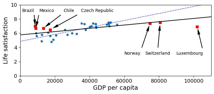
Which of the following statements about the dotted blue line do the red dots provide evidence for?
Does the blue model underestimate or overestimate the happiness of poor countries?
Does the blue model underestimate or overestimate the happiness of rich countries?
Q1. If we include both the training points (blue) and test points (red), it does a fair bit of both under estimate and overestimating. That is restricted to the poorer countries though.
Q2. The three richest countries are all in the test set, and the dotted blue model overestimates the happiness of all three rich countries. Indeed, so does the model trained on all the data, but not by as much.
8.2.5. Other models
The next cell has some code computing a complicated model, one which does not have to be a line. It is a higher order polynomial model which can curve up and down to capture all the data points. We can measure the aggregate error of a model on the training set by computing the distance of each actual point from the curve/line of the model. By that definition, the polynomial model is reducing the “error” on the training set by a large amount. But is it a better model? Only the performance on a test set will tell us for sure.
Note: The machine learning toolkit demoed here (scikit_learn) has a
variety of robust regression strategies implemented; see Scikit learn
docs
for discussion.
Pipeline
We choose a degree, the highest exponent in the polynomial function we will use to make predictions. Below we choose 20.
- Polynomial features. Generate a new feature matrix consisting of all polynomial combinations of the features with degree less than or equal to the specified degree k. For example, if an input sample is two dimensional and of the form [a, b] (say using the two features GDP and employment), the degree-2 polynomial features are [
 ].What this notation means is that the model has to learn coefficients or weights to associate with each of these values such that when the following polynomial is summed, it gets as close as possible to the real life-satisfaction value:
These polynomial models have a lot of numbers to learn. For a 1-dimensional input model (one feature, GDP, in our case) and k=60, the model will compute 20 new feature values [1, a^2, …, a^20] and need to learn weights for all of them. If we used employment in addition to GDP, it would be a lot more.
Scaler. The standard scaler computes the z-score, that is, it maps each feature value x onto z where
where
 is the mean of the feature and
  is the
standard deviation. As we saw in the pandas module, this is known as
centering and scaling. One motivation for scaling and centering is
that it reduces the possibility of over- or under- valuing features
with large/small value ranges. In a polynomial model some of the
features are practically guaranteed to be of different scale than the
others (because, for example,
is the
standard deviation. As we saw in the pandas module, this is known as
centering and scaling. One motivation for scaling and centering is
that it reduces the possibility of over- or under- valuing features
with large/small value ranges. In a polynomial model some of the
features are practically guaranteed to be of different scale than the
others (because, for example,  will generally be of a
different order of magnitude than
will generally be of a
different order of magnitude than  ), but scaling may help in
any model with more than one independent variable.
), but scaling may help in
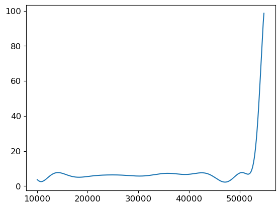
any model with more than one independent variable.With the new features we still do a linear regression, just in a much higher dimensional space. In other words, the learning computation in the example depicted below is exactly the same as if we had 60 independent features instead of 1 value we had raised to 60 different powers. In both cases it’s a linear model. In both cases, we seek to learn the weights that define a hyper plane that provides the least squared error solution. When we do a 2D plot of the predicted values our dimension-60 “linear” model assigns to our data (using the original data GDP feature as the X coordinate), the predicted Life Satisfaction value is a sinuous curve, because the function determining the y-values is of course polynomial.
Note: This is a pretty silly example but we use it to illustrate a simple point. With a model with enough parameters (each of those Polynomial features gets its own coefficient), you can fit anything.
full_country_stats.plot(kind='scatter', x="GDP per capita",
                        y='Life satisfaction', figsize=(8,3))
plt.axis([0, 110000, 0, 10])


poly = preprocessing.PolynomialFeatures(degree=20, include_bias=True)
scaler = preprocessing.StandardScaler()
lin_reg2 = linear_model.LinearRegression()

pipeline_reg = pipeline.Pipeline([('poly', poly), ('scal', scaler), ('lin', lin_reg2)])
# Train on the full GDP dataset for the sake of the picture
pipeline_reg.fit(Xfull, yfull)

# Pass in a large set of sample GDP values from poor to rich
Xvals = np.linspace(0, 110000, 1000)
# ... as a DF as per training
X = pd.DataFrame(Xvals, columns=["GDP per capita"])
curve = pipeline_reg.predict(X)
plt.plot(Xvals, curve)
plt.show()
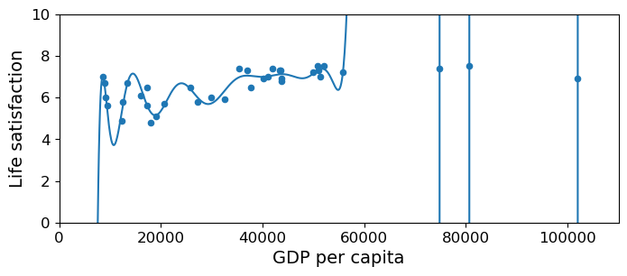
So this model really minimizes mean squared error. It pretty much threads the curve through every point.
But that’s every point of the training set. What about unseen data, the test set?
Let’s evaluate by computing the mean squared error of the polynomial and linear model when both are trained on the same training data (with 6 outliers removed).
pipeline_reg = pipeline.Pipeline([('poly', poly), ('scal', scaler), ('lin', lin_reg2)])
# Now Train on the sample dataset
pipeline_reg.fit(Xsample, ysample)

# Polynomial Model
#vals_poly = pipeline_reg.predict(missing_data["GDP per capita"].values[:,np.newaxis])
vals_poly = pipeline_reg.predict(missing_data[["GDP per capita"]])
# Compare predicted values to actual values
poly_mse = mean_squared_error (vals_poly[:,0], missing_data["Life satisfaction"])

# Linear Model
#vals_lin = lin1.predict(missing_data["GDP per capita"].values[:,np.newaxis])
vals_lin = lin1.predict(missing_data[["GDP per capita"]])
lin_mse = mean_squared_error (vals_lin[:,0], missing_data["Life satisfaction"])
And now the results, with a fluorish:
print(f' Lin Model MSE: {lin_mse:.3e}')
print(f'Poly Model MSE: {poly_mse:.3e}')
 Lin Model MSE: 2.682e+00
Poly Model MSE: 5.040e+24
The mean squared error of the polynomial model is crazy bad!
By comparison, the mean squared error of the linear model is pretty reasonable!
To look into this, let’s cook up a squared error function so as to look at the individual squared errors before the mean is taken.
def get_squared_error(predicted, actual):
    return (predicted - actual)**2
##  The general argument signature for evaluation metrics is
##  evaluation_metric(predicted_values,actual_values)
se_poly = get_squared_error (vals_poly[:,0], missing_data["Life satisfaction"])
# Save this to look at later.
missing_data['sq_err_poly'] = se_poly
# Now take the mean of squared error (to compare with sklearn function)
mse_poly = se_poly.mean()
## pretty good egreement with sklearn's mean_squared_error function
mse_poly
5.039974893489065e+24
# Same for the linear model
se_lin = get_squared_error (vals_lin[:,0], missing_data["Life satisfaction"])
# Save this too look at later
missing_data['sq_err_lin'] = se_lin
# Get the mean of squared error
mse_lin = se_lin.mean()
# Also good agreement
mse_lin
2.681893248747465
What happened?
Here is our data with squared errors from the models appended.
#  Think about why the squared error columns are so nicely aligned with the original data
#  What Python type does get_squared_error error return?
missing_data
| GDP per capita | Life satisfaction | sq_err_poly | sq_err_lin | |
|---|---|---|---|---|
| Country | ||||
| Brazil | 8669.998 | 7.0 | 9.936943e+00 | 2.962242 |
| Mexico | 9009.280 | 6.7 | 5.971153e-01 | 1.972487 |
| Chile | 13340.905 | 6.7 | 2.379451e-01 | 1.420155 |
| Czech Republic | 17256.918 | 6.5 | 1.558291e+00 | 0.638986 |
| Norway | 74822.106 | 7.4 | 5.020802e+17 | 1.272325 |
| Switzerland | 80675.308 | 7.5 | 6.602070e+19 | 1.730426 |
| Luxembourg | 101994.093 | 6.9 | 3.527976e+25 | 8.776632 |
What happened was on the three rich countries (Norway, Switzerland, and Luxembourg) the squared error skyrocketed for the polynomial model.
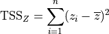
Looking back at the original picture of the polynomial model points to the source of the problem. The curve of the polynomial model swings wildly up and down in order to thread its way through the life-satisfaction scores for all training data countries, and the training data leaves it on an upswing.
We can observe the polynomial model’s model’s upward swing by drawing a picture in which the x-axis goes well beyond the GDP values the model was trained on, and that’s where the predicted life-satisfaction scores skyrocket.
pipeline_reg_full = pipeline.Pipeline([('poly', poly), ('scal', scaler), ('lin', lin_reg2)])
# Train on the full GDP dataset for the sake of the picture
pipeline_reg_full.fit(Xsample, ysample)

# Pass in a large set of sample GDP values from poor to rich
Xvals0 = np.linspace(Xsample.min()+1000, Xsample.max()-1000, 1000)
X0 = pd.DataFrame(Xvals0, columns=["GDP per capita"])
# predict expects a 2D array.  Make our 1D array X a 1000x1 2D array
#curve = pipeline_reg.predict(X[:, np.newaxis])
curve = pipeline_reg_full.predict(X0)
plt.plot(Xvals0, curve)
plt.show()
The polynomial model minimized the squared error on whatever training set it was given but it missed the general trend. As a result, it performed terribly on unseen data. This is known as overfitting or overtraining.
This is the danger of very powerful models. In basically memorizing the training set, they sometimes fail to learn the key generalization that will help cope with unseen data.
8.2.6. Evaluating Regression models ( vs MSE)
A final note on evaluation. We have been using mean squared error (MSE) as our chief tool for evaluating regression models. As a first approximation it is useful. It is intuitive and, so far, it has given us results that make sense.
But in practical applications it is wise to use another measure
 (or
(or r2_score in the sckit learn metrics, or
coefficient of determination as it’s sometimes called).
score is a number less than 1 that, in the general
case, represents the proportion of variability in  that can
be “explained” by the regressor variables.
that can
be “explained” by the regressor variables.  means that
all the variability is explained. The model is a perfect fit. value can be
negative (as it is in our case), when the model performs worse than a
model that always predicts the mean.
means that
all the variability is explained. The model is a perfect fit. value can be
negative (as it is in our case), when the model performs worse than a
model that always predicts the mean.Unlike mean_squared_error, it’s not symmetric, and the arguments
must be passed in this order:
r2_score(true_values, predicted_values).
What does explaining variance mean? We’ll try to convey the main idea by doing two things. First instead of talking about variance per se, we’ll talk about summed squares. The squares we’re summing look like this:
Here  is a value for some variable
  in our sample and
 is the mean value for . So we’re summing
the the squares of the differences between each and the mean.
And if we sum over the entire sample, we call the result Total Summed
Squares (TSS). The TSS of of a variable gives us a handle on
the scale of the variable: How far do values typically get from the
mean of ? Are we talking about a whose values can
differ by 10s, 100s, or 1000s? To compute the Total Variance (TV),
divide TSS by N-1, where N is the size of the sample.
is the mean value for . So we’re summing
the the squares of the differences between each and the mean.
And if we sum over the entire sample, we call the result Total Summed
Squares (TSS). The TSS of of a variable gives us a handle on
the scale of the variable: How far do values typically get from the
mean of ? Are we talking about a whose values can
differ by 10s, 100s, or 1000s? To compute the Total Variance (TV),
divide TSS by N-1, where N is the size of the sample.
Second to evaluate a model that tries to predict values for ,
we’ll use what’s called the ANOVA decomposition of TSS:
In this equation, we have data whose actual values we’ll call
and a model whose predicted values we’ll call  . The RSS
is the sum of the Residual Summed Squares (what is unaccounted for
by the model) and the ESS is the Explained Summed Squares (what is
accounted for by the model).
. The RSS
is the sum of the Residual Summed Squares (what is unaccounted for
by the model) and the ESS is the Explained Summed Squares (what is
accounted for by the model).
If the model is good, the difference between and
(the actual value) is small. In that case the RSS term (the
residual or unexplained summed squares) will be a relatively small part
of the right-hand side, and almost all of the TSS will be accounted for
by the ESS term. If the model is bad, most of the TSS will be due to the
RSS, often just referred to as the residuals.
We talk about model evaluation in terms of the TSS in order to have some handle on what counts as a small difference between the predictions and reality and what counts as as a big difference. An RSS of 100 is terrible when the TSS is 200 and wonderful when TSS is 10_000; in other words, we want a model that makes the ESS term a large percentage of the TSS. We might refer to that as explaining a large percentage of the Total Summed Squares. That, is the following will be large.
We’re now ready to define percentage of Total Variance explained. To turn equation (1) into an equation about Total Variance, we just just divide both sides by N-1. But that means the percentage of Total Variance Explained will be equal to the Percentage of TSS explained, so let’s just write the definition of Percent Variance Explained using ESS and TSS:
![\begin{array}[t]{lcll}
(A) & \text{Percent Variance Explained} = \frac{\text{ESS}}{\text{TSS}}
\end{array}](../../../../_images/math/5fe144dda8f815c2068f6531ecd5db0dfcf0fc9e.png)
Now in real life given some data and a model we don’t usually have our hands on ESS, so this is more usefully written using the following consequence of (1)
![\begin{array}[t]{lcll}
(1') & \text{TSS}/\text{TSS} & = & \text{RSS}/\text{TSS} + \text{ESS}/\text{TSS}\\
& 1 & = & \text{RSS}/\text{TSS} + \text{ESS}/\text{TSS}\\
\end{array}](../../../../_images/math/2fbf7b0609b40981cdcf7cae2f9702b4e49056ce.png)
That means:
![\begin{array}[t]{lcll}
& \text{Percent Variance Explained} = 1 - \frac{\text{RSS}}{\text{TSS}}
\end{array}](../../../../_images/math/4d2bf8022e91ed4059dccebc1f0aaf7d2310c9bf.png)
And finally, , as we said, measures Percent Variance
Explained. In fact:
![\begin{array}[t]{lcll}
(2) & \text{R}^{2} = 1 - \frac{\text{RSS}}{\text{TSS}}
\end{array}](../../../../_images/math/52ac47875496899ab2f01b0d743e50d05325e014.png)
Note that although we’ve defined as Percent Variance
Explained, this formula is actually not equivalent to (A) above. (A)
can’t be negative, which seems reasonable, because the way we normally
use percentages, they can’t be negative. However, the way people use
(and the way we’re using it in this notebook) it definitely
can be negative. The big advantage of equation (2) is that it allows
to be negative, as we’ll see. So equation (A) stands as a
reasonable definition of Percentage of Variance explained, but Equation
(2) is what we want when working with .
Summing this up: To compute Percent Variance Explained, or
, we look at the difference between our predictions and our
actual values ( ), square those, sum the
squares, and get our residuals RSS. Then we compute TSS, summing the
distances of the
), square those, sum the
squares, and get our residuals RSS. Then we compute TSS, summing the
distances of the  from the mean
(
from the mean
( ). Then we subtract $
:raw-latex:`frac{text{RSS}}{text{TSS}}`$ from 1.
). Then we subtract $
:raw-latex:`frac{text{RSS}}{text{TSS}}`$ from 1.
For concreteness let’s say our model is a linear model like the
regression models we’ve been talking about. If the model is good that
means the data points in our -sample (our ) all
lie on or very close to the model line. The points on the line are our
predicted values ( ); so if the are
close to the ,
); so if the are
close to the ,  (RSS) will
be small. That means a large percentage of the Variance is explained by
the model and will be close to 1.
(RSS) will
be small. That means a large percentage of the Variance is explained by
the model and will be close to 1.
is a key concept in model evaluation. The other key
concept is RSS or the sum of the squared errors of the model. Taking the
mean of that gives us the mean squared error (MSE), which is what
we’ve been using to evaluate our regression models.
So let’s review what we said about in light of equations (1)
and (2):
When is
equal to 1? When
 ; that is, when there are no
errors. The model is a perfect fit.
; that is, when there are no
errors. The model is a perfect fit.When is
equal to 0? When
 . that is, when
 . The model explains none of
the variance. The model can only do this by always predicting
, so that
. The model explains none of
the variance. The model can only do this by always predicting
, so that  is
always 0.
is
always 0.When is
negative? When
 is greater than 1, that is, when the
model’s summed errors exceed the data’s summed deviations from the
mean. No reason this can’t happen. There is no limit to how bad a
model can be, and therefore no lower bound on . Another
way of looking at this: there is no limit to how difficult a data set
can be to model.
is greater than 1, that is, when the
model’s summed errors exceed the data’s summed deviations from the
mean. No reason this can’t happen. There is no limit to how bad a
model can be, and therefore no lower bound on . Another
way of looking at this: there is no limit to how difficult a data set
can be to model.
One drawback of is that it grows as the number of variables
grows, so with no modification is of no help in evaluating
what happens as predictor variables are added to the model. For this
reason people have cooked up something called adjusted :math:`R^2`,
which corrects for this effect and gives a truer measure of whether a
new variable is informative. We’re not discussing that wrinkle here.
So below where we explore feature choice we’ve used to
illustrate its use, but we don’t rely on it to help evaluate the models.
You may want to try out this definition of adjusted .
To keep this discussion tidily in one place, here is the code for
training and evaluating the regression model above with sckit learn
metrics, using both mean_squared_error and r2_score.
from sklearn.metrics import mean_squared_error, r2_score
from sklearn import linear_model

#Data
# Independent variable Must be DataFrame
Xsample = sample_data[["GDP per capita"]]
# Dependent variable (can be Series)
ysample = sample_data["Life satisfaction"]
#Create model
lin1 = linear_model.LinearRegression()
#Train model on data
lin1.fit(Xsample, ysample)

vals_lin = lin1.predict(missing_data[["GDP per capita"]])
# vals_lin is  a 7x1 2D array.  mean_squared_error wants two 1D arrays or sequences,
# the predicted values and the actual values.  So we pass in the first column of vals_lin.
lin_mse = mean_squared_error (missing_data["Life satisfaction"], vals_lin)
# Same for r2 score
lin_r2 =  r2_score(missing_data["Life satisfaction"],vals_lin)
print(f' Lin Model MSE: {lin_mse:.3e} Lin Model R^2: {lin_r2:.2f}')
Lin Model MSE: 2.682e+00 Lin Model R^2: -21.43
An important point: in evaluating an regression system, we are often
only interested in the score on test data. We can compute
that directly with
lin1.score(missing_data[["GDP per capita"]],missing_data["Life satisfaction"])
Note that although both functions return values, the
.score() method has a different argument signature from
r2_score; the .score() method takes the same kind of arguments
as .fit(), a sequence of data points and a sequence of labels; while
r2_score score takes the same arguments as any scikit
learn evaluation metric: the actual values and the predicted values.
Thus, to use r2_score we must first use .predict() to generate
some predictions; .score() folds that step in.
print(f'{lin1.score(missing_data[["GDP per capita"]], missing_data["Life satisfaction"]):.2f}')
-21.43
Note that the value is a negative number less than -1. This
means this is a very bad model. Technically what it means is that we
would be better off predicting the mean life satisfaction score every
time. Let’s try that:
md_mn = missing_data["Life satisfaction"].mean()
md_mn
6.957142857142856
# Create a 1D prediction array that always predicts the Life Satisfaction mean
mean_predictions = np.full(len(missing_data), md_mn)

mn_mse = mean_squared_error (missing_data["Life satisfaction"], mean_predictions)

# Same for r2 score
mn_r2 =  r2_score(missing_data["Life satisfaction"],mean_predictions)

print(f'Mean Model R^2: {mn_r2:.2f} Mean Model MSE: {mn_mse:.3e}  Lin Model MSE: {lin_mse:.2f}')
Mean Model R^2: 0.00 Mean Model MSE: 1.196e-01 Lin Model MSE: 2.68
More generally, predictions normally distributed in a small region
around the mean will earn score near 0 but not equal to 0.
mean_predictions[0] = mean_predictions[0]+.1
mean_predictions[1] = mean_predictions[1]-.1
mean_predictions[2] = mean_predictions[2]+.3
mean_predictions[3] = mean_predictions[3]-.3

r2_score(missing_data["Life satisfaction"],mean_predictions)
-0.023890784982935065
ls_mn = sample_data["Life satisfaction"].mean()
num_samples = len(sample_data)
std = .01
# Equivalently: ls_mn + std * np.random.randn(num_samples)
new_predictions = np.random.normal(ls_mn,std,num_samples)
r2_score(sample_data["Life satisfaction"],new_predictions)
-0.011470230784547564
Using the mean model, the is 0 and the MSE is lower than the
linear model MSE.
So the negative less than -1 means our learner is performing
worse than the baseline system. The concept of a baseline system is
extremely useful in interpreting machine learning results. Define a
simple-minded, low-information strategy for a regression or
classification problem and call that your baseline. Compute your
evaluation score for that system and define that score as 0-level
performance. If your system can’t beat that, it’s not going to be
useful.
What counts as a baseline score can generally vary from task context to
task context. One of the useful properties of is that it’s
meaningful across a wide variety of contexts. Although what counts as
really good performance can take some interpreting, it gives us a good
handle on what terrible performance is.
Recall we called the .score() method on our training data after
training lin1:
print(f"Training R2: {lin1.score(Xsample,ysample):.2f}")
Training R2: 0.73
So the score we got the for the training data, which is
quite respectable, was also highly misleading. This model is exhibiting
quite a bit of overfitting: its performance on the training set is
considerably better than its performance on the test set.
It’s not quite as bad as the polynomial model, but it is still overfitting.
Here are the test data predictions and our errors compared:
comparison_df = missing_data["Life satisfaction"].to_frame(name="Actual")
comparison_df["Predicted"] = vals_lin
comparison_df["$E^2$"] = (comparison_df["Actual"]-comparison_df["Predicted"])**2
comparison_df
| Actual | Predicted | $E^2$ | |
|---|---|---|---|
| Country | |||
| Brazil | 7.0 | 5.278884 | 2.962242 |
| Mexico | 6.7 | 5.295548 | 1.972487 |
| Chile | 6.7 | 5.508297 | 1.420155 |
| Czech Republic | 6.5 | 5.700634 | 0.638986 |
| Norway | 7.4 | 8.527974 | 1.272325 |
| Switzerland | 7.5 | 8.815457 | 1.730426 |
| Luxembourg | 6.9 | 9.862538 | 8.776632 |
Coding note: score and r2_score will work on pandas
DataFrame and Series arguments.
For example:
print(lin1.score(missing_data[["GDP per capita"]],missing_data["Life satisfaction"],))
r2_score(comparison_df["Actual"],comparison_df["Predicted"])
-21.425387233553884
-21.425387233553884
8.2.7. Choosing features
Regression always starts with choosing features to predict with. Don’t skip this step. Don’t just always use all the features in your data set. More isn’t necessarily better.
Here’s an interesting observation about the training data, which a model might “notice” if we had features that represented the letters in the country name. Let’s consider all countries with a “w” in their name:
full_country_stats.loc[[c for c in full_country_stats.index
                        if "W" in c.upper()]]["Life satisfaction"]
Country
New Zealand    7.3
Sweden         7.2
Norway         7.4
Switzerland    7.5
Name: Life satisfaction, dtype: float64
Every single one of them has life satisfaction score of over 7! This is fairly high. If this were represented in our data, a learner would certainly pick up on it, and treat it as a feature that increases the likelihood of happiness. Yet it is fairly clear that this is just an accidental feature of our data that will not generalize to other cases.
This example shows how poorly chosen features can hurt. They introduce noise that can be mistaken for meaningful patterns. We note that this feature does not correlate particularly well with GDP in the GDP table, which has a larger sample of countries, and we know that very low GDP makes a high life satisfaction score virtually impossible (because many of the features used to compute the score depend on wealth).
# Let's just look at one column of this largish table
gdp_col = gdp_per_capita["GDP per capita"]
gdp_col.loc[[c for c in gdp_col.index if "W" in c.upper()]].head()
Country
Botswana        6040.957
Kuwait         29363.027
Malawi           354.275
New Zealand    37044.891
Norway         74822.106
Name: GDP per capita, dtype: float64
Note that relatively poor Botswana and Malawi are “W”-countries. This confirms our suspicion that the W “rule” is actually an accident of our sample.
With this warning in mind, let’s try training with more features.
8.2.7.1. lin3: Lifesat feats
Now let’s train with more features.
Shall we use all the columns? Here are some we might want to leave out.
They are precisely the features we acquired by merging in GDP data,
full_country_stats.columns[-6:]
Index(['Subject Descriptor', 'Units', 'Scale', 'Country/Series-specific Notes',
       'GDP per capita', 'Estimates Start After'],
      dtype='object')
Why leave out GDP? Because we used it in the model with one feature, We’ve demonstrated that it’s a powerful predictor. Let’s see how we do without it, using the other features, shown below:
predictors = list(full_country_stats.columns[:-6])
predicted ='Life satisfaction'
predictors.remove(predicted)
print(len(predictors),"features")
predictors
23 features
['Air pollution',
 'Assault rate',
 'Consultation on rule-making',
 'Dwellings without basic facilities',
 'Educational attainment',
 'Employees working very long hours',
 'Employment rate',
 'Homicide rate',
 'Household net adjusted disposable income',
 'Household net financial wealth',
 'Housing expenditure',
 'Job security',
 'Life expectancy',
 'Long-term unemployment rate',
 'Personal earnings',
 'Quality of support network',
 'Rooms per person',
 'Self-reported health',
 'Student skills',
 'Time devoted to leisure and personal care',
 'Voter turnout',
 'Water quality',
 'Years in education']
Here is the code we used above to train and evaluate the linear model with one feature. We’re going to adapt it to the case of many features.
# Linear Model with one feature

#Data
Xsample = sample_data[["GDP per capita"]]
ysample = sample_data[["Life satisfaction"]]


#Train model on data
lin1 = linear_model.LinearRegression()
lin1.fit(Xsample, ysample)


vals_lin = lin1.predict(missing_data[["GDP per capita"]])


lin1_mse = mean_squared_error (vals_lin[:,0], missing_data["Life satisfaction"])
lin1_r2 = r2_score (missing_data["Life satisfaction"],vals_lin[:,0])
# Linear Model with our new predictors
remove_indices = [0, 1, 6, 8, 33, 34, 35]
keep_indices = list(set(range(36)) - set(remove_indices))

#Test on this!
#missing_data = full_country_stats[["GDP per capita", 'Life satisfaction']].iloc[remove_indices]


#Train on this!
sample_data3 = full_country_stats[predictors].iloc[keep_indices]
#Test on this!
missing_data3 = full_country_stats[predictors].iloc[remove_indices]

# Scikit learn will accept a Pandas DataFrame for training data!
Xsample3 = sample_data3[predictors]
Xtest_sample3 = missing_data3[predictors]
print(Xsample3.shape)
print(Xtest_sample3.shape)
# Same as with 1 feature model
#ysample = np.c_[sample_data0["Life satisfaction"]]
ytrain = full_country_stats['Life satisfaction'].iloc[keep_indices]
ytest = full_country_stats['Life satisfaction'].iloc[remove_indices]
print(ytrain.shape,ytest.shape)
(29, 23)
(7, 23)
(29,) (7,)
These are the changes we need to create a training and test set with the 23 new features. Some code has been copied from above to make it clear what we’re doing.
We will use the same training test split to facilitate comparison.
#Create model
lin3 = linear_model.LinearRegression()
#Train model on data
lin3.fit(Xsample3, ysample)
print(f"Training R2: {lin3.score(Xsample3, ysample):.2f}")
tp3 = lin3.predict(Xsample3)
print(f"Training MSE: {mean_squared_error(tp3, ysample):.2f}")

vals3_lin = lin3.predict(Xtest_sample3)
lin3_mse = mean_squared_error (vals3_lin, missing_data["Life satisfaction"])
lin3_r2 = r2_score (missing_data["Life satisfaction"],vals3_lin)
Training R2: 0.96
Training MSE: 0.03
lin3_adj_r2
5.873134328091346
eval_df = pd.DataFrame({"MSE": [lin1_mse,lin3_mse,mn_mse],
                        "R2":[lin1_r2,lin3_r2,mn_r2]},
                       index=["GDP","LifeSat","Mean"])

with pd.option_context("display.precision",3):
    print(eval_df.sort_values(by="MSE"))
           MSE      R2
Mean     0.120   0.000
LifeSat  1.651 -12.807
GDP      2.682 -21.425
Substantial improvement in the MSE (it went down). Note the
is still negative and less than -1, meaning the mean model
still remains the winner.
Now let’s try folding GDP back in.
8.2.7.2. lin4: Lifesat feats + GDP
# Linear Model with our new predictors + GDP

remove_indices = [0, 1, 6, 8, 33, 34, 35]
keep_indices = list(set(range(36)) - set(remove_indices))

new_predictors = predictors + ['GDP per capita']
#Train on this!
sample_data4 = full_country_stats[new_predictors].iloc[keep_indices]
#Test on this!
missing_data4 = full_country_stats[new_predictors].iloc[remove_indices]


# Scikit learm Data
#Xsample4 = np.c_[sample_data4[new_predictors]]
#Xtest_sample4 = np.c_[missing_data4[new_predictors]]
Xsample4 = sample_data4[new_predictors]
Xtest_sample4 = missing_data4[new_predictors]
print(Xsample4.shape)
print(Xtest_sample4.shape)
(29, 7)
(7, 7)
#Create model
lin4 = linear_model.LinearRegression()
#Train model on data
lin4.fit(Xsample4, ysample)
print(f"Training R2: {lin4.score(Xsample4, ysample):.2f}")
tp4 = lin4.predict(Xsample4)
print(f"Training MSE: {mean_squared_error(tp4, ysample):.2f}")

vals4_lin = lin4.predict(Xtest_sample4)
lin4_mse = mean_squared_error (vals4_lin, missing_data["Life satisfaction"])
lin4_r2 = r2_score (missing_data["Life satisfaction"],vals4_lin)
Training R2: 0.85
Training MSE: 0.10
Note that both training and training MSE are better with the
GDP + Lifesat model than the Lifesat model (the improvement
is a general pattern for models with more features).
But the story on the test data is very different. Adding GDP to the LifeSat model makes it worse, both in MSE and R2 score:
eval_df = pd.DataFrame({"MSE": [lin1_mse,lin3_mse,lin4_mse,mn_mse],
                        "R2":[lin1_r2,lin3_r2,lin4_r2,mn_r2]},
                       index=["GDP","LifeSat","GDP + LifeSat","Mean"])

with pd.option_context("display.precision",3):
    print(eval_df.sort_values(by="MSE"))
                 MSE      R2
Mean           0.120   0.000
LifeSat        1.651 -12.807
GDP + LifeSat  2.110 -16.642
GDP            2.682 -21.425
We saw above that there is some noise in the GDP feature.
The other predictors appear better suited to the task of predicting Life Satisfaction on the test data.
The takeaway: More features often help, but not always.
8.2.8. Ridge learning (regularization)
Model building is all about making reasonable generalizations, which in turn is about wisely choosing which patterns in the data will be used to make those generalizations.
One very important kind of constraint on generalization is called smoothing or regularization. This is a family of techniques used to used to discourage “extreme” models, for example, models that forbid certain kinds of patterns because they were never seen in the training sample. Without going into the details here, the picture below shows the intended behavior of regularization, using a case in which it works well. The dashed red line shows a model trained on all the data. For the time being, think of this as the right answer. The dotted blue line shows the model trained on our original training sample, which as we noted before, was not entirely representative of the data. At the GDP extremes, that model drifts quite far from the “right” answer. The solid blue line is the same kind of model trained on the same sample data, but with “ridge” regularization, which penalizes models with many high coefficients; in this case it will help reduce the slope of the line, while still requiring it to reduce the error on the training data.
The result is the solid blue line, which is closer to the “right” answer than the original linear regression model. Note: this example is a somewhat oversimplified attempt to convey the intuition of what regularization does. One wouldn’t normally use ridge regression in a case where there’s a single predictor variable, because what makes it useful is that it reduces the influence of features that account for less of the variance.
plt.figure(figsize=(8,3))

plt.xlabel("GDP per capita")
plt.ylabel('Life satisfaction')

plt.plot(list(sample_data["GDP per capita"]), list(sample_data["Life satisfaction"]), "bo")
plt.plot(list(missing_data["GDP per capita"]), list(missing_data["Life satisfaction"]), "rs")

X = np.linspace(0, 110000, 1000)
plt.plot(X, t0full + t1full * X, "r--", label="Linear model on all data")
plt.plot(X, theta0 + theta1*X, "b:", label="Linear model on partial data")

ridge = linear_model.Ridge(alpha=10**9.5)
#ridge = linear_model.Ridge()
Xsample = np.c_[sample_data["GDP per capita"]]
ysample = np.c_[sample_data["Life satisfaction"]]
ridge.fit(Xsample, ysample)
t0ridge, t1ridge = ridge.intercept_[0], ridge.coef_[0][0]
plt.plot(X, t0ridge + t1ridge * X, "b", label="Regularized linear model on partial data")

plt.legend(loc="lower right")
plt.axis([0, 110000, 0, 10])
plt.show()
8.2.9. Summary thus far
We’ll conclude with some general regression tips.
Choose your features wisely.
Learn about smoothing and regularization.
Explore (cautiously) models of regression other than linear.
8.2.10. Non-linear example: K Nearest Neighbor Regression
In this section we intrdouce a non-linear regression algorithm, the K Nearest Neighbor algorithm. Having introduced the idea of non-linear regressors with the example of a polynomial regressor, we look at a much more constrained, and in many ways more successful example here.
The code below will also provide you with a model to use when
implementing new kinds of models using scikit_learn.
8.2.10.1. Loading the data
import pandas as pd
import numpy as np
from sklearn import linear_model
from sklearn.metrics import mean_squared_error, r2_score
from sklearn import preprocessing
from sklearn import pipeline
from sklearn import neighbors
from matplotlib import pyplot as plt


notebook_lifesat_url0 = 'https://github.com/gawron/python-for-social-science/blob/master/pandas/datasets/lifesat/'
lifesat_url = notebook_lifesat_url0.replace('github', 'raw.githubusercontent')
lifesat_url = lifesat_url.replace('blob/','')

def load_lifesat_data (lifesat_url):
    oecd_file = 'oecd_bli_2015.csv'
    oecd_url= f'{lifesat_url}{oecd_file}'
    return pd.read_csv(oecd_url, thousands=',',encoding='utf-8')


#backup = oecd_bli, gdp_per_capita
# Downloaded data from http://goo.gl/j1MSKe (=> imf.org) to github
def load_gdp_data ():
    gdp_file = "gdp_per_capita.csv"
    gdp_url = f'{lifesat_url}{gdp_file}'
    return pd.read_csv(gdp_url, thousands=',', delimiter='\t',
                                 encoding='latin1', na_values="n/a")


def prepare_country_stats(oecd_bli):
    """
    This would normally do prep work,including the train/test split.
    For now just redoing the steps whereby we merged gdp info with
    the original life-satisfaction data. and split training and test
    """
    oecd_bli = load_lifesat_data(lifesat_url)
    print(len(oecd_bli))
    oecd_bli = oecd_bli[oecd_bli["INEQUALITY"]=="TOT"]
    print(len(oecd_bli))
    oecd_bli = oecd_bli.pivot(index="Country", columns="Indicator", values="Value")
    gdp_per_capita = load_gdp_data()
    gdp_per_capita.rename(columns={"2015": "GDP per capita"}, inplace=True)
    # Make "Country" the index column.  We are going to merge data on this column.
    gdp_per_capita.set_index("Country", inplace=True)
    full_country_stats = pd.merge(left=oecd_bli, right=gdp_per_capita,
                                   left_index=True, right_index=True)
    #raise Exception
    full_country_stats.sort_values(by="GDP per capita", inplace=True)
    return full_country_stats

def split_full_country_stats (full_country_stats):
    remove_indices = [0, 1, 6, 8, 33, 34, 35]
    keep_indices = list(set(range(36)) - set(remove_indices))

    #Train on this!
    training_data = full_country_stats[["GDP per capita", 'Life satisfaction']].iloc[keep_indices]
    #Test on this!
    test_data = full_country_stats[["GDP per capita", 'Life satisfaction']].iloc[remove_indices]
    return training_data, test_data
# Prepare the data
oecd_bli = load_lifesat_data(lifesat_url)
full_country_stats = prepare_country_stats(oecd_bli)
training_data,test_data = split_full_country_stats(full_country_stats)

# The np.c_ makes both X and y  2D arrays
X_train = np.c_[training_data["GDP per capita"]]
X_test = np.c_[test_data["GDP per capita"]]

y_train = np.c_[training_data["Life satisfaction"]]
y_test = np.c_[test_data["Life satisfaction"]]
3292
888
8.2.10.2. Training and evaluation
The following demonstrates in principle how to build a regressor that
uses an instance of the scikit learn Pipeline class, which was first
demonstrated in the polynomial regression example earlier in this NB.
The example is trivial since scaling the data has no effect on regression with one independent variable, but the code model is solid, and will extend easily to more complicated (and more useful) pipelines.
y_train.shape
(29, 1)
#######################################################################
#
#   Training
#
########################################################################

from sklearn import linear_model
from sklearn import preprocessing
from sklearn import pipeline


##  Create the linear model pipeline
scaler2 = preprocessing.StandardScaler()
# select and train a linear regression model
lin_reg2 = linear_model.LinearRegression()
pipeline_reg3 = pipeline.Pipeline([('scal', scaler2), ('lin', lin_reg2)])

##  Create the KNN model pipeline
# Select and train a k-neighbors regression model, supplying values for important parameters
knn_reg_model = neighbors.KNeighborsRegressor(n_neighbors=2)
scaler3 = preprocessing.StandardScaler()
knn_pipeline = pipeline.Pipeline([('scal', scaler3), ('knn', knn_reg_model)])


# select and train a linear regression model
pipeline_reg3.fit(X_train, y_train)
print(f"Lin Training R2: {pipeline_reg3.score(X_train, y_train):.2f}")

# Train the model (always the .fit() method in sklearn, even with a pipeline)
# Unlike the usual version of scaling, for KNN regression we scale the
#points = np.concatenate([X_train,y_train],axis=1)
#scaler5 = preprocessing.StandardScaler()
#points_s = scaler5.fit_transform(points)
#X_train_s,y_train_s = points_s[:,0:1],points_s[:,1:2]
knn_pipeline.fit(X_train, y_train)
print(f"KNN Training R2: {knn_pipeline.score(X_train, y_train):.2f}")

# Train the model
#######################################################################
#
#   Testing
#
########################################################################

# Use models to predict y vals on test data.
#Yp = knn_reg_model.predict(X_test)  # Not using a pipeline
#t_points = np.concatenate([X_test,y_test],axis=1)
#t_points_s = scaler5.transform(t_points)
#X_test_s,y_test_s = t_points_s[:,0:1],t_points_s[:,1:2]
#X_test_s,y_test_s = X_test,scaler5.transform(y_test)
#knn_pipeline.fit(X_train_s, y_train_s)
#Yp = knn_pipeline.predict(X_test_s)
Yp = knn_pipeline.predict(X_test)

#Yp3 = lin_reg_model3.predict(X_test)  # Not using a pipeline
Yp3 = pipeline_reg3.predict(X_test)

#######################################################################
#
#   Plotting
#
########################################################################

# Set up a figure
f = plt.figure(figsize=(12,5))
#  Add 2 plots side by side
ax = f.add_subplot(121)
ax2 = f.add_subplot(122)

#######################################
# Model 1 plot
#######################################
# Put test points in plot, color red
#ax.scatter(Xm, Ym, c="r",marker="o")
ax.scatter(X_test, y_test, c="r",marker="o")
# Put  predicted test points in plot color grren
#ax.scatter(Xm, Yp, c="g",marker="s")
ax.scatter(X_test, Yp, c="g",marker="s")
# Put training data in plot; let matplotlib choose the color.
# It will choose a color not yet used in this axis.
ax.scatter(X_train,y_train)
# plot parameters
#ax.set_ylim([4.5,10])
ax.set_title('K Nearest Neighbors')
ax.set_xlabel('GDP per capita (centered/scaled)')
ax.set_ylabel('Life Sat (centered/scaled)')

#######################################
# Model 2 plot
#######################################
#ax2.scatter(Xm, Ym, c="r",marker="o")
ax2.scatter(X_test, y_test, c="r",marker="o")
#ax2.scatter(Xm, Yp3, c="g",marker="s")
ax2.scatter(X_test, Yp3, c="g",marker="s")
ax2.scatter(X_train, y_train)
# plot parameters
ax2.set_ylim([4.5,10])
ax2.set_xlabel('GDP per capita')
ax2.set_title('Linear Regression')

# Not usually needed in a NB but okay
plt.show()
########################################################################

#oecd_bli, gdp_per_capita = backup
Lin Training R2: 0.73
KNN Training R2: 0.91
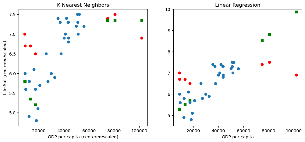
The blue points are the training data and the red points are the test data. The green points are the predicted locations of the red points (using the GDP, the x-value, to predict the Life Satisfaction, the y-value). Comparing the red points with the blue training data points, we see the test points are distinct outliers.
In the linear regression graph, as expected, the green points lie on a line chosen based on the blue points, the training data. Because the data does not lie on a line, the linear model ends up having two flaws. It underestimates the life satisfaction of poor folks in the test set, and overestimates that of rich folks.
The predicted K Nearest Neighbor points do not lie on a line. This is because the K Nearest Neighbor regressor is not a linear model. It is a more powerful, more flexible model and does a better job predicting here, in the sense that there is less spread between the red and green points. This is also seen in the improved training R2 score; more accuracy has been achieved in fitting the training data. Despite the fact that the training data lacks high GDP countries, the K Nearest Neighbor model seems to capture the fact that life satisfaction levels off with GDPs above 60K.
The KNN regressor is a very simple idea. Training is trivial: store the
training set in the model. At test time when predicting the regression
value for find the the  nearest training points to
and average their target values, possibly weighting their
contribution by their distance from . To make the idea clearer,
let’s suppose we are using two independent variables to predict with
instead of the one variable we used above. We’ll use the life
satisfaction data, but treat both life satisfaction and GDP as the
independent variables; they will be used to predict some other variable,
let’s say life expectancy. The idea of KNN is to divide the plane up
into cells defined by the training data, as shown in the plot below,
which is called a Voronoi diagram:
nearest training points to
and average their target values, possibly weighting their
contribution by their distance from . To make the idea clearer,
let’s suppose we are using two independent variables to predict with
instead of the one variable we used above. We’ll use the life
satisfaction data, but treat both life satisfaction and GDP as the
independent variables; they will be used to predict some other variable,
let’s say life expectancy. The idea of KNN is to divide the plane up
into cells defined by the training data, as shown in the plot below,
which is called a Voronoi diagram:
import matplotlib.pyplot as plt
from scipy.spatial import Voronoi, voronoi_plot_2d

points = np.concatenate([X_train,y_train],axis=1)
# Need to scale both X_train and y_train to make the diagram look at all comprehensible
scaler4 = preprocessing.StandardScaler()
points_s = scaler4.fit_transform(points)
vor = Voronoi(points_s)
fig = voronoi_plot_2d(vor)
plt.show()
Pick any polygon with orange vertices and call it X; call the single
blue training point in X P. Any test point falling within polygon X has
training point P as its nearest neighbor. Its other nearest neighbors
will be the training points in the adjoining polygons. For example,
suppose that , the number of nearest neighbors to be used, is
3; and suppose that the test point fell on the orange vertex at about
(-1.7,-.8). That point has 3 equally distant nearest neighbors. The
predicted target value is the average of the target values of those 3
training points.
So the model can predict values that lie at the intersections of complicated arrangements of line segments. At the same time, it’s very constrained by the Voronoi structure. What it’s doing is quite far from the kind of memorizing of the training set we saw with the polynomial model.
It is still a bad model, but it is the best we have seen so far:
knn_mse = mean_squared_error (Yp, y_test)
knn_r2 = r2_score (y_test,Yp)
knn_mse, knn_r2
(0.8557142857142864, -6.155290102389083)
Reviewing our linear model results:
lin3_mse = mean_squared_error (Yp3, y_test)
lin3_r2 = r2_score (y_test,Yp3)
lin3_mse, lin3_r2
(2.6818932487474605, -21.425387233553845)
Both the models had respectable scores on the training data,
but the performance of the K Nearest Neighbor model degrades less on the
test data. Thus the K Nearest Neighbor model, though non-linear, seems
to be show less overfitting than the linear model.
8.2.11. Adding more variables to the pipeline
We can of course play the same game with KNN that we played the linear regressor earlier in this notebook. We can add variables.
Warning: Running the KNN regressor with multiple variable seems to be a bit unpredictable. I have had some kernel crashes I can’t really explain, and my best guess is that they are due to memory issues, but this is far from clear. For best results, in doing the following experiments, restart your kernel, re-execute the first cell after the heading Reloading the data used earlier in this NB (which defines the code used below to lead data, but does not load the data). This should give you a clean Python image to play with.
We choose some lifesat predictors and retrain and re-evaluate:
oecd_bli = load_lifesat_data(lifesat_url)
full_country_stats = prepare_country_stats(oecd_bli)

predictors = ['Household net financial wealth',
              'Job security', 'Rooms per person',
              'Life expectancy','Homicide rate',
              'Long-term unemployment rate']

# Try even more variables at your own risk!
#num_ignored=6
#predictors = full_country_stats.columns[:-num_ignored])
predicted ='Life satisfaction'

try:
   predictors.remove(predicted)
except ValueError as e:
    print(f"{predicted} has already been removed from the predictors list")

# Linear Model with our new predictors
remove_indices = [0, 1, 6, 8, 33, 34, 35]
keep_indices = list(set(range(36)) - set(remove_indices))


#Train on this!
sample_data3 = full_country_stats[predictors].iloc[keep_indices]
#Test on this!
missing_data3 = full_country_stats[predictors].iloc[remove_indices]

# Scikit learn will accept a Pandas DataFrame for training data!
Xsample3 = sample_data3[predictors]
Xtest_sample3 = missing_data3[predictors]

ytrain = full_country_stats['Life satisfaction'].iloc[keep_indices]
ytest = full_country_stats['Life satisfaction'].iloc[remove_indices]
3292
888
Life satisfaction has already been removed from the predictors list
##  Create the KNN model pipeline
# Select and train a k-neighbors regression model, supplying values for important parameters
knn_LS_model = neighbors.KNeighborsRegressor(n_neighbors=3)
scaler_LS = preprocessing.StandardScaler()
knn_LS_pipeline = pipeline.Pipeline([('scal', scaler_LS), ('knn', knn_LS_model)])
# Train the model (always the .fit() method in sklearn)
knn_LS_pipeline.fit(Xsample3, ytrain)
Pipeline(steps=[('scal', StandardScaler()),
                ('knn', KNeighborsRegressor(n_neighbors=3))])
In a Jupyter environment, please rerun this cell to show the HTML representation or trust the notebook. On GitHub, the HTML representation is unable to render, please try loading this page with nbviewer.org.
Pipeline(steps=[('scal', StandardScaler()),
('knn', KNeighborsRegressor(n_neighbors=3))])StandardScaler()
KNeighborsRegressor(n_neighbors=3)
And a modest improvement ensues in both MSE and , although we
have still not reached the baseline.
Yp_LS = knn_LS_pipeline.predict(Xtest_sample3)
knn_LS_mse = mean_squared_error (Yp_LS, ytest)
knn_LS_r2 = r2_score (ytest,Yp_LS)
#(0.2976190476190477, -1.488623435722412)
knn_LS_mse, knn_LS_r2
(0.2976190476190477, -1.488623435722412)
Note that if all we care about in evaluating is the score,
we can also do:
knn_LS_pipeline.score(Xtest_sample3,ytest)
-1.488623435722412