9.5. Visualizing Geographical Data
9.5.1. Loading the data
import pandas as pd
HOUSING_PATH = "data"
def load_housing_data(housing_path=HOUSING_PATH):
    csv_path = os.path.join(housing_path, "housing.csv")
    return pd.read_csv(csv_path)
9.5.2. Eyeballing the data
Let’s look at some statewide housing data for California.
Each row represents one district in California. The districts range in size from 1 household to over 6,000. They vary in location, income level, and of course, median house value.
housing = load_housing_data()
housing.head()
| longitude | latitude | housing_median_age | total_rooms | total_bedrooms | population | households | median_income | median_house_value | ocean_proximity | |
|---|---|---|---|---|---|---|---|---|---|---|
| 0 | -122.23 | 37.88 | 41.0 | 880.0 | 129.0 | 322.0 | 126.0 | 8.3252 | 452600.0 | NEAR BAY |
| 1 | -122.22 | 37.86 | 21.0 | 7099.0 | 1106.0 | 2401.0 | 1138.0 | 8.3014 | 358500.0 | NEAR BAY |
| 2 | -122.24 | 37.85 | 52.0 | 1467.0 | 190.0 | 496.0 | 177.0 | 7.2574 | 352100.0 | NEAR BAY |
| 3 | -122.25 | 37.85 | 52.0 | 1274.0 | 235.0 | 558.0 | 219.0 | 5.6431 | 341300.0 | NEAR BAY |
| 4 | -122.25 | 37.85 | 52.0 | 1627.0 | 280.0 | 565.0 | 259.0 | 3.8462 | 342200.0 | NEAR BAY |
housing.info()
<class 'pandas.core.frame.DataFrame'>
RangeIndex: 20640 entries, 0 to 20639
Data columns (total 10 columns):
longitude             20640 non-null float64
latitude              20640 non-null float64
housing_median_age    20640 non-null float64
total_rooms           20640 non-null float64
total_bedrooms        20433 non-null float64
population            20640 non-null float64
households            20640 non-null float64
median_income         20640 non-null float64
median_house_value    20640 non-null float64
ocean_proximity       20640 non-null object
dtypes: float64(9), object(1)
memory usage: 1.6+ MB
housing["ocean_proximity"].value_counts()
<1H OCEAN     9136
INLAND        6551
NEAR OCEAN    2658
NEAR BAY      2290
ISLAND           5
Name: ocean_proximity, dtype: int64
print(housing.describe())
          longitude      latitude  housing_median_age   total_rooms  count  20640.000000  20640.000000        20640.000000  20640.000000
mean    -119.569704     35.631861           28.639486   2635.763081
std        2.003532      2.135952           12.585558   2181.615252
min     -124.350000     32.540000            1.000000      2.000000
25%     -121.800000     33.930000           18.000000   1447.750000
50%     -118.490000     34.260000           29.000000   2127.000000
75%     -118.010000     37.710000           37.000000   3148.000000
max     -114.310000     41.950000           52.000000  39320.000000

       total_bedrooms    population    households  median_income  count    20433.000000  20640.000000  20640.000000   20640.000000
mean       537.870553   1425.476744    499.539680       3.870671
std        421.385070   1132.462122    382.329753       1.899822
min          1.000000      3.000000      1.000000       0.499900
25%        296.000000    787.000000    280.000000       2.563400
50%        435.000000   1166.000000    409.000000       3.534800
75%        647.000000   1725.000000    605.000000       4.743250
max       6445.000000  35682.000000   6082.000000      15.000100

       median_house_value
count        20640.000000
mean        206855.816909
std         115395.615874
min          14999.000000
25%         119600.000000
50%         179700.000000
75%         264725.000000
max         500001.000000
%matplotlib inline
import matplotlib.pyplot as plt
housing.hist(bins=50, figsize=(11,8))
save_fig("histograms")
plt.show()
Saving figure histograms
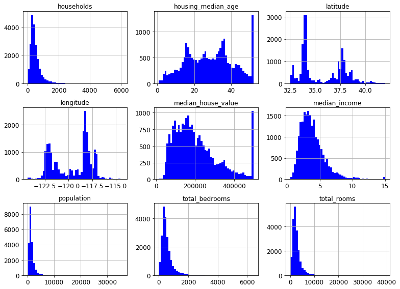
The median income data has been scaled to some strange units. More than that, it turns out that it is capped at both ends. The highest value is 15 and the lowest is .5. This may create some issues, but let’s try and work with it.
9.5.3. Transforming data: Binning
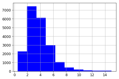
Despite the capping, the median income of the CA districts in our data has a typical Pareto’s Law distribution.
housing["median_income"].hist()
<matplotlib.axes._subplots.AxesSubplot at 0x1165a4bd0>
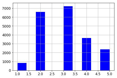
Let’s create a column that separates income into 5 categories. We’re not actually going to use these categories in visualizing our data, but we are going use them in sampling it.
First we scale down the existing income numbers by dividing each by 1.5,
for example 7.5/1.5 = 5.0. Then we do some capping of our own. We’ll
save all values less than 5 as is and anything greater than 5 is 5. This
is done using the where method.
housing["income_cat"] = np.ceil(housing["median_income"] / 1.5)
housing["income_cat"].where(housing["income_cat"] < 5, 5.0, inplace=True)
housing["income_cat"].value_counts()
3.0    7236
2.0    6581
4.0    3639
5.0    2362
1.0     822
Name: income_cat, dtype: int64
So the histogram for our new column looks as follows.
housing["income_cat"].hist()
<matplotlib.axes._subplots.AxesSubplot at 0x117741650>
Stratified sampling is a statistical sampling technique which attempts to guarantee that a sample represents the true proportions of given attributes. This is especially useful when the sample size is small enough so that the chances of a non-representative sample are fairly high. We’ev taken the first step, which is to divide the population into sample groups. Now we sample from each group in proportion to its size.
Here’s a toy example of how the data structures work.
from sklearn.model_selection import StratifiedShuffleSplit
X = np.array([[1, 2], [3, 4], [1, 2], [3, 4]])
y = np.array([0, 0, 1, 1])
sss = StratifiedShuffleSplit(n_splits=3, test_size=0.5, random_state=0)
print(sss.get_n_splits(X, y))
print(sss)
3
StratifiedShuffleSplit(n_splits=3, random_state=0, test_size=0.5,
            train_size=None)
for train_index, test_index in sss.split(X, y):
      print("TRAIN:", train_index, "TEST:", test_index)
      X_train, X_test = X[train_index], X[test_index]
      y_train, y_test = y[train_index], y[test_index]
TRAIN: [1 2] TEST: [3 0]
TRAIN: [0 2] TEST: [1 3]
TRAIN: [0 2] TEST: [3 1]
The second argument to the split method represents a column of
values for an attribute whose proportions we want to preserve in
samples.
When creating sss we passed in n_splits=3, so we got three
different samples; for each, the proportion of 0 and 1’s in y
reflects what it is in the data set as a whole (50/50).
Now let’s try this on our data, but we’ll just do one split, asking for the proportions of the various income levels as represented in our new column to be accurately preserved.
from sklearn.model_selection import StratifiedShuffleSplit

split = StratifiedShuffleSplit(n_splits=1, test_size=0.2, random_state=42)
for train_index, test_index in split.split(housing, housing["income_cat"]):
    strat_train_set = housing.loc[train_index]
    strat_test_set = housing.loc[test_index]
ss = split.split(housing, housing["income_cat"])
Let’s compare stratified sampling to ordinary random sampling to see the benefits of stratified sampling.
from sklearn.model_selection import train_test_split

def income_cat_proportions(data):
    return data["income_cat"].value_counts() / len(data)

train_set, test_set = train_test_split(housing, test_size=0.2, random_state=4)

compare_props = pd.DataFrame({
    "Overall": income_cat_proportions(housing),
    "Stratified": income_cat_proportions(strat_test_set),
    "Random": income_cat_proportions(test_set),
}).sort_index()
compare_props["Rand. %error"] = 100 * compare_props["Random"] / compare_props["Overall"] - 100
compare_props["Strat. %error"] = 100 * compare_props["Stratified"] / compare_props["Overall"] - 100
compare_props
| Overall | Random | Stratified | Rand. %error | Strat. %error | |
|---|---|---|---|---|---|
| 1.0 | 0.039826 | 0.039729 | 0.039729 | -0.243309 | -0.243309 |
| 2.0 | 0.318847 | 0.320010 | 0.318798 | 0.364686 | -0.015195 |
| 3.0 | 0.350581 | 0.352955 | 0.350533 | 0.677170 | -0.013820 |
| 4.0 | 0.176308 | 0.170300 | 0.176357 | -3.407530 | 0.027480 |
| 5.0 | 0.114438 | 0.117006 | 0.114583 | 2.243861 | 0.127011 |
Now that we’ve used the income_cat values to help us sample our
data, let’s drop them, since they’re clearly redundant.
for set in (strat_train_set, strat_test_set):
    set.drop("income_cat", axis=1, inplace=True)
9.5.4. Putting the data on a map
housing = strat_train_set.copy()
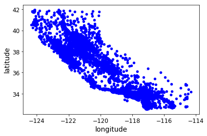
Now comes the interesting idea. Our data contains lat/long coordinates for each housing district. Each coordinate represent the geographic center of the district. As a start, let’s do a simple scatter plot of all the districts in our data. Note the familiar shape that emerges.
housing.plot(kind="scatter", x="longitude", y="latitude")
save_fig("bad_visualization_plot")
Saving figure bad_visualization_plot
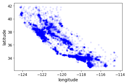
housing.plot(kind="scatter", x="longitude", y="latitude", alpha=0.1)
save_fig("better_visualization_plot")
Saving figure better_visualization_plot
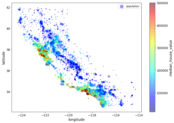
In the following plot command, the c parameter is telling us
which column value to use to determine the color given by the colormap.
The s parameter is determining the size of the point being
plotted. Thus the value of the median_house_value for a point will
determine its color, and the value in the population column (divided
by 100) will determine its size.
# c is the attribute we'll map onto colors, s is the attribute we'll represent with circle size.
housing.plot(kind="scatter", x="longitude", y="latitude",
    s=housing['population']/100, label="population",
    c="median_house_value", cmap=plt.get_cmap("jet"),
    colorbar=True, alpha=0.4, figsize=(10,7),
)
plt.legend()
save_fig("housing_prices_scatterplot")
plt.show()
Saving figure housing_prices_scatterplot
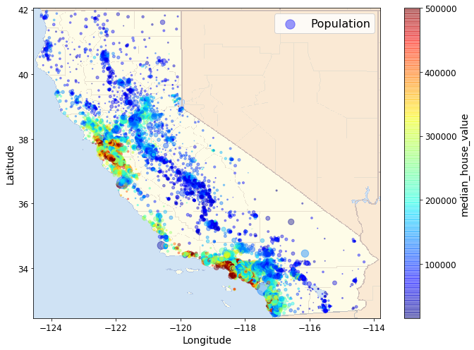
Next we include a map-image showing the boundaries of Californa. The
map-image is a polygon with 4 corners (a rectangle). The coordinates in
our scatter plots are Lat/Longs. To scale and position our map-image to
be consistent with out scatterplot, we need the Lat long coordinates for
two of the the 4 corners, the lower left and the upper right.
Those are given in extent parameter in the order
LongitudeLowerLeft, LongitudeUpperRight, LatitudeLowerLeft,
LatitudeUpperRight. Normally we would use a geographic tool kit like
basemap (included as part of matplotlib) that provides
geographic map polygons with boundaries of various kinds drawn, as well
as the associated Lat Long info. We’ll illustrate that in the next
example. For now we illustrate the basic idea with a evry simple map,
which still adds a considerable amount of value to our visualization.
# This is a excellent discussion of the ideas involved in a plot with a colorbar
# https://stackoverflow.com/questions/19816820/how-to-retrieve-colorbar-instance-from-figure-in-matplotlib
# What's called a "scalar mappable" in that discussion might also be called a scalar-valued function,
# a function that assigns a scalar value to each x,y point being plotted. Our scalar mappable in
# this example is NOT the image of CA, but the housing prices assigned tp each point in the scatter plot.
import matplotlib.image as mpimg
california_img=mpimg.imread(os.path.join(PROJECT_ROOT_DIR,'prepared_images','california.png'))
# c is the attribute we'll map onto colors, s is the attribute we'll represent with circle size.
ax = housing.plot(kind="scatter", x="longitude", y="latitude", figsize=(10,7),
                       s=housing['population']/100, label="Population",
                       c="median_house_value", cmap=plt.get_cmap("jet"),
                       colorbar=True, alpha=0.4,
                      )
plt.imshow(california_img, extent=[-124.55, -113.80, 32.45, 42.05], alpha=0.5)
plt.ylabel("Latitude", fontsize=14)
plt.xlabel("Longitude", fontsize=14)

prices = housing["median_house_value"]
tick_values = np.linspace(prices.min(), prices.max(), 11)
# Creating the plot later (doing the plot with colorbar=False) creates some sort of scaling issues.
# Only not sure why.
#cbar = plt.colorbar(ax=ax)
#cbar.ax.set_yticks([int(round(v/1000)) for v in tick_values])
#cbar.ax.set_yticklabels(["${0:d}k".format(int(round(v/1000))) for v in tick_values])
#cbar.set_label('Median House Value', fontsize=16)
plt.legend(fontsize=16)
save_fig("california_housing_prices_plot")
plt.show()
Saving figure california_housing_prices_plot
9.5.5. A Kernel Density Estimation example
We are going to draw a map that uses a probability estimate of a geographically linked variable. When a probability estimate is appropriate, and reasonably accurate, it is a very powerful tool; the problem is to know when a probability estimate is appropriate.
Let’s think about some basics. In the previous example we looked at data about housing prices, an eminently geographic property that is a number. What is the price of House A? Or in our particular case, the median price of houses in District A? In this example we’re going to look at species distributions, an eminently geographic property that could also be expressed as a number. What is the population of species A in district 1? The question is: How meaningful is that number? Since natural events can raise and lower the population, since species members move around from day to to day, often in large numbers, any data we collect is likely to be outdated very quickly. More interestingly, species population numbers are likely to change from place to place in predictable ways: There is a general tendency for the species population of district 1 to be similar to that of nearby districts. What we have is a variable that behaves like a continuous function over locations. These features suggest that it is profitable to think of species distribution as a probability distribution conditioned by location. Notice how the housing price example differs. Housing prices are much more stable from day to day. They are also much less continuous. The housing prices of one district are not a very good predictor of the housing prices of a neighboring district. Both housing prices and species population numbers can change dramatically over short distances – | natural barriers can have dramatic effects in both cases – but dramatic changes over short distances are much more the norm for housing prices. All this suggests that what we want for predicting housing prices is the actual prices of actual houses, and if not that, the closer to that that we can get, the better. With species, data about actual sightings of actual species members is still the ground truth, but what we can reliably conclude from a sighting is best expressed as an increase in our chances of seeing species members, a probability distribution.
And that is the kind of thing we know how to draw a picture for. We are going to draw what’s called a contour plot. A contour plot tells us the value of a continuous function on a 2D grid. In the simplest case, what we draw is lines telling us the places where the value of the function is the same. Those lines will generally be connected because the function is continuous. We can color code the lines to tell us the direction in which the function value increases, and if we draw lots of lines and use a continuous color map we get a full picture of the peaks and valleys of the function.
First we get some raw data about species distribution. In particular we’re going to look at distributions for ‘Bradypus Variegatus’ (the brown-throated sloth)
and ‘Microryzomys Minutus’ (the forest small rice rat)
This data consists of raw numbers for species population at particular
lat/long coordinates. Then we fit a certain kind of probability
distribution called a Gaussian to it. That defines a continuous
function over lat/long coordinates. The value returned for any
coordinate by that function – which is called a probability function –
is the probability of seeing a member of species at that latitude and
longitude. Then we draw a contour plot of the function. We will use
a “reds” colormap: this is a sequential colormap in which increasing
darkness and saturation of the color increases a higher numerical value.
Basically, the redder the shade, the higher the probability. You can
learn more about matplotlib colormaps and find other maps to try
here.
For those interested in more technical details, here are some facts about the computation:
What we are actually going to use is a probability density function which assigns probabilities to spatial regions, not to points.
The “fitting” of a probability function to set of points is called a kernel density estimation. Broadly speaking, the probability values are smoothed to assign values to all the points on the map, not just the ones we know about, using the principle that points that are close together have similar probabilities. We use the ‘haversine’ metric appropriate for lat/long coordinates (and spherical coordinates) to define “closeness”. It basically gives us the distance between points given their lat-long coordinates. We use the Ball Tree algorithm for kernel density estimation because it is the most appropriate for geographic applications.
# Author: Jake Vanderplas <jakevdp@cs.washington.edu>
#
# License: BSD 3 clause

import numpy as np
import matplotlib.pyplot as plt
from sklearn.datasets import fetch_species_distributions
from sklearn.datasets.species_distributions import construct_grids
from sklearn.neighbors import KernelDensity

# if basemap is available, we'll use it.
# otherwise, we'll improvise later...
try:
    from mpl_toolkits.basemap import Basemap
    basemap = True
except ImportError:
    basemap = False
The cell above does the basic imports. Note that an import is
attempted for a module named Basemap, but a flag is set in case
that import fails. More on this below.
# Get matrices/arrays of species IDs and locations
data = fetch_species_distributions()
species_names = ['Bradypus Variegatus', 'Microryzomys Minutus']

# The only attributes we care about in `training` are lat and long.
Xtrain = np.vstack([data['train']['dd lat'],
                    data['train']['dd long']]).T
# Microryzomys Minutus gets coded as 1,
# Bradypus Variegatus as 0
ytrain = np.array([d.decode('ascii').startswith('micro')
                  for d in data['train']['species']], dtype='int')
Xtrain *= np.pi / 180.  # Convert lat/long to radians

# Set up the data grid for the contour plot
xgrid, ygrid = construct_grids(data)
# To help kernel density estimation take a reasonable length of time we
# consistently use every 5th data point
X, Y = np.meshgrid(xgrid[::5], ygrid[::5][::-1])
# We'll make use of the fact that coverages[6] has measurements at all
# land points.  This will help us decide between land and water.
land_reference = data.coverages[6][::5, ::5]
# -9999 means water.  Make a Boolean grid identifying land.
land_mask = (land_reference > -9999).ravel()

xy = np.vstack([Y.ravel(), X.ravel()]).T
xy = xy[land_mask]
xy *= np.pi / 180.
The sklearn species distrubution docs are
here.
This is data appropriate for conservation studies, including data about
species distrubutions and 14 environmental variables. In this section
we’ll just explore the relationship between the distribution facts and
locations, and throw away the rest.
data.coverages[6].shape
(1592, 1212)
The cell above gets the data and does some preprocessing. Let’s look at the result first.
print xy.shape
xy [:5]
(28008, 2)
array([[ 0.41015237, -1.35699349],
       [ 0.41015237, -1.35263017],
       [ 0.41015237, -1.33081355],
       [ 0.41015237, -1.32645023],
       [ 0.41015237, -1.32208691]])
xy is a 28,008 x 2 array. The numbers are lat long coordinates
converted to radians (basically, degrees are converted to radians).
print ytrain[:5]
ois = [(i,cls) for (i,cls) in enumerate(ytrain) if cls == 1]
zis = [(i,cls) for (i,cls) in enumerate(ytrain) if cls == 0]
print len(ytrain)
print ois[:5], len(ois)
print zis[:5], len(zis)
[1 1 1 1 1]
1624
[(0, 1), (1, 1), (2, 1), (3, 1), (4, 1)] 698
[(88, 0), (89, 0), (90, 0), (91, 0), (92, 0)] 926
ytrain tells us our species (0 is ‘Bradypus Variegatus’, 1 is
‘Microryzomys Minutus’. There are 1,624 species location tuples in the
data, 698 ‘Microryzomys Minutus’ and 926 ‘Bradypus Variegatus’,.
# Plot map of South America with distributions of each species
fig = plt.figure()
fig.subplots_adjust(left=0.05, right=0.95, wspace=0.05)

for i in range(2):
    plt.subplot(1, 2, i + 1)

    # construct a kernel density estimate of the distribution
    print(" - computing KDE in spherical coordinates")
    kde = KernelDensity(bandwidth=0.04, metric='haversine',
                        kernel='gaussian', algorithm='ball_tree')
    kde.fit(Xtrain[ytrain == i])

    # evaluate only on the land: -9999 indicates ocean
    Z = -9999 + np.zeros(land_mask.shape[0])
    Z[land_mask] = np.exp(kde.score_samples(xy))
    Z = Z.reshape(X.shape)

    # plot contours of the density
    levels = np.linspace(0, Z.max(), 25)
    plt.contourf(X, Y, Z, levels=levels, cmap=plt.cm.Reds)
    plt.title(species_names[i])
plt.show()
- computing KDE in spherical coordinates
- computing KDE in spherical coordinates
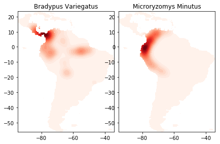
The cell above trains the KDE model on the species distribution data and
draws the contour plots. You can see the lightly drawn outline of South
America in both species plots. It’s there because land_mask
restricts our data to points on land, and since we have species data
from all over South America, our points capture the shape of the entire
land mass. Next we’ll redraw the picture adding basemap to draw an
outline map of South America, coordinated with our data, including major
rivers and country borders, to help locate the contour masses. This
picture will help us tell a story our data. For example, we’ll see that
Bradypus Variegatus has populations along the eastern Amazon, where
Microryzomus Minutus does not. However the habitation area of
Microryzomus Minutus extends much further south, along the entire
Peruvian coast. To learn more about basemap, look
here and also
here.
for i in range(2):
    plt.subplot(1, 2, i + 1)

    # construct a kernel density estimate of the distribution
    print(" - computing KDE in spherical coordinates")
    kde = KernelDensity(bandwidth=0.04, metric='haversine',
                        kernel='gaussian', algorithm='ball_tree')
    kde.fit(Xtrain[ytrain == i])

    # evaluate only on the land: -9999 indicates ocean
    Z = -9999 + np.zeros(land_mask.shape[0])
    Z[land_mask] = np.exp(kde.score_samples(xy))
    Z = Z.reshape(X.shape)

    # plot contours of the density
    levels = np.linspace(0, Z.max(), 25)
    plt.contourf(X, Y, Z, levels=levels, cmap=plt.cm.Greens)
    plt.title(species_names[i])
    if basemap:
        print(" - plot coastlines using basemap")
        m = Basemap(projection='cyl', llcrnrlat=Y.min(),
                    urcrnrlat=Y.max(), llcrnrlon=X.min(),
                    urcrnrlon=X.max(), resolution='c')
        m.drawcoastlines()
        m.drawcountries()
    else:
        print(" - plot coastlines from coverage")
        plt.contour(X, Y, land_reference,
                    levels=[-9999], colors="k",
                    linestyles="solid")
        plt.xticks([])
        plt.yticks([])

    plt.title(species_names[i])

plt.show()
- computing KDE in spherical coordinates
- plot coastlines using basemap
- computing KDE in spherical coordinates
- plot coastlines using basemap
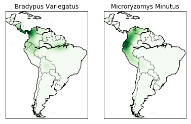
The codeblock under if basemap draws the coastlines and country
borders using basemap. The else block is executed if basemap
is not available and just draws boundaries based on the locations in the
data, which basically just draws black lines along the lightly shaded
boundaries of our first picture. You can see what that looks like even
if you do have basemap by changing the if basemap line to
if not basemap. It’s not bad, but it’s not nearly as easy to
understand how the colors relate to actual locations.
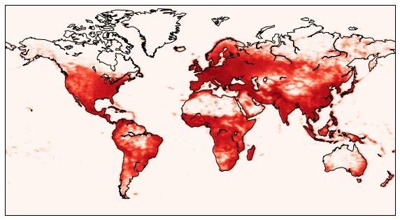
9.5.6. Human population (more kernel density estimation)
In this example, we will do something very similar to the last example, but for humans.
import pandas as pd
filename = '../chapter3/data/worldcitiespop.txt'
data = pd.read_csv(filename)
Let’s plot the raw coordinates, with one pixel per position.
plot(data.Longitude, data.Latitude, ',')
[<matplotlib.lines.Line2D at 0x212cef90>]
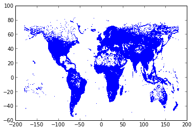
We easily recognize the world map!
locations = data[['Longitude','Latitude']].as_matrix()
Now, we load a world map with matplotlib.basemap.
from mpl_toolkits.basemap import Basemap
m = Basemap(projection='mill', llcrnrlat=-65, urcrnrlat=85, llcrnrlon=-180, urcrnrlon=180)
The name m is now set to a Python function that returns Cartesian
coordinates when given Lat/Longs. We get the Cartesian coordinates of
the map’s corners.
x0, y0 = m(-180, -65)
x1, y1 = m(180, 85)
Let’s create a histogram of the human density. First, we retrieve the population of every city.
population = data.Population
We project the geographical coordinates into cartesian coordinates.
x, y = m(locations[:,0], locations[:,1])
We handle cities which do not have a population value.
weights = population.copy()
weights[isnan(weights)] = 1000
We create the 2D histogram with NumPy.
h, _, _ = histogram2d(x, y, bins=(linspace(x0, x1, 500), linspace(y0, y1, 500)), weights=weights)
h[h==0] = 1
We filter this histogram with a Gaussian kernel.
import scipy.ndimage.filters
z = scipy.ndimage.filters.gaussian_filter(log(h.T), 1)
We draw the coast lines in the world map, as well as the filtered human density.
figure(figsize=(10,6))
m.drawcoastlines()
m.imshow(z, origin='lower', extent=[x0,x1,y0,y1], cmap=get_cmap('Reds'))
<matplotlib.image.AxesImage at 0x6e417d0>