6.6. Pivot Tables
6.6.1. Introducing the pivot table
Suppose, as an aid to interpreting the numbers in the 'births'
column, we we are interest in the average popularity of a female name.
Then we want to find the mean births for all female names.
We might proceed as follows. Pick a year, say 1881.
names1881 = names[names['year'] == 1881]
namesfemale1881 = names1881[names1881['sex'] == 'F']
namesfemale1881['births'].mean()
98.03304904051173
We might characterize this code as follows:
Split step: Line 1 splits off a group of rows,
namesfemale1881using one of the possible values insexcolumn. We’ll call that column the indexing column.Apply step: Line 2 applies an aggregation function (
.mean()) to the'births'column of those rows; callbirthsthe values column.
In this example we performed the split step on one of the possible values in the indexing column, then performed apply step on one group of rows. As we saw with cross-tabulation. we frequently want to perform these two steps for all possible values in the indexing column.
And of course that leads to the need for combining: we want to
combine the results in a new Data Structure, indexed by the values
that defined our groups In our example, the indexing column is 'sex'
with possible values 'F' and 'M’, so we’d like a new DataFrame
with a single column containing the 'births' means for those groups.
Summarizing: we need to split the DataFrame into groups of rows
(using an index column), apply (applying an aggregation function to
a values column), and combine (into a DataFrame). These are exactly
the steps we executed for cross-tabulation. The difference in this case
is that instead of just counting the groups of rows, we want to apply
the aggregation function to the values column 'births' . It turns
out this variation on the three steps comes up often enough to merit a
name.
All three steps can be performed using pivot table method.
pt = names1881.pivot_table(values= 'births',index='sex',aggfunc='mean')
pt
| births | |
|---|---|
| sex | |
| F | 98.033049 |
| M | 101.051153 |
In fact, mean is the default aggregation function, and the first and
second arguments of the .pivot_table() method are always the values
column and the index column, so we get the same result by writing:
pt = names1881.pivot_table('births','sex')
pt
| births | |
|---|---|
| sex | |
| F | 98.033049 |
| M | 101.051153 |
It is worth emphasizing the importance of the combine step; the
.pivot_table() method combines its results into a DataFrame.
That means we can leverage all our knowledge of how DataFrames work in
using it, for example, by plotting the results. One of the key takeaways
about pandas is that almost all the functions and methods that apply
to DataFrames and Series return either a DataFrame or a Series. By
understanding the properties of what’s returned, we can use it more
effectively in the next analytical step.
As desired, the values in the 'sex' column now index the new
DataFrame:
pt.index
Index(['F', 'M'], dtype='object', name='sex')
Note the original name of the indexing column has been preserved, as the
above output shows. It is stored in the name attribute of the
DataFrame index:
pt.index.name
'sex'
As with any DataFrame, .loc[ ] is used to access individual rows
using names from the index.
# Any expression containing this is a KeyError
# pt['sex']
# because 'sex' is not the name of a column in `pt`.
pt.loc['F']
births    98.033049
Name: F, dtype: float64
We have just found the mean female and male births for 1881.
Suppose we want total births instead of mean births. It can still be
done with a pivot table, and we still need to group by sex, and apply an
aggregation functiomn to the values column, but we need to change our
aggregation function from mean to sum.
names1881.pivot_table('births','sex',aggfunc='sum')
| births | |
|---|---|
| sex | |
| F | 91955 |
| M | 100748 |
So now we know the total number of male and female births in 1881 (at least those accounted for our data sample).
Continuing along these lines, let’s move back to the names
DataFrame: Suppose we want to find birth totals by gender and by year.
That is, we want a new DataFrame in which the index value for a row is a
year and the two columns show the total births for 'F' and 'M'
in that year.
So want the following pivot table:
total_births = names.pivot_table('births','year', columns='sex', aggfunc='sum')
total_births.head()
| sex | F | M |
|---|---|---|
| year | ||
| 1880 | 90993 | 110493 |
| 1881 | 91955 | 100748 |
| 1882 | 107851 | 113687 |
| 1883 | 112322 | 104632 |
| 1884 | 129021 | 114445 |
Of course we could just as easily have the index values be genders and the columns be years.
total_births2 = names.pivot_table('births','sex', columns='year', aggfunc='sum')
#only showing the first 10 of 131 columns
total_births2.iloc[:,:10]
| year | 1880 | 1881 | 1882 | 1883 | 1884 | 1885 | 1886 | 1887 | 1888 | 1889 |
|---|---|---|---|---|---|---|---|---|---|---|
| sex | ||||||||||
| F | 90993 | 91955 | 107851 | 112322 | 129021 | 133056 | 144538 | 145983 | 178631 | 178369 |
| M | 110493 | 100748 | 113687 | 104632 | 114445 | 107802 | 110785 | 101412 | 120857 | 110590 |
The difference between these two pivot table computations lies entirely in the combine step.
Under the hood both DataFrames require computing the same row groups and
applying 'sum' to the births column in each group.
In fact, total_births2 is the transpose of total_births.
import numpy as np
np.all(total_births2.T == total_births)
True
Thus in total_births, we find the 2006 birth totals with .loc[]:
total_births.loc[2006]
sex
F    1896468
M    2050234
Name: 2006, dtype: int64
In total_births2, we access the same 2006 birth totals the way we
access any column.
total_births2[2006]
sex
F    1896468
M    2050234
Name: 2006, dtype: int64
Since total_births and total_births2 contain essentially the
same information, let’s summarize what we learned about the
.pivot_table() method with total_births.
How was total_births created? By three steps
Splitting the rows of
nameinto groups (one for each year, gender pair).Applying the aggregation function
sumto each groupCombining the results into a single DataFrame
total_births.
This is the now familiar the split/apply/combine strategy.
6.6.1.1. Cross tab versus pivot_table
Compare total_births2 with the output of pd.crosstab, which we
use to get the joint distribution counts for two attributes; although
the rows and columns are the same, the numbers are different.
total_births2.iloc[:,:5]
| year | 1880 | 1881 | 1882 | 1883 | 1884 |
|---|---|---|---|---|---|
| sex | |||||
| F | 90993 | 91955 | 107851 | 112322 | 129021 |
| M | 110493 | 100748 | 113687 | 104632 | 114445 |
crosstab_sex_year = pd.crosstab(names['sex'],names['year'])
crosstab_sex_year.iloc[:,:10]
| year | 1880 | 1881 | 1882 | 1883 | 1884 | 1885 | 1886 | 1887 | 1888 | 1889 |
|---|---|---|---|---|---|---|---|---|---|---|
| sex | ||||||||||
| F | 942 | 938 | 1028 | 1054 | 1172 | 1197 | 1282 | 1306 | 1474 | 1479 |
| M | 1058 | 997 | 1099 | 1030 | 1125 | 1097 | 1110 | 1067 | 1177 | 1111 |
crosstab_sex_year[1880]['F']
942
What does
crosstab_sex_year[1880]['F']
mean?
It represents how many times the names DataFrame pairs 1880 in the
'year' column with ‘F’ in the 'sex' column, and in names,
that amounts to computing how many distinct female names there were in
1880.
In this example pd.crosstab combined two columns of the names
DataFrame to compute the crosstab DataFrame crosstab_sex_year. In
general, pd.crosstab takes any two sequences of equal length and
computes how many times unique pairings occur.
[1,0,1,0,0,1,1]
[b,b,b,a,b,a,a]
For example, in the two arrays seen here, a 1 from the first
sequence is paired with a b from the second twice. The results are
summarized in the cross-tabulation DataFrame.
pd.crosstab(np.array([1,0,1,0,0,1,1]),np.array(['b','b','b','a','b','a','a']))
| col_0 | a | b |
|---|---|---|
| row_0 | ||
| 0 | 1 | 2 |
| 1 | 2 | 2 |
If the two sequences are columns from a DataFrame, then the counts tell
us how many rows contain each possible pairing of values. So each pair
of values defines a group of rows (the rows with 'year' 1881 and
'sex' ‘F’, for example, in names). Note there’s no values column
providing numbers to perform an aggregation operation on. All we do is
compute the row groups and count their sizes.
Now there is one curve ball, mentioned here because you may come across
code that uses it: pd.crosstab has an optional values argument.
In lieu of just counting the rows in a group, we can apply an
aggregation operation to the values column of the row groups.
For example we can use crosstab to recreate total_births2, the
DataFrame we created above with pivot_table. Here is the DataFrame
we created with pivot_table.
total_births2.iloc[:,:10]
| year | 1880 | 1881 | 1882 | 1883 | 1884 | 1885 | 1886 | 1887 | 1888 | 1889 |
|---|---|---|---|---|---|---|---|---|---|---|
| sex | ||||||||||
| F | 90993 | 91955 | 107851 | 112322 | 129021 | 133056 | 144538 | 145983 | 178631 | 178369 |
| M | 110493 | 100748 | 113687 | 104632 | 114445 | 107802 | 110785 | 101412 | 120857 | 110590 |
And here is the same DataFrame using crosstab.
# Specify sum as the aggregation function
# and births as the numerical value column for sum to apply to
ct_table = pd.crosstab(names['sex'],names['year'], values= names['births'],aggfunc='sum')
ct_table.iloc[:,:10]
| year | 1880 | 1881 | 1882 | 1883 | 1884 | 1885 | 1886 | 1887 | 1888 | 1889 |
|---|---|---|---|---|---|---|---|---|---|---|
| sex | ||||||||||
| F | 90993 | 91955 | 107851 | 112322 | 129021 | 133056 | 144538 | 145983 | 178631 | 178369 |
| M | 110493 | 100748 | 113687 | 104632 | 114445 | 107802 | 110785 | 101412 | 120857 | 110590 |
So it is possible to use crosstab to create a pivot_table type
DataFrame; however, the general convention is that it is clearer to use
pivot_table, the more specific tool, to create what most people know
as a pivot table.
6.6.1.1.1. Plotting
All data frames have a plot method; for a simple DataFrame like a
pivot table the the plot method draws a very simple picture.
Consider plotting total_births, the pivot table created in a
previous section. Here’s the DataFrame. Note the index and the two
columns:
total_births
| sex | F | M |
|---|---|---|
| year | ||
| 1880 | 90993 | 110493 |
| 1881 | 91955 | 100748 |
| 1882 | 107851 | 113687 |
| 1883 | 112322 | 104632 |
| 1884 | 129021 | 114445 |
| ... | ... | ... |
| 2006 | 1896468 | 2050234 |
| 2007 | 1916888 | 2069242 |
| 2008 | 1883645 | 2032310 |
| 2009 | 1827643 | 1973359 |
| 2010 | 1759010 | 1898382 |
131 rows × 2 columns
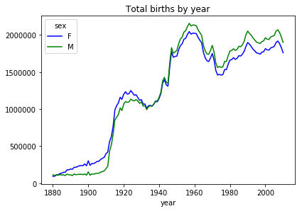
And here is the default plot, which puts the index on the x-axis and plots the two columns as separate line plots.
from matplotlib import pyplot as plt
ax = total_births.plot(title='Total births by year')
#plt.show()
6.6.1.1.2. Alternative plotting script
The above graph is great and often what we want is just to take a quick
look at the relationships in the data, and the default DataFrame plot
will do exactly the right thing with no customization. It’s helpful to
know that pandas is using a Python package called matplotlib to
draw the graph above, and we can do the same ourselves, with a lot more
lines of code, but also with a lot more customization.
import matplotlib.pyplot as plt
fig = plt.figure(1,figsize=(8,8))
ax1 = fig.add_subplot(111)
fig.subplots_adjust(top=0.9,left=0.2)
ax1.set_ylabel('births')

ax1.set_xlabel('year')
(p1,) = ax1.plot(total_births.index,total_births['F'],color='salmon',label='F')
(p2, ) = ax1.plot(total_births.index,total_births['M'],color='blue',label='M')
ax1.set_title('Total births by sex and year')

ax1.legend((p2,p1),('M','F'),loc='upper left',title='sex')
plt.show()
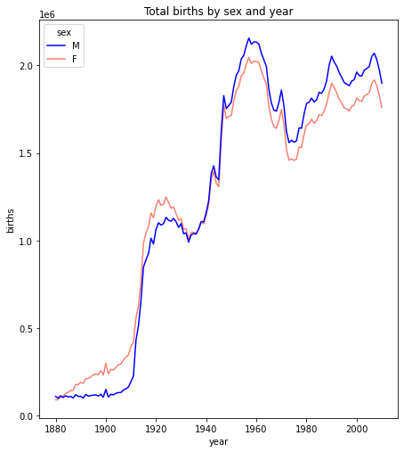
The basic requirement for the matplotlib.plot(...) function is that
you need to supply two sequences of the same length giving the x- and y-
coordinates respectively of the plot. We can optionally specify plot
attributes like line style, color, and label (for use in the legend) for
each line plotted.
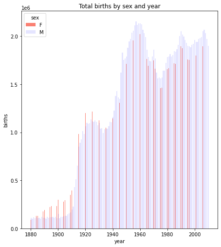
There are also other plot functions which could provide alternative views of the relationships.
For example, we could do this as a bar plot. The focus below is on lines 9 and 10 which draw the bar plots for the two genders.
import matplotlib.pyplot as plt
fig = plt.figure(1,figsize=(8,8))
ax1 = fig.add_subplot(111)
fig.subplots_adjust(top=0.9,left=0.2)
ax1.set_ylabel('births')

ax1.set_xlabel('year')
width=.1
ax1.bar(total_births.index,total_births['F'],color='salmon',label='F',width=width)
ax1.bar(total_births.index+width,total_births['M'],color='blue',label='M',alpha=.1)
ax1.set_title('Total births by sex and year')

ax1.legend(loc='upper left',title='sex')
plt.show()
6.6.1.2. Cross tab vs pivot table revisited
When do we do use a pivot table, when cross-tabulation?
The answer is that we use cross-tabulation whenever counting is involved, even normalized counting (percentages).
Recall the problem we solved with cross-tabulation in Part One of the Pandas Intro, getting the joint distribution of complaint types and agencies:
import os.path
#How to break up long strings into multiline segments
#Note the use of "line continued" character \
data_url = 'https://raw.githubusercontent.com/gawron/python-for-social-science/master/'\
'pandas/datasets/311-service-requests.csv'
# Some columns are of mixed types.  This is OK.  But we have to set
# low_memory=False
complaints = pd.read_csv(data_url,low_memory=False)
three = ['DOT', "DOP", 'NYPD']
pt00 = complaints[complaints.Agency.isin(three)]
# only show the first 15 of many rows
pd.crosstab(pt00['Complaint Type'], pt00['Agency']).iloc[:15]
| Agency | DOP | DOT | NYPD |
|---|---|---|---|
| Complaint Type | |||
| Agency Issues | 0 | 20 | 0 |
| Animal Abuse | 0 | 0 | 164 |
| Bike Rack Condition | 0 | 7 | 0 |
| Bike/Roller/Skate Chronic | 0 | 0 | 32 |
| Blocked Driveway | 0 | 0 | 4590 |
| Bridge Condition | 0 | 20 | 0 |
| Broken Muni Meter | 0 | 2070 | 0 |
| Bus Stop Shelter Placement | 0 | 14 | 0 |
| Compliment | 0 | 1 | 0 |
| Curb Condition | 0 | 66 | 0 |
| DOT Literature Request | 0 | 123 | 0 |
| Derelict Vehicle | 0 | 0 | 803 |
| Disorderly Youth | 0 | 0 | 26 |
| Drinking | 0 | 0 | 83 |
| Ferry Complaint | 0 | 4 | 0 |
In thinking about how we used pd.crosstab to solve this problem,
it’s worth considering whether we could do this with a pivot table.
Pivot_table construction begins the same way cross-tabulation does: it splits the rows into groups such that each group contains all the rows for one agency/compliant type say, ‘NYPD’/‘Anmal Abuse’; it then applies the aggregation function to each group.
There is an aggregation function'count' which does we want. It
simply computes the number of rows in each group.
There is one wrinkle, and this is the awkward part: the pivot table
function needs an argument for the values column (in other
aggregation operations this argument gives the numerical values to which
the aggregation operation applies). When the aggregation operation is
'count' any valid column will serve.
So we pick one at random, say "Status". The result is almost exactly
what we computed with crosstab, though with slightly more obscure
code:
three = ['DOT', "DOP", 'NYPD']
pt00 = complaints[complaints.Agency.isin(three)]
pt0 = pt00.pivot_table(values='Status', index='Complaint Type' ,
                       columns = 'Agency', aggfunc='count')
pt0.iloc[:15]
| Agency | DOP | DOT | NYPD |
|---|---|---|---|
| Complaint Type | |||
| Agency Issues | NaN | 20.0 | NaN |
| Animal Abuse | NaN | NaN | 164.0 |
| Bike Rack Condition | NaN | 7.0 | NaN |
| Bike/Roller/Skate Chronic | NaN | NaN | 32.0 |
| Blocked Driveway | NaN | NaN | 4590.0 |
| Bridge Condition | NaN | 20.0 | NaN |
| Broken Muni Meter | NaN | 2070.0 | NaN |
| Bus Stop Shelter Placement | NaN | 14.0 | NaN |
| Compliment | NaN | 1.0 | NaN |
| Curb Condition | NaN | 66.0 | NaN |
| DOT Literature Request | NaN | 123.0 | NaN |
| Derelict Vehicle | NaN | NaN | 803.0 |
| Disorderly Youth | NaN | NaN | 26.0 |
| Drinking | NaN | NaN | 83.0 |
| Ferry Complaint | NaN | 4.0 | NaN |
The difference is the appearance of NaN in all those places where
there were no rows in the group to count.
All in all, it is an improvement in clarity and informativeness to use crosstab for this task. As we shall see below, there are cases where cross tabulation can be extended, using other aggregation operations, to build DataFrames that are more easily understood as pivot_tables. The rule of thumb is to use cross tabulation where the operation applied to groups is counting.
Summarizing: this is the kind of problem to use cross-tabulation for. It involves counting.
Even though it is possible to we call the .pivot_table() method on
complaints, using 'count' as the aggregation operation, this is
not best practice when counting is involved.
6.6.1.2.1. Using pivot instead of groupby
As we discussed in part one, splitting (or grouping) is the first of the three operations in the split/apply/combine strategy.
We used the nba dataset to illustrate, because it has some very natural groupings.
We reload the NBA dataset.
import pandas as pd
nba_file_url = 'https://gawron.sdsu.edu/python_for_ss/course_core/data/nba.csv'
nba_df = pd.read_csv(nba_file_url)
Some of the questions we answered there could have been done with a pivot table:
For example, let’s use a pivot table to answer the question about average weight of centers.
nba_pt_wt = nba_df.pivot_table('Weight','Position')
print(nba_pt_wt)
print()
print(f"And the answer is: {nba_pt_wt.loc['C','Weight']:.1f}")
              Weight
Position
C         254.205128
PF        240.430000
PG        189.478261
SF        221.776471
SG        206.686275

And the answer is: 254.2
The numbers here are means because mean is the default aggregation function. Similarly, consider the question:
What position earns the highest salary on average?
The pivot table answer, going all the way to the highest valued position:
# Get pivot table; sort values for the Salary column, get first element of index
nba_df.pivot_table('Salary','Position')['Salary'].sort_values(ascending=False).index[0]
'C'
The point is that pivot_table, like pd.crosstab, executes the
split-apply-combine strategy in one step and so it will often be more
convenient to call pivot_table rather than groupby.
The .groupby() method is the first step in creating a pivot table;
hence, we can always emulate the effect of .pivot_table() by
grouping and then apply an aggregation function.
However, if we’re after only one aggregation operation for a particular
grouping, there really isn’t an advantage to using groupby. We may
as well use pivot_table.
6.6.1.3. New Stocks dataset: More pivot table examples using Time
Adding columns to enable new kinds of grouping.
“Melting” different value columns into 1 value column (in order to set up a pivot).
Centering and scaling data.
import pandas as pd
import os.path
import urllib.request
import os.path
from matplotlib import pyplot as plt

url_dir = 'https://gawron.sdsu.edu/python_for_ss/course_core/data'
time1 = pd.read_csv(os.path.join(url_dir,'stocks.csv'))
time1
| Unnamed: 0 | date | AA | GE | IBM | MSFT | |
|---|---|---|---|---|---|---|
| 0 | 0 | 1990-02-01 00:00:00 | 4.98 | 2.87 | 16.79 | 0.51 |
| 1 | 1 | 1990-02-02 00:00:00 | 5.04 | 2.87 | 16.89 | 0.51 |
| 2 | 2 | 1990-02-05 00:00:00 | 5.07 | 2.87 | 17.32 | 0.51 |
| 3 | 3 | 1990-02-06 00:00:00 | 5.01 | 2.88 | 17.56 | 0.51 |
| 4 | 4 | 1990-02-07 00:00:00 | 5.04 | 2.91 | 17.93 | 0.51 |
| ... | ... | ... | ... | ... | ... | ... |
| 5467 | 5467 | 2011-10-10 00:00:00 | 10.09 | 16.14 | 186.62 | 26.94 |
| 5468 | 5468 | 2011-10-11 00:00:00 | 10.30 | 16.14 | 185.00 | 27.00 |
| 5469 | 5469 | 2011-10-12 00:00:00 | 10.05 | 16.40 | 186.12 | 26.96 |
| 5470 | 5470 | 2011-10-13 00:00:00 | 10.10 | 16.22 | 186.82 | 27.18 |
| 5471 | 5471 | 2011-10-14 00:00:00 | 10.26 | 16.60 | 190.53 | 27.27 |
5472 rows × 6 columns
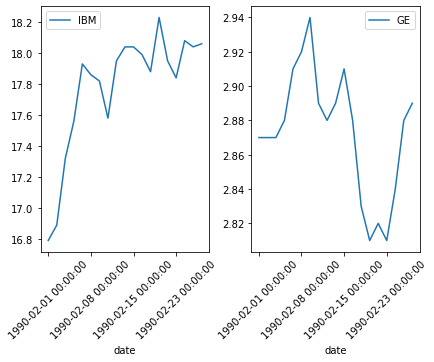
To get the idea of this data set try this:
Plotting challenge: Plot IBM and GE stock prices for February. Try to place the two plots side by side.
Note: even though the values in the 'date' column are strings,
they’ve very well chosen strings for our purposes. Normal string sorting
will reproduce chronological order.
There are no NaN values in the data.
len(time1), len(time1.dropna())
(5472, 5472)
time_feb = time1[(time1['date'] >='1990-02-01 00:00:00') & (time1['date'] < '1990-03-01 00:00:00') ]
# Subplot array is 1x2 1 row with 2 cols.
(fig, (ax1,ax2))  = plt.subplots(1,2)
# More room between subplots
fig.tight_layout()
# Rotate the xaxis labels 45 degrees to get them to display nicer.
time_feb.plot('date',"IBM",rot=45,ax=ax1)
time_feb.plot('date',"GE",rot=45,ax=ax2)
<AxesSubplot:xlabel='date'>
Task: Create a pivot table which shows the mean prices by month for ‘IBM’.
We’d like to look at things month by month. We need to make grouping by
month easy. While we’re at it, let’s also enable year by year
aggregation. The structure of the entries in the 'date' column makes
both things easy.
time1['year'] = time1['date'].apply(lambda x: int(x[:4]))
time1['month'] = time1['date'].apply(lambda x: x[:7])
Note that adding columns is not the only way to facilitate different
kinds of grouping. You can also use groupby, which takes an
arbitrary function to assign labels, or you can simply pass groupby
a sequence of labels you’ve created. These options are described in the
pandas documentation; see the pandas_doc_notes notebook for
examples.
Here is time1 with the new columns.
time1
| Unnamed: 0 | date | AA | GE | IBM | MSFT | year | month | |
|---|---|---|---|---|---|---|---|---|
| 0 | 0 | 1990-02-01 00:00:00 | 4.98 | 2.87 | 16.79 | 0.51 | 1990 | 1990-02 |
| 1 | 1 | 1990-02-02 00:00:00 | 5.04 | 2.87 | 16.89 | 0.51 | 1990 | 1990-02 |
| 2 | 2 | 1990-02-05 00:00:00 | 5.07 | 2.87 | 17.32 | 0.51 | 1990 | 1990-02 |
| 3 | 3 | 1990-02-06 00:00:00 | 5.01 | 2.88 | 17.56 | 0.51 | 1990 | 1990-02 |
| 4 | 4 | 1990-02-07 00:00:00 | 5.04 | 2.91 | 17.93 | 0.51 | 1990 | 1990-02 |
| ... | ... | ... | ... | ... | ... | ... | ... | ... |
| 5467 | 5467 | 2011-10-10 00:00:00 | 10.09 | 16.14 | 186.62 | 26.94 | 2011 | 2011-10 |
| 5468 | 5468 | 2011-10-11 00:00:00 | 10.30 | 16.14 | 185.00 | 27.00 | 2011 | 2011-10 |
| 5469 | 5469 | 2011-10-12 00:00:00 | 10.05 | 16.40 | 186.12 | 26.96 | 2011 | 2011-10 |
| 5470 | 5470 | 2011-10-13 00:00:00 | 10.10 | 16.22 | 186.82 | 27.18 | 2011 | 2011-10 |
| 5471 | 5471 | 2011-10-14 00:00:00 | 10.26 | 16.60 | 190.53 | 27.27 | 2011 | 2011-10 |
5472 rows × 8 columns
Now it’s easy to create a pivot table which shows the month-by-month mean prices for IBM. Note that IBM is tha value column and month the indexing column.
time1.pivot_table('IBM','month')
| IBM | |
|---|---|
| month | |
| 1990-02 | 17.781579 |
| 1990-03 | 18.466818 |
| 1990-04 | 18.767500 |
| 1990-05 | 20.121818 |
| 1990-06 | 20.933810 |
| ... | ... |
| 2011-06 | 164.875455 |
| 2011-07 | 178.204500 |
| 2011-08 | 169.194348 |
| 2011-09 | 170.245714 |
| 2011-10 | 182.405000 |
261 rows × 1 columns
Task: Create a DataFrame which has a single row for each month showing the mean prices for ‘IBM’, “GE’ and ‘MSFT’ for that month in separate columns.
It would be nice to have one DataFrame which gave the month by month
means for all three stocks in time1; this is essentially a
pivot_table task. The issue is that each pivot_table command can only
apply .mean() to one values column; and we have three.
We could do three pivots and concatenate columnwise. An alternative
pandas offers is “melting”; conceptually, melt is the inverse of
groupby. We unfold 30 day rows for April into 90 rows, 30 for each
stock, by replacing the original three stock value columns with one
values column and adding a variable column to keep track of what
stock had each value:
time1_melt = pd.melt(time1, id_vars=['month'], value_vars=['AA', 'GE','IBM'])
time1_melt[time1_melt['month'] == '1990-04']
| month | variable | value | |
|---|---|---|---|
| 41 | 1990-04 | AA | 5.18 |
| 42 | 1990-04 | AA | 5.17 |
| 43 | 1990-04 | AA | 5.13 |
| 44 | 1990-04 | AA | 5.15 |
| 45 | 1990-04 | AA | 5.04 |
| 46 | 1990-04 | AA | 5.06 |
| 47 | 1990-04 | AA | 5.11 |
| 48 | 1990-04 | AA | 5.20 |
| 49 | 1990-04 | AA | 5.25 |
| 50 | 1990-04 | AA | 5.27 |
| 51 | 1990-04 | AA | 5.26 |
| 52 | 1990-04 | AA | 5.21 |
| 53 | 1990-04 | AA | 5.15 |
| 54 | 1990-04 | AA | 5.10 |
| 55 | 1990-04 | AA | 5.04 |
| 56 | 1990-04 | AA | 5.07 |
| 57 | 1990-04 | AA | 5.10 |
| 58 | 1990-04 | AA | 5.12 |
| 59 | 1990-04 | AA | 5.14 |
| 60 | 1990-04 | AA | 5.07 |
| 5513 | 1990-04 | GE | 2.99 |
| 5514 | 1990-04 | GE | 3.04 |
| 5515 | 1990-04 | GE | 3.01 |
| 5516 | 1990-04 | GE | 3.01 |
| 5517 | 1990-04 | GE | 3.01 |
| 5518 | 1990-04 | GE | 3.02 |
| 5519 | 1990-04 | GE | 3.01 |
| 5520 | 1990-04 | GE | 3.03 |
| 5521 | 1990-04 | GE | 3.09 |
| 5522 | 1990-04 | GE | 3.12 |
| 5523 | 1990-04 | GE | 3.13 |
| 5524 | 1990-04 | GE | 3.11 |
| 5525 | 1990-04 | GE | 3.08 |
| 5526 | 1990-04 | GE | 3.06 |
| 5527 | 1990-04 | GE | 3.02 |
| 5528 | 1990-04 | GE | 3.01 |
| 5529 | 1990-04 | GE | 3.01 |
| 5530 | 1990-04 | GE | 3.02 |
| 5531 | 1990-04 | GE | 2.99 |
| 5532 | 1990-04 | GE | 2.99 |
| 10985 | 1990-04 | IBM | 18.41 |
| 10986 | 1990-04 | IBM | 18.54 |
| 10987 | 1990-04 | IBM | 18.52 |
| 10988 | 1990-04 | IBM | 18.45 |
| 10989 | 1990-04 | IBM | 18.41 |
| 10990 | 1990-04 | IBM | 18.34 |
| 10991 | 1990-04 | IBM | 18.41 |
| 10992 | 1990-04 | IBM | 18.49 |
| 10993 | 1990-04 | IBM | 18.62 |
| 10994 | 1990-04 | IBM | 19.28 |
| 10995 | 1990-04 | IBM | 19.32 |
| 10996 | 1990-04 | IBM | 19.10 |
| 10997 | 1990-04 | IBM | 18.97 |
| 10998 | 1990-04 | IBM | 19.01 |
| 10999 | 1990-04 | IBM | 19.01 |
| 11000 | 1990-04 | IBM | 18.93 |
| 11001 | 1990-04 | IBM | 19.01 |
| 11002 | 1990-04 | IBM | 18.91 |
| 11003 | 1990-04 | IBM | 18.67 |
| 11004 | 1990-04 | IBM | 18.95 |
Now we can pivot into the DataFrame we want:
time1_month_pivot = time1_melt.pivot_table('value','month','variable')
time1_month_pivot
| variable | AA | GE | IBM |
|---|---|---|---|
| month | |||
| 1990-02 | 5.043684 | 2.873158 | 17.781579 |
| 1990-03 | 5.362273 | 2.963636 | 18.466818 |
| 1990-04 | 5.141000 | 3.037500 | 18.767500 |
| 1990-05 | 5.278182 | 3.160000 | 20.121818 |
| 1990-06 | 5.399048 | 3.275714 | 20.933810 |
| ... | ... | ... | ... |
| 2011-06 | 15.390000 | 18.295000 | 164.875455 |
| 2011-07 | 15.648000 | 18.500500 | 178.204500 |
| 2011-08 | 12.353478 | 15.878261 | 169.194348 |
| 2011-09 | 11.209524 | 15.557143 | 170.245714 |
| 2011-10 | 9.778000 | 15.735000 | 182.405000 |
261 rows × 3 columns
What stock gave the best return over the time period in the data?
To answer this question we essentially want to perform a delta
calculation: subtract the value on the first day from the value on the
last day. The issue is what measure of value should we use when stock
share prices differ significantly in scale (compare IBM and MSFT in Feb
1990 in time1). We need some way of scaling the price differences so
as to make them comparable.
We will present one way of doing this without a great deal of discussion because this question is essentially a pretext for showing you how to center and scale data.
Strategy: Center and scale each stock column to show stock price in standard deviation units. (Plot the three resulting stock price lines, for fun). Delta calculation: For each stock, compute the difference between the first and last days in the data in standard deviation units.
The stock that is the furthest above its starting point at the end of the period is the winner. Note that the “center” of the centering is arbitrary for this calculation. We choose to make it the mean because that is a standard choice. But in the end we’re just computing the difference in values beween the last day and the first day, and the choice of center will have no effect on that difference.
(x_last - c) - (x_first - c) = x_last - x_first
What does matter is the choice of the units we use to represent stock
values. We choose standard deviation units because that is a
reasonable way to standardize the prices of stocks.
The next cell actually centers and scales each column.
# If you used time1 you would need to tinker with both the plot command
# and the delta calculation below, because the DataFrame index is not a sequence of time points.
# df = time1[['AA','GE','IBM']]
df = time1_month_pivot
mn,std = df.mean(),df.std()
# centering (the numerator)  & scaling (the denominator)
new_df=(df-mn)/std
How did that work? Well, pandas sensibly decides that in a
normally structured DataFrame, it doesn’t make sense to take the mean or
standard deviation of a row (each column is a different kind of thing),
so mean and standard deviation calculations are automatically applied to
columns.
mn
variable
AA     17.445346
GE     17.947286
IBM    66.919186
dtype: float64
When we subtract this from df the numbers are automatically aligned
with columns, and
df - mn
automatically turns into elementwise subtraction of the mean from each column.
Note that for the cell above to work we should (minimally) have a
DataFrame with all numerical columns and no NaN issues (or at least NaN
issues that have been thought through in advance). Our pivot table meets
these criteria: It is all numerical with no NaNs. Because there are no
NaNs in the original DataFrame time1, we could have just as easily
have used the three value columns in time1 for centering and
scaling, but we would end up with a DataFrame with no temporal index and
no time related columns.
Here is the result of centering the pivot table:
new_df
| variable | AA | GE | IBM |
|---|---|---|---|
| month | |||
| 1990-02 | -1.288710 | -1.418216 | -1.172091 |
| 1990-03 | -1.255604 | -1.409703 | -1.155745 |
| 1990-04 | -1.278598 | -1.402754 | -1.148573 |
| 1990-05 | -1.264343 | -1.391229 | -1.116268 |
| 1990-06 | -1.251783 | -1.380342 | -1.096900 |
| ... | ... | ... | ... |
| 2011-06 | -0.213580 | 0.032714 | 2.336573 |
| 2011-07 | -0.186770 | 0.052048 | 2.654514 |
| 2011-08 | -0.529118 | -0.194660 | 2.439593 |
| 2011-09 | -0.647991 | -0.224871 | 2.464671 |
| 2011-10 | -0.796747 | -0.208138 | 2.754710 |
261 rows × 3 columns
The brief code snippet above is in this case equivalent to the for-loop in the cell below, which might be useful code if you try to do this on a subset of the columns in a DataFrame.
df = time1_month_pivot
new_dict = {}
for col in df.columns:
    col_series = df[col]
    mn, std = col_series.mean(),col_series.std()
    # centering (the numerator)  & scaling (the denominator)
    new_dict[col] = (col_series - mn)/std
new_df = pd.DataFrame(new_dict)
new_df
| AA | GE | IBM | |
|---|---|---|---|
| month | |||
| 1990-02 | -1.288710 | -1.418216 | -1.172091 |
| 1990-03 | -1.255604 | -1.409703 | -1.155745 |
| 1990-04 | -1.278598 | -1.402754 | -1.148573 |
| 1990-05 | -1.264343 | -1.391229 | -1.116268 |
| 1990-06 | -1.251783 | -1.380342 | -1.096900 |
| ... | ... | ... | ... |
| 2011-06 | -0.213580 | 0.032714 | 2.336573 |
| 2011-07 | -0.186770 | 0.052048 | 2.654514 |
| 2011-08 | -0.529118 | -0.194660 | 2.439593 |
| 2011-09 | -0.647991 | -0.224871 | 2.464671 |
| 2011-10 | -0.796747 | -0.208138 | 2.754710 |
261 rows × 3 columns
new_df.plot()
<AxesSubplot:xlabel='month'>
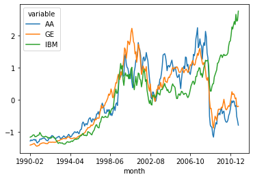
Delta calculation: The winner, as the picture suggests, is IBM.
# (Values on last day) - (Values on first day)
(new_df.iloc[-1] - new_df.iloc[0])
variable
AA     0.491963
GE     1.210078
IBM    3.926800
dtype: float64
Of course it always matters what time period you choose: Same steps as above over different time period.
Different answer for what the best stock is.
time2 = time1[time1['year']< 2008]
time2_melt = pd.melt(time2, id_vars=['month'], value_vars=['AA', 'GE','IBM'])
time2_month_pivot = time2_melt.pivot_table('value','month','variable')
df = time2_month_pivot
mn,std = df.mean(),df.std()
# centering (the numerator)  & scaling (the denominator)
new_df=(df-mn)/std
Revised plot.
new_df.plot()
<AxesSubplot:xlabel='month'>
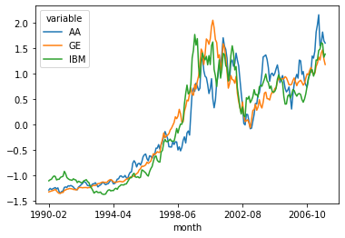
Revised delta calculation:
(new_df.iloc[-1] - new_df.iloc[0])
variable
AA     2.892419
GE     2.507379
IBM    2.496016
dtype: float64
6.7. Merging
In this section we introduce pandas merging function, which merges
the data in two different DataFrames into one DataFrame.
We will look at an example that illustrates the simplest case, the case
where the indexes of the two DatFrames agree. The operation is very much
like the following operation in numpy:
import numpy as np
## Prepare a1
a1 = np.ones((3,4))
a1[1] =np.zeros(4,)
print(a1)
## Prepare a2
a2 = np.zeros((3,5))
a2[1] = np.ones((5,))
print(a2)
# Merge
np.concatenate([a1,a2],axis=1)
[[1. 1. 1. 1.]
 [0. 0. 0. 0.]
 [1. 1. 1. 1.]]
[[0. 0. 0. 0. 0.]
 [1. 1. 1. 1. 1.]
 [0. 0. 0. 0. 0.]]
array([[1., 1., 1., 1., 0., 0., 0., 0., 0.],
       [0., 0., 0., 0., 1., 1., 1., 1., 1.],
       [1., 1., 1., 1., 0., 0., 0., 0., 0.]])
We concatenate the rows of the first array with the row sof the second, ending up with a new array with 9 columns.
The pandas merge operation will be very similar, except that in pandas merging, the order of the rows won’t matter. The indexes of the two DataFrames are used to align the rows.
We begin by loading the first of our two DataFrames, which contains LifeSatisfaction data on many countries.
import pandas as pd
import importlib.util
import os.path
#from google.colab import drive

notebook_lifesat_url0 = 'https://gawron.sdsu.edu/python_for_ss/course_core/book_draft/_static/'
oecd_file = 'oecd_bli_2015.csv'
oecd_url= f'{notebook_lifesat_url0}{oecd_file}'
# Clean up some number formatting issues '1,000' => 1000
# Unicode characters that can only be interpreted with an encoding
oecd_bli = pd.read_csv(oecd_url, thousands=',',encoding='utf-8')
# Focus on a subset of of the daty
oecd_bli = oecd_bli[oecd_bli["INEQUALITY"]=="TOT"]
This table contains economic and social statistics for people in a
number of countries. The INEQUALITY attribute contains statistics
for subpopulations like low/high income, men/women. Since we won’t be
looking at those sub-populations in this section, the first step after
reading in the data is to reduce the table to those rows containing
statistics about the total population.
The data in this big table is stored in an interesting and very popular
format. Let’s understand that before moving on. First there are facts
about 36 distinct countries. One of the names in the Country column
(OECD - Total) is a label under which totals for all the countries
will be aggregated.
countries = oecd_bli['Country'].unique()
print(f'{len(countries)} countries in data')
print (countries)
37 countries in data
['Australia' 'Austria' 'Belgium' 'Canada' 'Czech Republic' 'Denmark'
 'Finland' 'France' 'Germany' 'Greece' 'Hungary' 'Iceland' 'Ireland'
 'Italy' 'Japan' 'Korea' 'Luxembourg' 'Mexico' 'Netherlands' 'New Zealand'
 'Norway' 'Poland' 'Portugal' 'Slovak Republic' 'Spain' 'Sweden'
 'Switzerland' 'Turkey' 'United Kingdom' 'United States' 'Brazil' 'Chile'
 'Estonia' 'Israel' 'Russia' 'Slovenia' 'OECD - Total']
The cell below shows what happens when we zoom in on one country,
Poland. The table contains a number of rows with information about
Poland, each with a different value in the Indicator column. That is
the name of some statistic about Poland. The numerical value for that
statistic is in the Value column and the unit for that statistic and
the unit is in the UNIT CODE (or Unit) column. So the first row
printed out tells us that 3.2% of all households in Poland are dwellings
without basic facilities, an indicator of substantial poverty.
pol = oecd_bli[oecd_bli["Country"]=="Poland"]
pol.iloc[:,:12]
| LOCATION | Country | INDICATOR | Indicator | MEASURE | Measure | INEQUALITY | Inequality | Unit Code | Unit | PowerCode Code | PowerCode | |
|---|---|---|---|---|---|---|---|---|---|---|---|---|
| 21 | POL | Poland | HO_BASE | Dwellings without basic facilities | L | Value | TOT | Total | PC | Percentage | 0 | units |
| 130 | POL | Poland | HO_HISH | Housing expenditure | L | Value | TOT | Total | PC | Percentage | 0 | units |
| 239 | POL | Poland | HO_NUMR | Rooms per person | L | Value | TOT | Total | RATIO | Ratio | 0 | units |
| 348 | POL | Poland | IW_HADI | Household net adjusted disposable income | L | Value | TOT | Total | USD | US Dollar | 0 | units |
| 531 | POL | Poland | IW_HNFW | Household net financial wealth | L | Value | TOT | Total | USD | US Dollar | 0 | units |
| 640 | POL | Poland | JE_EMPL | Employment rate | L | Value | TOT | Total | PC | Percentage | 0 | units |
| 825 | POL | Poland | JE_JT | Job security | L | Value | TOT | Total | PC | Percentage | 0 | units |
| 936 | POL | Poland | JE_LTUR | Long-term unemployment rate | L | Value | TOT | Total | PC | Percentage | 0 | units |
| 1121 | POL | Poland | JE_PEARN | Personal earnings | L | Value | TOT | Total | USD | US Dollar | 0 | units |
| 1306 | POL | Poland | SC_SNTWS | Quality of support network | L | Value | TOT | Total | PC | Percentage | 0 | units |
| 1473 | POL | Poland | ES_EDUA | Educational attainment | L | Value | TOT | Total | PC | Percentage | 0 | units |
| 1584 | POL | Poland | ES_STCS | Student skills | L | Value | TOT | Total | AVSCORE | Average score | 0 | units |
| 1769 | POL | Poland | ES_EDUEX | Years in education | L | Value | TOT | Total | YR | Years | 0 | units |
| 1880 | POL | Poland | EQ_AIRP | Air pollution | L | Value | TOT | Total | MICRO_M3 | Micrograms per cubic metre | 0 | units |
| 1989 | POL | Poland | EQ_WATER | Water quality | L | Value | TOT | Total | PC | Percentage | 0 | units |
| 2100 | POL | Poland | CG_TRASG | Consultation on rule-making | L | Value | TOT | Total | AVSCORE | Average score | 0 | units |
| 2209 | POL | Poland | CG_VOTO | Voter turnout | L | Value | TOT | Total | PC | Percentage | 0 | units |
| 2394 | POL | Poland | HS_LEB | Life expectancy | L | Value | TOT | Total | YR | Years | 0 | units |
| 2505 | POL | Poland | HS_SFRH | Self-reported health | L | Value | TOT | Total | PC | Percentage | 0 | units |
| 2690 | POL | Poland | SW_LIFS | Life satisfaction | L | Value | TOT | Total | AVSCORE | Average score | 0 | units |
| 2869 | POL | Poland | PS_SFRV | Assault rate | L | Value | TOT | Total | PC | Percentage | 0 | units |
| 2980 | POL | Poland | PS_REPH | Homicide rate | L | Value | TOT | Total | RATIO | Ratio | 0 | units |
| 3091 | POL | Poland | WL_EWLH | Employees working very long hours | L | Value | TOT | Total | PC | Percentage | 0 | units |
| 3202 | POL | Poland | WL_TNOW | Time devoted to leisure and personal care | L | Value | TOT | Total | HOUR | Hours | 0 | units |
We can use the pivot method to recast the data into a much easier to
grasp format. The key point is that each country and INDICATOR
determines a specific value. So let’s have one row for each country with
one column for each INDICATOR, and in that column we’ll place the
VALUE associated with that country and that indicator. It’s as easy
as this:
oecd_bli_pt = oecd_bli.pivot_table(index="Country", columns="Indicator", values="Value")
# Looking at one row
oecd_bli_pt.loc['Poland']
Indicator
Air pollution                                   33.00
Assault rate                                     1.40
Consultation on rule-making                     10.80
Dwellings without basic facilities               3.20
Educational attainment                          90.00
Employees working very long hours                7.41
Employment rate                                 60.00
Homicide rate                                    0.90
Household net adjusted disposable income     17852.00
Household net financial wealth               10919.00
Housing expenditure                             21.00
Job security                                     7.30
Life expectancy                                 76.90
Life satisfaction                                5.80
Long-term unemployment rate                      3.77
Personal earnings                            22655.00
Quality of support network                      91.00
Rooms per person                                 1.10
Self-reported health                            58.00
Student skills                                 521.00
Time devoted to leisure and personal care       14.20
Voter turnout                                   55.00
Water quality                                   79.00
Years in education                              18.40
Name: Poland, dtype: float64
Looking back to compare one value in the original DF, with the derived data in the pivot:
poland = oecd_bli[oecd_bli['Country']=='Poland']
poland[poland['Indicator']  == 'Job security']['Value']
825    7.3
Name: Value, dtype: float64
oecd_bli_pt.loc['Poland'].loc['Job security']
7.3
What is weird about what we just did with pivot_table?
The example above is not an outlier. For every country/indicator pair,
the value in the 'Value' column in the original DataFrame is exactly
the same as the value in the corresponding row and column of the pivot
table. It appears as if no aggregation operation has taken place!
Actually appearances are deceiving. What has happened is that in this particular data set all the row groups we get by pairing country and indicator are of size 1; the default aggregation operation is mean and when we take the mean of a single number we get that number back.
In future exercises with this data, we’re going to take particular
interest in the Life satisfaction score, a kind of general “quality
of life” or “happiness” score computed from a formula combining the
indicators in this data.
That is, it is a value computed from the other values in the same row. In a regression context, we would think of this as the dependent variable, the variable whose value we try to compute as some function of the others.
oecd_bli_pt["Life satisfaction"].head()
Country
Australia    7.3
Austria      6.9
Belgium      6.9
Brazil       7.0
Canada       7.3
Name: Life satisfaction, dtype: float64
Elsewhere, on the world wide web, with help from Google, we find data about GDP (“gross domestic product”) here.
This is the second of the two DataFrames we will merge.
This is a very simple data frame with columns containing various useful
country-specific pieces of information. Since there is one row per
country, we have made the 'Country’ column the index.
# Downloaded data from http://goo.gl/j1MSKe (=> imf.org) to github
gdp_file = "gdp_per_capita.csv"
gdp_url = f'{notebook_lifesat_url0}{gdp_file}'
gdp_per_capita = pd.read_csv(gdp_url, thousands=',', delimiter='\t',
                             encoding='latin1', na_values="n/a")
gdp_per_capita.rename(columns={"2015": "GDP per capita"}, inplace=True)
# Make "Country" the index column.  We are going to merge data on this column.
gdp_per_capita.set_index("Country", inplace=True)
#gdp_per_capita.head(2)
gdp_per_capita.index
Index(['Afghanistan', 'Albania', 'Algeria', 'Angola', 'Antigua and Barbuda', 'Argentina', 'Armenia', 'Australia', 'Austria', 'Azerbaijan',
       ...
       'United States', 'Uruguay', 'Uzbekistan', 'Vanuatu', 'Venezuela', 'Vietnam', 'Yemen', 'Zambia', 'Zimbabwe', 'International Monetary Fund, World Economic Outlook Database, April 2016'], dtype='object', name='Country', length=190)
Note that this lines up reasonably well with the index of the pivot table we created above.
oecd_bli_pt.index
Index(['Australia', 'Austria', 'Belgium', 'Brazil', 'Canada', 'Chile',
       'Czech Republic', 'Denmark', 'Estonia', 'Finland', 'France', 'Germany',
       'Greece', 'Hungary', 'Iceland', 'Ireland', 'Israel', 'Italy', 'Japan',
       'Korea', 'Luxembourg', 'Mexico', 'Netherlands', 'New Zealand', 'Norway',
       'OECD - Total', 'Poland', 'Portugal', 'Russia', 'Slovak Republic',
       'Slovenia', 'Spain', 'Sweden', 'Switzerland', 'Turkey',
       'United Kingdom', 'United States'],
      dtype='object', name='Country')
We now engage in the great magic, the single most important operation by
which information is created, the merge. We are going to take the
quality of life data, which is indexed by country, and the GDP data, now
also indexed by country, and merge rows, producing one large table which
contains all the rows and columns of the oecd_bli table, as well as
a new GDP per Capita column.
full_country_stats = pd.merge(left=oecd_bli_pt, right=gdp_per_capita, left_index=True, right_index=True)
full_country_stats.sort_values(by="GDP per capita", inplace=True)
len(oecd_bli_pt),len(gdp_per_capita),len(full_country_stats)
(37, 190, 36)
Note that the gdp data cotained many rows not contained in the life satisfaction data index. Those rows were ignored.
We have a new DataFrame combining the columns of the two merged DataFrames:
print(len(oecd_bli_pt.columns),len(gdp_per_capita.columns),len(full_country_stats.columns))
full_country_stats.head(2)
24 6 30
| Air pollution | Assault rate | Consultation on rule-making | Dwellings without basic facilities | Educational attainment | Employees working very long hours | Employment rate | Homicide rate | Household net adjusted disposable income | Household net financial wealth | Housing expenditure | Job security | Life expectancy | Life satisfaction | Long-term unemployment rate | Personal earnings | Quality of support network | Rooms per person | Self-reported health | Student skills | Time devoted to leisure and personal care | Voter turnout | Water quality | Years in education | Subject Descriptor | Units | Scale | Country/Series-specific Notes | GDP per capita | Estimates Start After | |
|---|---|---|---|---|---|---|---|---|---|---|---|---|---|---|---|---|---|---|---|---|---|---|---|---|---|---|---|---|---|---|
| Country | ||||||||||||||||||||||||||||||
| Brazil | 18.0 | 7.9 | 4.0 | 6.7 | 45.0 | 10.41 | 67.0 | 25.5 | 11664.0 | 6844.0 | 21.0 | 4.6 | 73.7 | 7.0 | 1.97 | 17177.0 | 90.0 | 1.6 | 69.0 | 402.0 | 14.97 | 79.0 | 72.0 | 16.3 | Gross domestic product per capita, current prices | U.S. dollars | Units | See notes for: Gross domestic product, curren... | 8669.998 | 2014.0 |
| Mexico | 30.0 | 12.8 | 9.0 | 4.2 | 37.0 | 28.83 | 61.0 | 23.4 | 13085.0 | 9056.0 | 21.0 | 4.9 | 74.6 | 6.7 | 0.08 | 16193.0 | 77.0 | 1.0 | 66.0 | 417.0 | 13.89 | 63.0 | 67.0 | 14.4 | Gross domestic product per capita, current prices | U.S. dollars | Units | See notes for: Gross domestic product, curren... | 9009.280 | 2015.0 |
We print out a sub DataFrame containing just the GDP per capita and Life
Satisfaction columns; we look at the "United States" and following
rows:
full_country_stats[["GDP per capita", 'Life satisfaction']].loc["United States":]
| GDP per capita | Life satisfaction | |
|---|---|---|
| Country | ||
| United States | 55805.204 | 7.2 |
| Norway | 74822.106 | 7.4 |
| Switzerland | 80675.308 | 7.5 |
| Luxembourg | 101994.093 | 6.9 |
In a future exercise we will try to run a linear regression analysis to predict Life Satisfaction.
As a first step, it might be interesting to see how well we could do just using GDP, though a close look at the rows above shows no linear predictor will be perfect: An increase in GDP does not necessarily predict an increase in life satisfaction.
Summing up what we did in this section. We loaded two Data frames and merged them on their indexes, in effect concatenating the rows of the first dataFrame with the rows of the second.
In order to execute the merge we had to make sure their indexes
contained the same sort of things. We modified he first dataset with a
pivot table operation that made 'Countries' the index. We modified
the second dataset by promoting the 'Countries' column to be the
index.
6.7.1. Another kind of merging: Join
We look at a second Merge example involving a slightly different
operation join.
We will merge data about U.S. Covid case numbers with geographical data, to allow visualizing the data on maps.
import pandas as pd
from datetime import datetime


def geoid2code(geoid):
    return int(geoid[4:])

# this data set has cumulative stats
nyt_github_covid_cumulative = 'https://raw.githubusercontent.com/nytimes/'\
                        'covid-19-data/master/us-counties.csv'
nyt_github_covid_rolling_avg = 'https://raw.githubusercontent.com/nytimes/'\
                        'covid-19-data/master/rolling-averages/us-counties.csv'
df = pd.read_csv(nyt_github_covid_rolling_avg,converters=dict(geoid=geoid2code))
#df.rename(columns={'geoid': 'GEOID'},inplace=True)

start, end = datetime.fromisoformat(df['date'].min()),\
               datetime.fromisoformat(df['date'].max())
One row per county day pair containing various kind of Covide case data.
df2 = df[(df['county']=='Cook') & (df['state']=='Illinois')]
df2
| date | geoid | county | state | cases | cases_avg | cases_avg_per_100k | deaths | deaths_avg | deaths_avg_per_100k | |
|---|---|---|---|---|---|---|---|---|---|---|
| 4 | 2020-01-24 | 17031 | Cook | Illinois | 1 | 0.14 | 0.00 | 0 | 0.00 | 0.00 |
| 6 | 2020-01-25 | 17031 | Cook | Illinois | 0 | 0.14 | 0.00 | 0 | 0.00 | 0.00 |
| 9 | 2020-01-26 | 17031 | Cook | Illinois | 0 | 0.14 | 0.00 | 0 | 0.00 | 0.00 |
| 14 | 2020-01-27 | 17031 | Cook | Illinois | 0 | 0.14 | 0.00 | 0 | 0.00 | 0.00 |
| 19 | 2020-01-28 | 17031 | Cook | Illinois | 0 | 0.14 | 0.00 | 0 | 0.00 | 0.00 |
| ... | ... | ... | ... | ... | ... | ... | ... | ... | ... | ... |
| 1760590 | 2021-09-25 | 17031 | Cook | Illinois | 0 | 865.71 | 16.81 | 0 | 8.86 | 0.17 |
| 1763838 | 2021-09-26 | 17031 | Cook | Illinois | 0 | 865.71 | 16.81 | 0 | 8.86 | 0.17 |
| 1767086 | 2021-09-27 | 17031 | Cook | Illinois | 1924 | 786.86 | 15.28 | 21 | 8.57 | 0.17 |
| 1770334 | 2021-09-28 | 17031 | Cook | Illinois | 486 | 748.00 | 14.52 | 17 | 10.29 | 0.20 |
| 1773582 | 2021-09-29 | 17031 | Cook | Illinois | 764 | 723.00 | 14.04 | 4 | 9.29 | 0.18 |
615 rows × 10 columns
6.7.2. Adding Lat Longs to the data
The Geographical info is stored in a column named 'geoid' (note the
lower case).
df[:5]
| date | geoid | county | state | cases | cases_avg | cases_avg_per_100k | deaths | deaths_avg | deaths_avg_per_100k | |
|---|---|---|---|---|---|---|---|---|---|---|
| 0 | 2020-01-21 | 53061 | Snohomish | Washington | 1 | 0.14 | 0.02 | 0 | 0.0 | 0.0 |
| 1 | 2020-01-22 | 53061 | Snohomish | Washington | 0 | 0.14 | 0.02 | 0 | 0.0 | 0.0 |
| 2 | 2020-01-23 | 53061 | Snohomish | Washington | 0 | 0.14 | 0.02 | 0 | 0.0 | 0.0 |
| 3 | 2020-01-24 | 53061 | Snohomish | Washington | 0 | 0.14 | 0.02 | 0 | 0.0 | 0.0 |
| 4 | 2020-01-24 | 17031 | Cook | Illinois | 1 | 0.14 | 0.00 | 0 | 0.0 | 0.0 |
The 'geoid' column contains FIPS geographical codes that we can use
to make maps visualizing the geographic distribution of the Covid data.
The problem is many of the programs designed for that purpose want lat/long coordinates.
Solution: we go to the census.gov site to find mappings from geocodes to lat/longs. We turn this new data into a pandas DataFrame. We then join the new DataFrame to our old one.
#Normally you'd get this data at census.giv from a compressed file.
true_url = 'https://www2.census.gov/geo/docs/maps-data/data/gazetteer/2021_Gazetteer/'\
      '2021_Gaz_counties_national.zip'
# To simplify things Ive uncompressed it and copied it here, uncompressed,
url = 'https://gawron.sdsu.edu/python_for_ss/course_core/book_draft/_static/'\
      '202### Doing the join1_Gaz_counties_national.txt'
# The file uses tabs, not "," as a separator.  `pd.read_csv` still works if you
# tell it that.
codes = pd.read_csv(url,sep='\t')
# last column name misparsed, many spaces added.  data cleanup
long = codes.columns[-1]
codes.rename(columns={long: long.strip()},inplace=True)
Note that the new data set has both a GEOID column and LAT and LONG columns; note the case of ‘GEOID’.
In fact, the LAT/LONGs are located at the centers of the GEOID regions, so each GEOID value is associated with exactly one LAT/LONG pair.
codes[:5]
| USPS | GEOID | ANSICODE | NAME | ALAND | AWATER | ALAND_SQMI | AWATER_SQMI | INTPTLAT | INTPTLONG | |
|---|---|---|---|---|---|---|---|---|---|---|
| 0 | AL | 1001 | 161526 | Autauga County | 1539634184 | 25674812 | 594.456 | 9.913 | 32.532237 | -86.646440 |
| 1 | AL | 1003 | 161527 | Baldwin County | 4117656514 | 1132955729 | 1589.836 | 437.437 | 30.659218 | -87.746067 |
| 2 | AL | 1005 | 161528 | Barbour County | 2292160149 | 50523213 | 885.008 | 19.507 | 31.870253 | -85.405104 |
| 3 | AL | 1007 | 161529 | Bibb County | 1612188717 | 9572303 | 622.470 | 3.696 | 33.015893 | -87.127148 |
| 4 | AL | 1009 | 161530 | Blount County | 1670259090 | 14860281 | 644.891 | 5.738 | 33.977358 | -86.566440 |
In addition, each county has a unique GEOID.
codes[(codes['NAME']=='King County')&(codes['USPS']=='WA')]
| USPS | GEOID | ANSICODE | NAME | ALAND | AWATER | ALAND_SQMI | AWATER_SQMI | INTPTLAT | INTPTLONG | |
|---|---|---|---|---|---|---|---|---|---|---|
| 2970 | WA | 53033 | 1531933 | King County | 5479337396 | 496938967 | 2115.584 | 191.869 | 47.490552 | -121.833977 |
Going back from the GEOID gets us the same row.
codes[(codes['GEOID']==53033)]
| USPS | GEOID | ANSICODE | NAME | ALAND | AWATER | ALAND_SQMI | AWATER_SQMI | INTPTLAT | INTPTLONG | |
|---|---|---|---|---|---|---|---|---|---|---|
| 2970 | WA | 53033 | 1531933 | King County | 5479337396 | 496938967 | 2115.584 | 191.869 | 47.490552 | -121.833977 |
6.7.3. Doing the join
In this section we explain the join operation that we’ll use to merge the lat-long info in the codes table with the Covid data.
The idea is to join on GEOID. Since each GEOID identifies a unique LAT/LONG pair, let’s zero in on just the columns we want to merge into the Covid data.
#Make the subtable we're going to join to.
geoid_lat_long = codes[['GEOID','INTPTLAT','INTPTLONG']]
geoid_lat_long[:5]
| GEOID | INTPTLAT | INTPTLONG | |
|---|---|---|---|
| 0 | 1001 | 32.532237 | -86.646440 |
| 1 | 1003 | 30.659218 | -87.746067 |
| 2 | 1005 | 31.870253 | -85.405104 |
| 3 | 1007 | 33.015893 | -87.127148 |
| 4 | 1009 | 33.977358 | -86.566440 |
We promote the GEOID column to be an index.
geoid_lat_long_gind = geoid_lat_long.set_index('GEOID')
geoid_lat_long_gind[:5]
| INTPTLAT | INTPTLONG | |
|---|---|---|
| GEOID | ||
| 1001 | 32.532237 | -86.646440 |
| 1003 | 30.659218 | -87.746067 |
| 1005 | 31.870253 | -85.405104 |
| 1007 | 33.015893 | -87.127148 |
| 1009 | 33.977358 | -86.566440 |
Let’s prepare some test rows we’ll check to see the join goes right.
Here are some rows from the Covid data that all share their GEOID (because they contain data for the same county on different days). After the join, we’d like all these rows linked to the same Lat/Long info.
df[:4]
| date | geoid | county | state | cases | cases_avg | cases_avg_per_100k | deaths | deaths_avg | deaths_avg_per_100k | |
|---|---|---|---|---|---|---|---|---|---|---|
| 0 | 2020-01-21 | 53061 | Snohomish | Washington | 1 | 0.14 | 0.02 | 0 | 0.0 | 0.0 |
| 1 | 2020-01-22 | 53061 | Snohomish | Washington | 0 | 0.14 | 0.02 | 0 | 0.0 | 0.0 |
| 2 | 2020-01-23 | 53061 | Snohomish | Washington | 0 | 0.14 | 0.02 | 0 | 0.0 | 0.0 |
| 3 | 2020-01-24 | 53061 | Snohomish | Washington | 0 | 0.14 | 0.02 | 0 | 0.0 | 0.0 |
Here we do the join, and we see it has the desired effect.
The new DataFrame has two new LAT/LONG columns. Rows with the same GEOID value have the same LAT/LONG values.
new_df = df.join(geoid_lat_long_gind,on='geoid')
new_df[:4]
| date | geoid | county | state | cases | cases_avg | cases_avg_per_100k | deaths | deaths_avg | deaths_avg_per_100k | INTPTLAT | INTPTLONG | |
|---|---|---|---|---|---|---|---|---|---|---|---|---|
| 0 | 2020-01-21 | 53061 | Snohomish | Washington | 1 | 0.14 | 0.02 | 0 | 0.0 | 0.0 | 48.054913 | -121.765038 |
| 1 | 2020-01-22 | 53061 | Snohomish | Washington | 0 | 0.14 | 0.02 | 0 | 0.0 | 0.0 | 48.054913 | -121.765038 |
| 2 | 2020-01-23 | 53061 | Snohomish | Washington | 0 | 0.14 | 0.02 | 0 | 0.0 | 0.0 | 48.054913 | -121.765038 |
| 3 | 2020-01-24 | 53061 | Snohomish | Washington | 0 | 0.14 | 0.02 | 0 | 0.0 | 0.0 | 48.054913 | -121.765038 |
Let’s summarize what we did.
We had two columns (
INTPTLAT,INTPTLONG) in the join DataFrame (geoid_lat_long_gind) that we wanted to distribute to the rows of the Covid df (df).We identified a column in
dfthat we were going to merge on ('geoid'). This column is like an indexing column in a pivot or cross-tabulation. It divides the rows ofdfinto groups. Each group should get the sameINTPTLAT,INTPTLONGvalues.We promoted the geoid column in
geoid_lat_long_gindto be the index. Note the name of this promoted column didn’t matter ('geoid'and'GEOID'are different). What mattered is that both'geoid'and'GEOID'contained the same value set, geoid codes.We did the join, creating a new data frame with the same number of rows as
df, but two new columns.
len(df),len(new_df),len(df.columns),len(new_df.columns)
(1774204, 1774204, 10, 12)
We join one DataFrame df with another join DataFrame.
What makes a join different from a merge is that there has to be a
column in df that is joined on; and the values in that column
can all be found in the index of the join DataFrame.
The data in the join DataFrame is then distributed to the rows of df
according to the row groups defined by the joined-on column.
We do not show it here, but it is possible to join on more than one column, just as it is possible to use more than one column for grouping in a cross-tabulation or a pivot table.
6.7.3.1. Summary and conclusion
In Part two of our introduction to pandas we focused on pivoting and
merging.
Both these topics fall under the general heading of restructuring data. Pivot tables collapse multiple rows of the input dfata, often making it easier to understand; often, but not always, that involves performing some aggregation operation on groups of rows.
Merging operations combine data from two DataFrames (often from two different data sources). Merging results in DataFrame with a different number of columns than either of the inputs. This counts as restructuring. But where pivoting and cross tabulation are essentially ways of computing staistical summaries, merging has the potential creating new information and adding value. Adding GDP numbers to the life satisfaction data opened up new ways of constructing a data model. Adding lat longs to the Covid data opened the door to new kinds of visualization.