9.4. Visualization and Story-telling
Visualization is a challenging multidisciplinary field that combines elements of mathematics, social science, psychology, and visual art. We might add to that narrative art, the art of telling a story. In the justly famous graphic above, due to Charles Joseph Minard, six kinds of information are combined to tell the story of Napoleon’s retreat from Moscow, latitude and longitude, date, troop strength, direction of travel, and temperature. We see the the temperature and location records from an officer’s notebook combined with estimates of troop strength and the army’s path from other sources to tell the story of an army traveling enormous distances in an extreme winter and gradually dissolving. We see that although the great battles may have been the turning points, the events that most clearly determined the next phase of European history may have happened after the battles.
In his classic book The Visual Display of Quantitative Information, Edward Tufte calls Minard’s graphic of Napoleon in Russia one of the “best statistical drawings ever created.” Nowadays diagrams like this one are called “flow diagrams”. They are also called Sankey diagrams, after Irish Engineer Matthew Sankey; but Sankey began using diagrams like these around 30 years after the Minard visualisation was published.
In this notebook, we’ll talk a little bit about story-telling is done with quantitative data. We’ll use the interactive graoh module bokeh to illustrate some basic idea.s
9.4.1. The base example
import pandas as pd
from bokeh.plotting import figure, output_file, show
from bokeh.sampledata.stocks import AAPL
#from bokeh.models import (PanTool, WheelZoomTool)

df = pd.DataFrame(AAPL)
df['date'] = pd.to_datetime(df['date'])

output_file("datetime.html")

# create a new plot with a datetime axis type
p = figure(plot_width=800, plot_height=250, x_axis_type="datetime")
p.line(df['date'], df['close'], color='navy', alpha=0.5)

show(p)
The code imports some stock data and produces the following graph (which pops up in browser window).
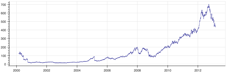
The browser window has some interactive tools which allow exploration of the graph, in particular, some zoom and panning capability, and the option of saving the image.
9.4.2. Telling a story with a visualization
The code in the cell below illustrates a scatterplot
with bokeh. Each point is drawn as
a circle. The position of each circle in the plot tells something about
one data point.
On the final line in the next cell, we ask our browser to display the HTML file we’ve just created.
from bokeh.plotting import figure, show
from bokeh.sampledata.autompg import autompg as df
from bokeh.models import ColumnDataSource

source = ColumnDataSource(df)
p = figure()
p.circle('index', 'mpg', source=source, fill_color='red', size=8, line_color='black')
show(p)
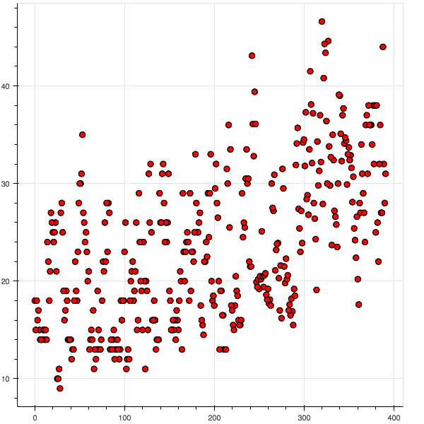
The opens a new tab in your browser displaying the file and display the image above.
The data loaded is from bokeh’s sample data module: Each point represents the mileage of a particular model of car. The higher the point, the higher the mileage.
It will be useful to also note: Each point on the x-axis represents
an ID number for a particular model of car. Each point on the y-axis
represents miles per gallon.
The picture created is largely a useless visual artifact. None of the pieces of information we could use to tell a story are available.
Let’s look at the original table for the data and see what we’re missing.
The source instance created in the code above is a bokeh wrapper
around a pandas data frame. We’ll map back to the data frame and use
what we know about data frames.
source.to_df()[:20]
| origin | mpg | displ | weight | index | hp | accel | name | yr | cyl | |
|---|---|---|---|---|---|---|---|---|---|---|
| 0 | 1 | 18.0 | 307.0 | 3504 | 0 | 130 | 12.0 | chevrolet chevelle malibu | 70 | 8 |
| 1 | 1 | 15.0 | 350.0 | 3693 | 1 | 165 | 11.5 | buick skylark 320 | 70 | 8 |
| 2 | 1 | 18.0 | 318.0 | 3436 | 2 | 150 | 11.0 | plymouth satellite | 70 | 8 |
| 3 | 1 | 16.0 | 304.0 | 3433 | 3 | 150 | 12.0 | amc rebel sst | 70 | 8 |
| 4 | 1 | 17.0 | 302.0 | 3449 | 4 | 140 | 10.5 | ford torino | 70 | 8 |
| 5 | 1 | 15.0 | 429.0 | 4341 | 5 | 198 | 10.0 | ford galaxie 500 | 70 | 8 |
| 6 | 1 | 14.0 | 454.0 | 4354 | 6 | 220 | 9.0 | chevrolet impala | 70 | 8 |
| 7 | 1 | 14.0 | 440.0 | 4312 | 7 | 215 | 8.5 | plymouth fury iii | 70 | 8 |
| 8 | 1 | 14.0 | 455.0 | 4425 | 8 | 225 | 10.0 | pontiac catalina | 70 | 8 |
| 9 | 1 | 15.0 | 390.0 | 3850 | 9 | 190 | 8.5 | amc ambassador dpl | 70 | 8 |
| 10 | 1 | 15.0 | 383.0 | 3563 | 10 | 170 | 10.0 | dodge challenger se | 70 | 8 |
| 11 | 1 | 14.0 | 340.0 | 3609 | 11 | 160 | 8.0 | plymouth 'cuda 340 | 70 | 8 |
| 12 | 1 | 15.0 | 400.0 | 3761 | 12 | 150 | 9.5 | chevrolet monte carlo | 70 | 8 |
| 13 | 1 | 14.0 | 455.0 | 3086 | 13 | 225 | 10.0 | buick estate wagon (sw) | 70 | 8 |
| 14 | 3 | 24.0 | 113.0 | 2372 | 14 | 95 | 15.0 | toyota corona mark ii | 70 | 4 |
| 15 | 1 | 22.0 | 198.0 | 2833 | 15 | 95 | 15.5 | plymouth duster | 70 | 6 |
| 16 | 1 | 18.0 | 199.0 | 2774 | 16 | 97 | 15.5 | amc hornet | 70 | 6 |
| 17 | 1 | 21.0 | 200.0 | 2587 | 17 | 85 | 16.0 | ford maverick | 70 | 6 |
| 18 | 3 | 27.0 | 97.0 | 2130 | 18 | 88 | 14.5 | datsun pl510 | 70 | 4 |
| 19 | 2 | 26.0 | 97.0 | 1835 | 19 | 46 | 20.5 | volkswagen 1131 deluxe sedan | 70 | 4 |
There are many stories we could tell with this data. But we can’t begin
to tell one until we come up with a question. We’d like not just any
question, but a question that has some significance. Since mileage is
clearly an important component of the data, let’s ask a question about
mileage. Since manufacturing low mileage vehicles is clearly a trend in
modern automobile manufacture, let’s ask about that. Noting that the
manufacturer is represented in the model name, let’s try and say
something about which manufacturers are paying attention to making
cars with good mileage.
Now we’ve made some progress.
Let’s also try and reduce some clutter. Since we want to tell a story about cars with good mileage, the obvious first step is to filter out the data points for cars with very poor mileage.
Combining elements
Too many points => filtering points by a value (MPG)
Adding computed columns to a data frame. We want to tell a story about manufacturers. Add a computed manufacturer column.
All same color => choosing color by attribute (manufacturer)
Adding computed columns. Add fill_color column and line_color columns based on the manuyfacturer column just added.
Customizing line color as well as fill color (darker colors get a different outline than bright colors)
Using index as plotted value => Plotting points by manufacturer
Overlapping tick labels => rotating tick labels.
9.4.3. Improving the visualization
from bokeh.plotting import figure, show
from bokeh.sampledata.autompg import autompg as df
from bokeh.models import ColumnDataSource
source = ColumnDataSource(df)
Next we filter out the poor mileage cars.
better = df[df['mpg'] >= 30.0]
better = better.copy()
Now we’re going to create three new columns in our table, two with color information, one with the manufacturer.
All are computed columns. We compute the values of each cell in the new columns based on other values in the same row.
def find_manufacturer (name):
    mnfctr = name.split()[0]
    mnfctr = mnfctr.split('-')[0]
    if mnfctr == 'vw':
        return 'volkswagen'
    else:
        return mnfctr

def assign_colors (model_name):
    if model_name.startswith('honda'):
        return 'green'
    elif model_name.startswith('mazda'):
        return 'red'
    elif model_name.startswith('datsun'):
        return 'blue'
    elif model_name.startswith('plymouth'):
        return 'indigo'
    elif model_name.startswith('toyota'):
        return 'firebrick'
    elif (model_name.startswith('vw') or model_name.startswith('volkswagen')):
        return 'yellow'
    else:
        return 'black'

def assign_line_colors (color):
    """
    Get contrasting outline for darker colors.
    """
    if color.startswith('bl') or  color.startswith('indi'):
        return 'red'
    else:
        return 'black'

better['fill_color'] = better['name'].map(assign_colors)
better['line_color'] = better['fill_color'].map(assign_line_colors)
better['manufacturer'] = better['name'].map(find_manufacturer)
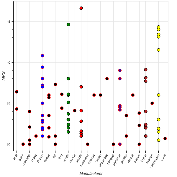
In the new plot we’re going to arrange out points into columns, one column for each manufacturer, so the coordinate of each point is determined by the manufacturer.
We make a set called v_set of the possible manufacturers, and we
create our figure specifiying taht as the range of possible x-values.
v_set = sorted(list(set(better['manufacturer'].values)))

p = figure(x_range=v_set)
The next line does most of the work in drawing the plot.
p.circle('manufacturer', 'mpg', source=better, fill_color='fill_color', size=10, line_color='line_color')
p.xaxis.axis_label = 'Manufacturer'
p.xaxis.major_label_orientation = 45
p.yaxis.axis_label = 'MPG'
show(p)
The display looks like this now:
9.4.4. Iris example
We look at the classic example of the Iris data.
We want to look at which of the four attributes in the data tell us something that helps us distinguish the three iris species.
from __future__ import print_function

from bokeh.document import Document
from bokeh.embed import file_html
from bokeh.layouts import gridplot
from bokeh.models.glyphs import Circle
from bokeh.models import (BasicTicker, ColumnDataSource, Grid, LinearAxis,
                         DataRange1d, PanTool, Plot, WheelZoomTool)
from bokeh.resources import INLINE
from bokeh.sampledata.iris import flowers
from bokeh.util.browser import view

colormap = {'setosa': 'red', 'versicolor': 'green', 'virginica': 'blue'}
First note that the imports include importing some data. The iris data
is imported as a pandas datframe under the name flowers.
As the colormap dictionary suggests, we want to color different species
differently. To make doing that simpler, we’ll augment flowers with
a new column whose value for the current row is computed by applying
lambda x: colormap[x] to the species value.
flowers['color'] = flowers['species'].map(lambda x: colormap[x])
Done!
Next we place all the data we need for plotting in a bokeh wrapper.
source = ColumnDataSource(
    data=dict(
        petal_length=flowers['petal_length'],
        petal_width=flowers['petal_width'],
        sepal_length=flowers['sepal_length'],
        sepal_width=flowers['sepal_width'],
        color=flowers['color']
    )
)
We’re going to make a grid consisting of 16 different plots. Apart species and color, we have 4 flower attributes and we’ll have a plot for each pairing of those attributes. We’ll even have a plot when an attribute is paired with itself, though we’ll make those plots look different than the others.
We’ll define a make_plot functions whose job is to draw one of the
16 plots. It takes two attribute bames, and a couple of boolean
attributes as arguments.
The attribute xax is True if an xaxis should be drawn and false
otherwise, and similarly for yax.
xdr = DataRange1d(bounds=None)
ydr = DataRange1d(bounds=None)

def make_plot(xname, yname, xax=False, yax=False):
    mbl = 40 if yax else 0  # Min Border Left (margin?)
    mbb = 40 if xax else 0  # Min Border Bottom (margin?)

    # Basic Plot Obj (what normally goes inside a Figure, but we're doing a multiplot in this exercise)
    plot = Plot(
        x_range=xdr, y_range=ydr, background_fill_color="#efe8e2",
        border_fill_color='white', plot_width=200 + mbl, plot_height=200 + mbb,
        min_border_left=2+mbl, min_border_right=2, min_border_top=2, min_border_bottom=2+mbb)

    # scatter points using circle style.  Use data table "source".  Get values for plot coords x from xname and y from yname.
    # The implicit idea is one point per row. Get fill_color and line_color from "color" attribute of row.
    circle = Circle(x=xname, y=yname, fill_color="color", fill_alpha=0.2, size=4, line_color="color")
    r = plot.add_glyph(source, circle)

    xdr.renderers.append(r)
    ydr.renderers.append(r)

    xticker = BasicTicker()
    if xax:
        xaxis = LinearAxis()
        plot.add_layout(xaxis, 'below')
        xticker = xaxis.ticker
    plot.add_layout(Grid(dimension=0, ticker=xticker))

    yticker = BasicTicker()
    if yax:
        yaxis = LinearAxis()
        plot.add_layout(yaxis, 'left')
        yticker = yaxis.ticker
    plot.add_layout(Grid(dimension=1, ticker=yticker))

    plot.add_tools(PanTool(), WheelZoomTool())

    return plot
Here are the attributes we’ll plot on the-axis
xattrs = ["petal_length", "petal_width", "sepal_width", "sepal_length"]
We’ll plot the same attributes on the y-axis, but we’ll list them backward.
This way we plot att x vs att x in row x, col n-x (diag goes from right to left).
yattrs = list(reversed(xattrs))
Next we collect our 16 plots in the list plots. We’re going to make
a 4x4 grid, so we’ll build a list of 4 rows, each row being a lits that
contains 4 plots.
plots = []

# Building a 4x4 grid of plots in this double loop.
# Each
# Each plot is a Plot obj returned by make_plot
# plotting a pair of attributes in the iris data.
# The diagonal shows each att plotted against itself
for y in yattrs:
    row = []
    for x in xattrs:
        # boolean specifying whether to show xaxis ticks in this subplot
        # Only show xticks in last row
        xax = (y == yattrs[-1])
        # Only show yticks in first col
        yax = (x == xattrs[0])
        plot = make_plot(x, y, xax, yax)
        row.append(plot)
    plots.append(row)
Next we use the bokeh facility for drawing a grid of plots.
grid = gridplot(plots)
Next we output our grid to an HTML file, letting bokeh take care of
all the gruesome details of creating HTML and javascript. On the final
line in the next cell, we ask our browser to display the HTML file we’ve
just created.
That will open a new tab in your broswer displaying the file, and after looking at you’ll want to navigate back to the tab displaying this notebook.
doc = Document()
doc.add_root(grid)
doc.validate()
filename = "iris_splom.html"
with open(filename, "w") as f:
     f.write(file_html(doc, INLINE, "Iris Data SPLOM"))
print("Wrote %s" % filename)
view(filename)
Wrote iris_splom.html