9.2. Box and Whisker Plots
In this section we look at boxplots (McGill, Tukey, and Larsen 1978). Tukey is one of the big names in visualization and exploratory data analysis, and boxplots are an excellent example of exploratory data analysis as Tukey conceives it:
Procedures for analyzing data, techniques for interpreting the results of such procedures,ways of planning the gathering of data to make its analysis easier, more precise or more accurate, and all the machinery and results of (mathematical) statistics which apply to analyzing data.
Tukey (1962)
9.2.1. What is a normal distribution?
Suppose you wish to measure some attribute A for a population of students, and to be concrete let’s choose A so that it has a numerical value, so A can be something like height, or number of computers owned, or income. We’ll call the values you get by measuring A A-values. In many cases, the A-values will cluster around some mean value. And the further away from that mean an A-value v gets, the smaller the proportion of the population that has an A-value around v.
Often this pattern turns put to be describable with a kind of probability distribution called a normal distribution (also called a Gaussian). When you plot how close to the mean a measurement is versus how many members of the population have it, normal distributions look like this:
from scipy import stats
import matplotlib.pyplot as plt
import pylab
import numpy as np
%matplotlib inline
pylab.rcParams['figure.figsize'] = (10.0, 8.0)
ax = plt.subplot(111)
x = stats.norm.rvs(loc=0, scale=1, size=10000)

x = np.sort(x)
ax.set_xlim([-2.5,2.5])
ax.plot(x,stats.norm.pdf(x))
plt.show()
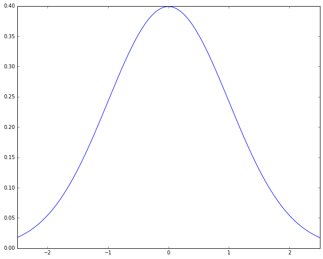
Here the shape of the curve is roughly that of a bell, leading to yet another name for this kind of distribution, the “bell curve”. The name is descriptive, but it needs to be used with caution, because there are other bell-curved distributions that are not normal distributions. The meaning of the graph is fairly simple. The points on the X-axis represent A-values, ordered from lowest A-value to highest. The height of a point on the curve reflects roughly what proportion of the population has A-values in the neighborhood of that point. The bell shape comes from this: The highest point is at 0; that is, the most likely A-value for a student to have is the mean value; for both higher and lower A-values, moving away from the mean rapidly reduces the proportion of population with that A-value. The picture then represents the idea that most things hover around the mean. This sounds like something that has to be true (“Most people are average”), but as we shall see, that is far from the case.
We’ll do some practical examples shortly. First, let’s get a little clearer about exactly what kind of clustering around a mean we’re talking about.
9.2.1.1. Creating a sample
Let’s create two samples, one from a bell curve kind of distribution and one from a random sample. We’ll compare the basic data sets using a histogram.
import numpy as np
import numpy.random as random


N, mu, sigma = 1000, 80, 5
x = mu + sigma*np.random.randn(N)
y = mu + sigma*(np.random.rand(N)-0.5)
First let’s talk about ‘x’. Note that N = 1000, so
np.random.randn(N)
is just going to choose 1000 points centered around 0. Because I used
the function randn the points are going to be normally distributed
around 0 (0 will be the mean). Their average distance from 0 will be
1. When I multiply all the points by 5 (the value of sigma)
sigma*np.random.randn(N)
I spread them out more (the average distance from 0 will be 5), but they’re still centered around 0.
M,sigma = 50,5
w0 = np.random.randn(M)
print min(w0),max(w0)

w1 = sigma* w0
print min(w1),max(w1)
-2.41637765454 1.83097623747
-12.0818882727 9.15488118735
The number sigma, or amount of spread, is one way in which a normal
distribution can vary. The default spread is 1.0. The important
point is that multiplying all the data points by 5 still gives me a
normal distribution, just one that’s spread out more. This degree of
spread (roughly, average distance from the mean) has a technical name.
It’s called the standard deviation. It’s usually symbolized
sigma, but you’ll most often see it written with the Greek letter
 .
.
We’ll define it more precisely below (it’s not exactly the average distance from the mean, but it can be helpful for a beginner to think of it that way). The key intuition is what you’ve just seen. The standard deviation is just a scaling number. It’s like a change of units (moving from feet to inches). The numbers will change but many of the relationships between them will not.
Finally I add mu (which = 80; mu stands for mean, often
written with the Greek letter  ) and that just shifts all my
points over so that instead of being centered around 0 they are are
centered around 80. So 80 is the new mean.
) and that just shifts all my
points over so that instead of being centered around 0 they are are
centered around 80. So 80 is the new mean.
Now let’s talk about y. I did very much the same thing with y
that I did with x except that instead of using randn, I used
rand.
y = mu + sigma*(np.random.rand(N)-0.5)
The difference between randn and rand is that randn chooses
points according to a normal distribution, and rand chooses them
randomly. As we’ll see shortly, that’s a big difference. We still shift
the points much as before. With randn I had to subtract 0.5 from
all the points first to get them centered around 0 to start with, but
otherwise I did as before.
Let’s check to see that the numpy mean and standard deviation functions agree with what I’ve just said.
x_mean,x_std = np.mean(x),np.std(x)
print x_mean, x_std
y_mean,y_std = np.mean(y),np.std(y)
print y_mean, y_std
80.0238520624 4.93347592864
80.0242650586 1.43246132748
The two means are very close to 80 as we’d expect and therefore close to each other. The two STDs are not close at all. More about that later.
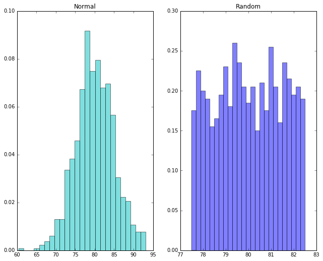
Now let’s look at our distributions using a histogram. The idea of a histogram is to divide up our measurements into intervals of a fixed width. We’ll call these intervals bins. We’ll draw a bar to represent the measurements that fall into each bin, and the height of the bar will represent the number of students who fell into each bin.
import matplotlib.pyplot as plt
import scipy.stats as stats

fig, axes = plt.subplots(ncols=2)
axes[0].set_title('Normal')
n, bins, patches = axes[0].hist(x, 25, normed=1, facecolor='c', alpha=0.5)

axes[1].set_title('Random')
n2, bins2, patches2 = axes[1].hist(y, 25, normed=1, facecolor='blue', alpha=0.5)

plt.show()
9.2.1.2. Measuring goodness of fit
Notice that in the normal distribution the peak is roughly at the mean of 80. In the random distribution, there’s no particular peak.
We’ve just learned something important. A normal distribution is something very specific. Not every data set centered on some mean has a normal distribution. How in general do we tell when we’ve got one? Well, we just saw that drawing the histogram can sometimes give us a pretty good idea. If A-values don’t get less likely as we move away from the mean, that’s not normal.
However, that’s not very mathematical, and in fact sometimes eyeballing the histogram can be very misleading, especially when we throw a little “noise” (random effects) into the data, or when we don’t have a lot of data.
So we’ll introduce a plotting function that basically let’s us see if the proportion of population exhibiting an A-Value v dwindles appropriately as we move away from the mean.
import scipy.stats as stats
import pylab

stats.probplot(x, dist="norm", plot=pylab)
pylab.show()
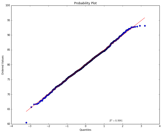
The red straight line tells us what we’d expect to see if this were a
normal distribution with the mean and STD the data has. Notice the
numbers of the y-axis are centered on the mean 80. The numbers shown on
the x-axis represent the population in “standard deviation units”. How
much of the population fits into one STD unit depends on the kind of
distribution we’re looking at. For a normal distribution, we have about
2/3 of the points centered between -1 and +1. If this this were a normal
distribution with an STD of 1, the A-values of the points would just be
the STD (the further away from 0 on the x-axis the more extreme the
A-values) and the line would be a perfect diagonal (at 45 degrees).
Because we chose an STD of 5 the line ought to have a slope of 5, but
the plotting program has scrunched the numbers on the y-scale so that it
doesn’t look like a slope of 5. An (x,y) point on the line means that
the point falls x STD units from the mean and has an A-value of y. By
definition a point with the A-value 80 falls at the mean, so it is shown
at (x=0,y=80). The red line tells us that for a normal distribution,
if we if move one STD unit below 0 on the x axis we should move about 5
down on the y axis. In percentages, about 34% of the population of
students should show up between the mean and -1. As we move away from
the mean, the sample points should be more and more spread out. Moreover
a point one STD below the mean has an A-value of about 75 on the red
line, and two STDs away (where the points are less crowded, it should
have a value of about 70.
So much for the red line. The actual points are shown in blue. If their A-value was very much above or below where we expect them to be, given their x-position, they’d show up far above or below the red line, but what we see here is a pretty good fit. This looks like a normal distribution.
Notice the  value shown in the plot. This is a number
measuring the goodness of fit of the red line to the blue data
points (the closeness of the actual points to the expected line). A
number close to 1 means we have a very good fit, and here we see that
the mathematical measurement of goodness of fit corresponds with our
visual impression. The points lie very close to the line.
value shown in the plot. This is a number
measuring the goodness of fit of the red line to the blue data
points (the closeness of the actual points to the expected line). A
number close to 1 means we have a very good fit, and here we see that
the mathematical measurement of goodness of fit corresponds with our
visual impression. The points lie very close to the line.
Now let’s try the randomly generated data, which doesn’t have a normal distribution.
stats.probplot(y, dist="norm", plot=pylab)
pylab.show()
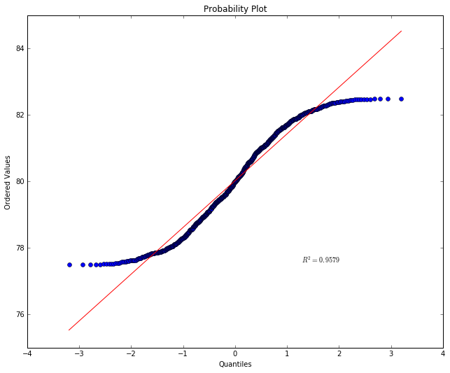
What we’re seeing is that points below the mean are showing up far above
their expected value and points above the mean far below their expected
value. This is because the distribution is pretty uniform. A-values far
away from the mean are showing up about as often as A-values right
around the mean. And that’s not normal. Notice the value has
gone down.
9.2.1.3. Defining and understanding standard deviation
When we did
x = np.random.randn(N)
We get N points centered around 0, at average distance of 1 away from 0. When we do
x = 5*np.random.randn(N)
The points are at an average distance of 5 away from 0.
For a lot of analytical purposes we want to be able to take a set of points and find their standard deviation. To do that, we first find the mean, and then compute something that is roughly the average distance from the mean as follows.
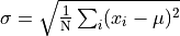
That is, we find the average of the squared distances from the mean
and take the square root of that.
Now is very important because it gives a us a notion of a
standard unit that we can apply to any normal distribution. The idea is
illustrated in the picture below, which works for any normal
distribution, whether the bell is skinny or fat. In the lower half of
the diagram we see that if we take an interval from one
below the mean to one above the mean, we get 68.27% of
the population, roughly two thirds. The upper half of the diagram shows
the converse situation, where we want to pick out some “average band”
that includes the mean. The band in darker blue picks out the middle 50%
of the population. You will sometimes hear people talk in terms of
percentiles. The mean is the 50th percentile point; 50 percent of the
population fall below that point and 50 percent fall above. So, the
darker band falls between the 25th and 75th percentiles. That fixes
values for ; in the case of 50% the values marking that
band are  and
and  .
.
Another frequently used term is quartile. The 25th percentile point is sometimes referred to as the first quartile, the 50th percentile point the second quartile and the 75th percentile the third quartile. The range between the 25th and 75 the percentile is called the inner quartile range (IQR). This is the band in darker blue in the upper half of the diagram.
from IPython.display import Image
Image(filename='normal_dist.png')

Summarizing, standard deviations are natural units for normal distributions. By marking off fixed intervals above and beliow the mean in STD units, we select fixed percentages of the population. We took advantage of this property of normal distributions above when we measured goodness of fit. Basically what we were testing when we fit our points to the line was whether, as we moved away from the mean, we included the right proportion of the population.
9.2.1.4. Mean versus median
Another way in which data can drift away from a normal distribution is that it can be skewed. This means the mean value does not equal the median value. Mean means what it’s meant throughout this lesson, the average value, computed by adding all the values together and dividing by the sample size.
The median value is the value that falls exactly at the midpoint of all
the values when all the values are listed in rank order. As an intuitive
example of when mean might not equal median, consider house prices in a
relatively small market, where say, less than 20 houses are sold in a
month. Suppose in July the mean house price does equal the median, and
both numbers are 250K. Then suppose in August one house is sold for 4.5
million while all the rest remain in the neighborhood of 250K. The
median value may not change at all, but the mean will take a dramatic
jump. You can bet all the realtors will report a dramatic jump in
housing prices and announce a hot market. But that would be very
misleading. Most home buyers will be far more interested in the median
value than the mean. This is illustrated in the cell below using the
numpy functions nanmedian and and nanmean to compute the
median and means respectively for our fictional real estate market.
import numpy as np
x,outlier,var = 250000, 4500000, 2000
july_data = [x-2*var,x-2*var,x-var,x-var,x-var,x,x,x,x,x+var,x+var,x+var,x+2*var, x+2*var]
august_data = july_data + [outlier]
print 'July sales: {0} houses: {1}'.format(len(july_data), july_data)
print np.nanmedian(july_data), np.nanmean(july_data)
print np.nanmedian(august_data), np.nanmean(august_data)
July sales: 14 houses: [246000, 246000, 248000, 248000, 248000, 250000, 250000, 250000, 250000, 252000, 252000, 252000, 254000, 254000]
250000.0 250000.0
250000.0 533333.333333
9.2.2. Abalone example
Some new data from the web.
This data is about predicting the age of abalone from physical measurements. The age of abalone can be found reliably by cutting the shell open and counting the number of rings — a laborious process.
Other measurements, which are easier to obtain, are given in this new data set. These measurements can be used to predict the age. Further information, such as location, may be required to solve the problem, so let’s remain neutral on whether we’ve actually got enough information to solve the problem. That’s pretty normal in data analysis.
We load the information with the help of a python module called
pandas, which provides a number of facilities for reading, storing,
and manipulating data. For now let’s just note the following:
The file we’re reading on the web contains an abalone data set stored in what’s known as
.csvformat. That means each line represents a distinct data instance (abalone shell), and provides an arbitrary number of attributes of that instance, seperated by commas. “CSV” stands for “comma separated values”.In the code below, the
pandas read_csvfunction retrieves the data from the URL it’s given and stores it under the nameabaloneusing a special kind of data object called adata frame. More on data frames later.We print the first and last rows of the data, to give you an idea of what we’ve got. Each abalone shell has 8 numerical attributes and one string attribute (“Sex”). Notice that the numerical attributes are not necessarily comparable. Some are lengths, some weights. The last attribute is a count of the number of rings.
import pandas as pd
from pandas import DataFrame
import pylab
import matplotlib.pyplot as plot
pd.set_option('display.width',200)

target_url = ("http://archive.ics.uci.edu/ml/machine-"
              "learning-databases/abalone/abalone.data")
#read abalone data.  This file has no column names (header = None),
# so we provide them ourselves.
abalone = pd.read_csv(target_url,header=None, prefix="V")
abalone.columns = ['Sex', 'Length', 'Diameter', 'Height', 'Whl weight',
                   'Shckd weight', 'Visc weight', 'Shll weight',
                   'Rings']

# Print first few rows of data
print(abalone.head())
print
# Print last few rows
print(abalone.tail())
  Sex  Length  Diameter  Height  Whl weight  Shckd weight  Visc weight  Shll weight  Rings
0   M   0.455     0.365   0.095      0.5140        0.2245       0.1010        0.150     15
1   M   0.350     0.265   0.090      0.2255        0.0995       0.0485        0.070      7
2   F   0.530     0.420   0.135      0.6770        0.2565       0.1415        0.210      9
3   M   0.440     0.365   0.125      0.5160        0.2155       0.1140        0.155     10
4   I   0.330     0.255   0.080      0.2050        0.0895       0.0395        0.055      7

     Sex  Length  Diameter  Height  Whl weight  Shckd weight  Visc weight  Shll weight  Rings
4172   F   0.565     0.450   0.165      0.8870        0.3700       0.2390       0.2490     11
4173   M   0.590     0.440   0.135      0.9660        0.4390       0.2145       0.2605     10
4174   M   0.600     0.475   0.205      1.1760        0.5255       0.2875       0.3080      9
4175   F   0.625     0.485   0.150      1.0945        0.5310       0.2610       0.2960     10
4176   M   0.710     0.555   0.195      1.9485        0.9455       0.3765       0.4950     12
We’re going to do something called a box plot which is an excellent visualization tool that gives a you a feel for how the data attributes are distributed.
The box plot visualization assumes shows how concentrated each attribute is around the mean, and where the outliers are.
Here’s a first stab at visualizing the data:
%matplotlib inline
# Make the figures big enough for the optically challenged.
pylab.rcParams['figure.figsize'] = (10.0, 8.0)
#box plot the numerical attributes
#convert data frame to array for plotting
plot_array = abalone.iloc[:,1:9].values
plot.boxplot(plot_array)
# Nice labels using attribute names on the x-axis.
plot.xticks(range(1,9),abalone.columns[1:9])
plot.ylabel(("Attribute values"))
plot.title('All variables')
#show()
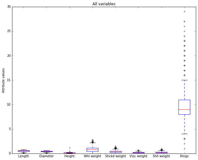
The horizontal axis is showing our 8 numerical attributes. It doesn’t take a degree in data science to see that most of the display space is being taken up by the last attribute (‘Rings’), which is in fact our representation of age in the data. That is, it represents the dependent variable, the attribute we’re trying to predict. It’s out of scale with the others because it takes large integer values and the other attributes all take values below 3, and almost all values fall below 2.
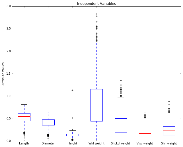
Let’s remove it and re-plot. Since it’s the dependent variable, it makes sense to set it aside while we look at the predictors, the independent variables.
plot_array2 = abalone.iloc[:,1:8].values
boxplot(plot_array2)
plot.xticks(range(1,8),abalone.columns[1:8])
plot.ylabel(("Attribute Values"))
plot.title('Independent Variables')
Before we discuss this picture, it will be helpful to review something
we saw in the Normal Distribution notebook, the diagram of how
population percentages aligned with STD units in a normal distribtion.
Here it is:
from IPython.display import Image
Image(filename='normal_dist.png')
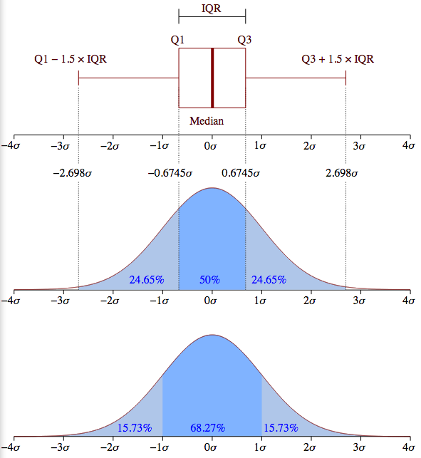
The meaning of a box in a boxplot can best be rembered by looking at the box turned on it side in the top half of the diagram. A boxplot box always contains the 25th-75th percentile, the middle 50% of the population. The box thus represents IQR (the inner quartile) in the diagrams of normal distributions above.
The red horizontal line represents the median values; it is placed so as to tell you what percentage of the population falls at or below the median value. Assuming a normal distribution, it should be in the middle of the box, and in some cases in the abalone picture below, it is clearly shifted a bit up or down. The horizontal line at the the end of the a boxplot “whisker” marks 24.675% more of the population above the mean, and the bottom whisker marks off the same interval below the mean. So, totaling these up, between the top and bottom horizontal bars, you’ve got 99.3% of the population. Anything outside that interval on either side (top .35% and bottom .35%) is defined to be an outlier. Note that the placement of the box and whiskers is defined in terms of percentiles, not standard deviations, so a box plot does not assume a normal distribution; in fact, it’s another very good tool for deciding whether your data is normally distributed. If you look back at the upper half the normal distribution diagram above, you can see what the box and whiskers in a boxplot should look like for a perfectly normal distribution. Since the IQR is the middle 50% of the population (1.349 sigma), the lower whisker would end at the Q1 - (1.5 * IQR) point [= -2.698 sigma] and the upper whisker would end at the Q3 + (1.5 * IQR) point [= +2.698 sigma].
In the boxplot below, each plus above or below those top bars stands for an outlier.
Removing a troublesome column is okay, but renormalizing the
variables generalizes better. Let’s renormalize columns to zero mean and
unit standard deviation. We’ll go ahead and put the rings attribute
back now since the fact that it’s out of scale with the others won’t
matter.
This is a common normalization and desirable for other kinds of statistical analysis and machine learning applications, like k-means clustering or k-nearest neighbors. To do that, let’s first grab some statistical info about our data.
summary = abalone.describe()
print summary
            Length     Diameter       Height   Whl weight  Shckd weight  Visc weight  Shll weight        Rings
count  4177.000000  4177.000000  4177.000000  4177.000000   4177.000000  4177.000000  4177.000000  4177.000000
mean      0.523992     0.407881     0.139516     0.828742      0.359367     0.180594     0.238831     9.933684
std       0.120093     0.099240     0.041827     0.490389      0.221963     0.109614     0.139203     3.224169
min       0.075000     0.055000     0.000000     0.002000      0.001000     0.000500     0.001500     1.000000
25%       0.450000     0.350000     0.115000     0.441500      0.186000     0.093500     0.130000     8.000000
50%       0.545000     0.425000     0.140000     0.799500      0.336000     0.171000     0.234000     9.000000
75%       0.615000     0.480000     0.165000     1.153000      0.502000     0.253000     0.329000    11.000000
max       0.815000     0.650000     1.130000     2.825500      1.488000     0.760000     1.005000    29.000000
Notice the summary is a data frame of its own with statistical
information about each attribute. We see we have data on 4177 abalones.
Notice the mean and std are in rows 2 and 3 (row indices 1 and
2).
# We start by making a copy of the original data frame, minus the sex attribute.
abalone2 = abalone.iloc[:,1:9]
# We'll iterate through each attribute, and for each attribute we'll change all the rows at once.
for i in range(8):
    # Grab the mean and std of attribute i
    mean = summary.iloc[1, i]
    std = summary.iloc[2, i]
    # LHS: what's being changed, RHS, what it's changing to.
    # We convert to STD units, distance from mean divided by STD
    abalone2.iloc[:,i:(i + 1)] = (
              abalone2.iloc[:,i:(i + 1)] - mean) / std
Now we have centered the data in abalone2 (placed all the mean
values at 0 and represented the distances from the mean in STD units).
Now we replot usinhg abalone2.
# replot
plot_array3 = abalone2.values
boxplot(plot_array3)
plot.xticks(range(1,9),abalone.columns[1:9])
plot.ylim((-4,+7))
plot.ylabel(("Quartile Ranges - Renormalized "))
plot.title('Renormalized data')
<matplotlib.text.Text at 0x12d6cee50>
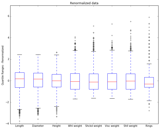
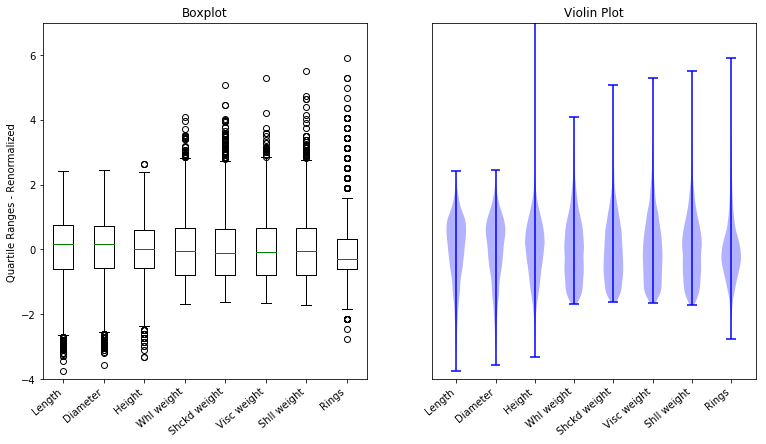
Now we see some new details. The 0 point on the y-axis is now the mean, and by looking at the placement of the median in the box we can see whether the median is above or below the mean.
The Rings attribute has an outlier that’s 6 STD units above the
mean. That’s extreme. If this were IQ, that would be an Einstein; if
this were basketball talent, that would be Michael Jordan. Since we’re
talking about abalone and age, that’s one very old abalone.
9.2.2.1. Limitations of boxplots
Boxplots look at multivariate data one dimension at a time. You can learn a lot that way, but there are some things you are not going to learn.
Let’s make some fictional data. I’m going to generate some points that lie on a line, but not exactly on the line, and then I’m going to add in an outlier. This will be the kind of outlier a boxplot won’t show you.
%matplotlib  inline
import numpy as np
import matplotlib.pyplot as plt

N= 50
mu, sigma = 0, 1. # mean and standard deviation for our NOISE
noise = np.random.normal(mu, sigma, N)
x = np.linspace(0,10,N)
(m,b) = 2.,1.
# Out well-behaved line
y = m*x + b
#Add the noise to JIGGLE points off the line
yprime = y + noise
# Create an outlier here
yprime[-5] = 4
plt.plot(x,y,c="r")
ax = plt.gca()

plt.scatter(x,yprime)
ax.annotate("A", xy = (x[-5],yprime[-5]),xycoords='data',
            xytext = (6.8,2.8), textcoords='offset points',
            size=15)
#plt.draw()
<matplotlib.text.Annotation at 0x12255e390>
Look at the point A. It is an outlier, clearly. It does not lie on the line that all the other points are near, yet notice that it is not an outlier if we look at the xvalues alone or the yvalues alone.
print "x min {0:.3f}  max {1:.3f}".format(x.min(), x.max())
print "y min {0:.3f}  max {1:.3f}".format(yprime.min(), yprime.max())
print
print "out:"
print 'x {0:.3f}'.format(x[-5])
print 'y {0:.3f}'.format(yprime[-5])
x min 0.000  max 10.000
y min -0.175  max 20.724

out:
x 9.184
y 4.000
The box plot for y will not show this outlier point as an outlier. It lies well off the minimum of -.175 and the maximum of 20.724
The moral is that when looking at multivariate data, there are some generalizations you can only see by looking at multiple dimensions simultaneously. And we need other visualization tools for that purpose. The picture above shows us that a 2D scatterplot can in fact show us 2D generalizations. But what applies to 1 dimension versus 2 also applies to 2 versus 3, and so on. In multimdimensional data, when looking at less than the full array of dimensions, there always the possibility of missing some higher dimensional generalization.
And that’s something to be aware whenever you tell a story using a graphical simplification. This is a point emphasized in Tufte (1983), an excellent source for design principles governing visualization of quantitative data.
9.2.2.2. Violin plots
We turn to an important variant of Tukey’s (1977) box plot, the violin plot.
Violin plots are closely related to box plots, but they add useful information since they sketch a density trace, giving a rough picture of the distribution of the data .
By default, box plots show data points outside 1.5 * the inter-quartile range as outliers above or below the whiskers whereas violin plots show the whole range of the data.
A good general reference on boxplots and their history can be found here.
Violin plots require matplotlib >= 1.4.
For more information on violin plots, the scikit-learn docs have a great section.
Here’s a nice demonstration of the basic idea, contrasting what a violin plot gives you with what a boxplot gives you, on some random data.
import matplotlib.pyplot as plt
import numpy as np

fig, axes = plt.subplots(nrows=1, ncols=2, figsize=(9, 4))

# generate some random test data
all_data = [np.random.normal(0, std, 100) for std in range(6, 10)]

# plot violin plot
axes[0].violinplot(all_data,
                   showmeans=False,
                   showmedians=True)
axes[0].set_title('violin plot')

# plot box plot
axes[1].boxplot(all_data)
axes[1].set_title('box plot')

# adding horizontal grid lines
for ax in axes:
    ax.yaxis.grid(True)
    ax.set_xticks([y+1 for y in range(len(all_data))])
    ax.set_xlabel('xlabel')
    ax.set_ylabel('ylabel')

# add x-tick labels
plt.setp(axes, xticks=[y+1 for y in range(len(all_data))],
         xticklabels=['x1', 'x2', 'x3', 'x4'])
plt.savefig('box_viol_plot_example.png')
plt.show()
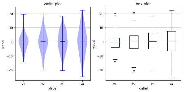
Below we’ve loaded the image created by saving one particular run of the above code. Because random sampling is used, the pictures created will cary slightly each time you execute the code.
The key point to notice is that all the medians (the horizontal midlines
shown in both kinds of plot) are in roughly the same place. However,
that does not mean the population is concentrated around that midline.
Notice that the violin plot in the top row shows that, for x2 the
fat part of the violin (the value attracting the greatest number of
points) is around, while for x1 the fat part of the viol is near 0.
These differences cannot be seen in the box plot of the
abalone.
import pandas as pd
from pandas import DataFrame
import pylab
#from pylab import *
import matplotlib.pyplot as plot
pd.set_option('display.width',200)

target_url = ("http://archive.ics.uci.edu/ml/machine-"
              "learning-databases/abalone/abalone.data")
#read abalone data.  This file has no column names (header = None),
# so we provide them ourselves.
abalone = pd.read_csv(target_url,header=None, prefix="V")
abalone.columns = ['Sex', 'Length', 'Diameter', 'Height', 'Whl weight',
                   'Shckd weight', 'Visc weight', 'Shll weight',
                   'Rings']
summary = abalone.describe()
# We start by making a copy of the original data frame, minus the sex attribute.
abalone2 = abalone.iloc[:,1:9]
# We'll iterate through each attribute, and for each attribute we'll change all the rows at once.
for i in range(8):
    # Grab the mean and std of attribute i
    mean = summary.iloc[1, i]
    std = summary.iloc[2, i]
    # LHS: what's being changed, RHS, what it's changing to.
    # We convert to STD units, distance from mean divided by STD
    abalone2.iloc[:,i:(i + 1)] = (
              abalone2.iloc[:,i:(i + 1)] - mean) / std
#abalone2 = abalone.iloc[:,1:9]
plot_array3 = abalone2.values
%matplotlib inline
import matplotlib.pyplot as plt
import numpy as np
#fig, axes = plt.subplots(nrows=1, ncols=2, figsize=(12, 6))
figure = plt.figure(figsize=(12,6))
# Make the figures big enough for the optically challenged.
#pylab.rcParams['figure.figsize'] = (10.0, 8.0)
# We start by making a copy of the original data frame, minus the sex attribute.
#replot
plot.subplot(121)
plot.boxplot(plot_array3)
plot.xticks(range(1,9),abalone.columns[1:9],rotation=40,ha='right')
#axes[0].boxplot(plot_array3)
#axes[0].set_xticks(range(1,9))
#axes[0].set_xticklabels(abalone.columns[1:9],rotation=45,ha='right')
plot.ylim((-4,+7))
plot.ylabel(("Quartile Ranges - Renormalized "))
plot.title('Boxplot')
#axes[0].boxplot(plot_array3)
plot.subplot(122)
#axes[1].xticks(range(1,9),abalone.columns[1:9])
#plot.xticks(range(1,9))
plot.xticks(range(1,9), abalone.columns[1:9],rotation=40,ha='right')
plot.ylim((-4,+7))
plot.yticks([],[])
#axes[1].set_ylabel(("Quartile Ranges - Renormalized "))
plot.violinplot(plot_array3)
plot.title('Violin Plot')
<matplotlib.text.Text at 0x11b7200d0>
9.2.2.3. Homework questions
In the abalone data, explain why the numbers on the y-axis have changed between the plot labeled “Independent variables” and the plot labeled “renormalized data”. What attributes have medians that are above the mean?
State in your own words what it means that the horizontal bar on the lower whisker is placed so high on the weight attributes? [Hint: Look at those attributes in the plot labeled ‘Independent Variables’.]
Propose a verbal explanation for why the median is below the mean for the ‘Rings’ attribute. In other words, what fact about abalone shells does this represent? [Hint: Remember what the value of the rings attribute tells us.] Compare this case to the case of the fictional housing market discussed above.
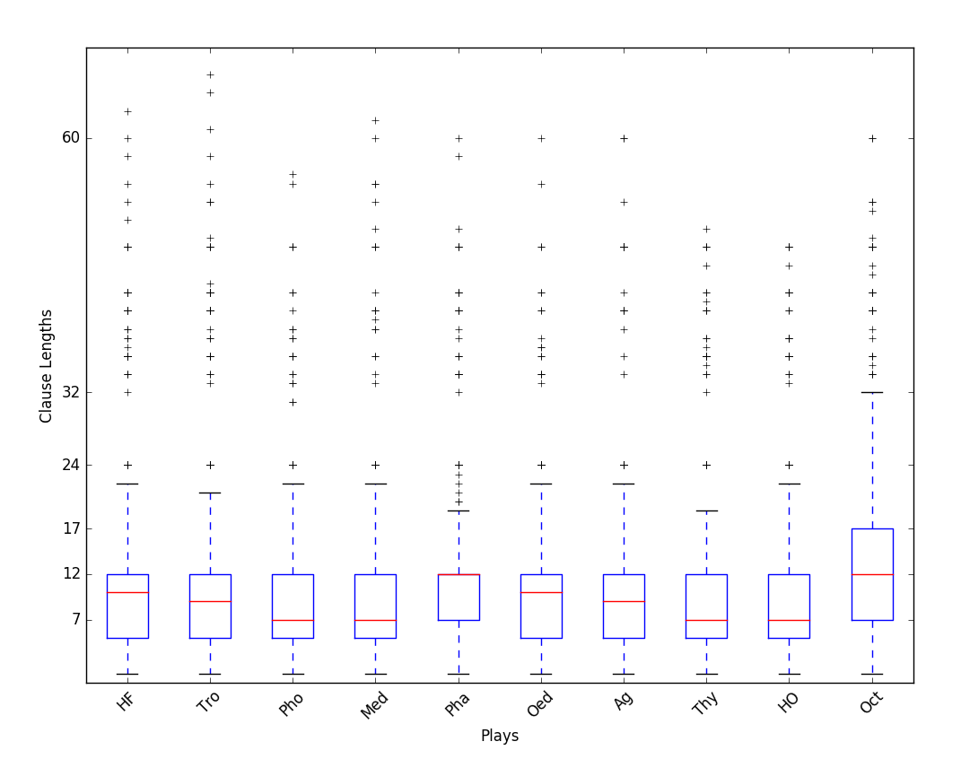
The next cell shows the box plot for some new data, showing clause lengths in the plays of Seneca. The data has not been renormalized. The units on the y-axis are, roughly, syllables; 12 syllables is one line. Answer the following questions.
For each play, estimate what percentage of the clauses fall at or below the median clause length.
For each play, estimate what percentage of the clauses have a length of 12 or less.
Plays Pha (Phaedra) and Oct (Octavia) have the same median clause length (the red line), but the red lines are placed differently in the box. Explain what that means.
from IPython.display import Image
Image(filename='seneca_clause_lengths_boxplots.png')
9.2.2.4. References
McGill, R., Tukey, John W., and Larsen, W. A. 1978. The American Statistician. Vol. 32, No. 1, Feb., 1978, pp. 12-16.
Tufte, E. R. 1983. The visual display of quantitative data. Cheshire, CT: Graphics.
Tukey, John W. 1962. The Future of Data Analysis. Ann. Math. Statist. 33, no. 1, pp. 1–67. doi:10.1214/aoms/1177704711. http://projecteuclid.org/euclid.aoms/1177704711.