8.3. Classification Tutorial
This notebook goes a bit beyond the video lecture version, especially in the discussions of how to evaluate a classifier (Section 6,and Appendix B) and in the discussion of dimensionality reduction (Section 7). The quiz and discussion questions do include material from those sections, so be sure to read through them.
Note for followers of the original notebook set: This notebook incorporates the material of the plot_iris_svc.ipynb notebook and therefore supercedes it.
8.3.1. The data
Let’s look at a dataset used in one of the foundational papers in linear discriminant analysis (LDA) by Ronald Fisher. The data was actually collected by Edgar Anderson in a study of the morphological variation of iris species (variation due to shape).
First we load the data from the sklearn module, which contains many
tools and datasets used in machine learning research.
from sklearn.datasets import load_iris
from sklearn.metrics import accuracy_score, recall_score, precision_score
import matplotlib.pyplot as plt
from sklearn.metrics import RocCurveDisplay
from sklearn.metrics import roc_auc_score
from sklearn import linear_model
from sklearn.svm import LinearSVC

data = load_iris()
features = data['data']
feature_names = data['feature_names']
target = data['target']
Two large arrays are defined, features and target.
The raw data about the irises is in features; features is a 2D
array.
features.shape
(150, 4)
That means we have 150 data exemplars (individual irises), and we have 4 measured attributes for each.
Here’s the first 10 rows
features[:10]
array([[5.1, 3.5, 1.4, 0.2],
       [4.9, 3. , 1.4, 0.2],
       [4.7, 3.2, 1.3, 0.2],
       [4.6, 3.1, 1.5, 0.2],
       [5. , 3.6, 1.4, 0.2],
       [5.4, 3.9, 1.7, 0.4],
       [4.6, 3.4, 1.4, 0.3],
       [5. , 3.4, 1.5, 0.2],
       [4.4, 2.9, 1.4, 0.2],
       [4.9, 3.1, 1.5, 0.1]])
To understand what the data means, consider an example iris. Let’s take the row 90 rows up from the end of the array.
P = features[-90]
P
array([5. , 2. , 3.5, 1. ])
Looking at feature names, we can decode this:
#Defined above as feature_names = data['feature_names']
feature_names
['sepal length (cm)',
 'sepal width (cm)',
 'petal length (cm)',
 'petal width (cm)']
P is an iris with sepal length 5 cm, sepal width 2 cm, petal length 3.5 cm, and petal width 1 cm. All of these are shape attributes.
P also has a class, stored in the target array, whose first ten
members are:
#Defined above as target = data['']
target[:10]
array([0, 0, 0, 0, 0, 0, 0, 0, 0, 0])
To find the class of our example iris, we look at the class of the iris 90 irises up from the last iris:
target[-90]
1
So P belongs to class 1. It turns out there are three classes, all numerical. We can see there are 3 classes and what they are by doing the following:
set(target)
{0, 1, 2}
target_names = data['target_names']
target_names
array(['setosa', 'versicolor', 'virginica'], dtype='<U10')
# equivalent to target_names[1]
target_names[target[-90]]
'versicolor'
Each number in target represents a different species of iris, 0 =
I. setosa, 1 = I. versicolor, and 2 = I. virginica. In fact our data
has 50 exemplars of each of these 3 species. So what this data helps us
study is variation in the shape attributes in feature_names among
iris species.
The target array lets us select rows by species number.
If we want to select rows by species name instead of species number, we
do fancy indexing of the array target_names — using target as
our sequence of indices— to induce a sequence of species names:
print(target_names)
target_names[target]
['setosa' 'versicolor' 'virginica']
array(['setosa', 'setosa', 'setosa', 'setosa', 'setosa', 'setosa',
       'setosa', 'setosa', 'setosa', 'setosa', 'setosa', 'setosa',
       'setosa', 'setosa', 'setosa', 'setosa', 'setosa', 'setosa',
       'setosa', 'setosa', 'setosa', 'setosa', 'setosa', 'setosa',
       'setosa', 'setosa', 'setosa', 'setosa', 'setosa', 'setosa',
       'setosa', 'setosa', 'setosa', 'setosa', 'setosa', 'setosa',
       'setosa', 'setosa', 'setosa', 'setosa', 'setosa', 'setosa',
       'setosa', 'setosa', 'setosa', 'setosa', 'setosa', 'setosa',
       'setosa', 'setosa', 'versicolor', 'versicolor', 'versicolor',
       'versicolor', 'versicolor', 'versicolor', 'versicolor',
       'versicolor', 'versicolor', 'versicolor', 'versicolor',
       'versicolor', 'versicolor', 'versicolor', 'versicolor',
       'versicolor', 'versicolor', 'versicolor', 'versicolor',
       'versicolor', 'versicolor', 'versicolor', 'versicolor',
       'versicolor', 'versicolor', 'versicolor', 'versicolor',
       'versicolor', 'versicolor', 'versicolor', 'versicolor',
       'versicolor', 'versicolor', 'versicolor', 'versicolor',
       'versicolor', 'versicolor', 'versicolor', 'versicolor',
       'versicolor', 'versicolor', 'versicolor', 'versicolor',
       'versicolor', 'versicolor', 'versicolor', 'versicolor',
       'versicolor', 'versicolor', 'versicolor', 'virginica', 'virginica',
       'virginica', 'virginica', 'virginica', 'virginica', 'virginica',
       'virginica', 'virginica', 'virginica', 'virginica', 'virginica',
       'virginica', 'virginica', 'virginica', 'virginica', 'virginica',
       'virginica', 'virginica', 'virginica', 'virginica', 'virginica',
       'virginica', 'virginica', 'virginica', 'virginica', 'virginica',
       'virginica', 'virginica', 'virginica', 'virginica', 'virginica',
       'virginica', 'virginica', 'virginica', 'virginica', 'virginica',
       'virginica', 'virginica', 'virginica', 'virginica', 'virginica',
       'virginica', 'virginica', 'virginica', 'virginica', 'virginica',
       'virginica', 'virginica', 'virginica'], dtype='<U10')
And that sequence can be used for row selection. Here are the first 5 rows of species “Versicolor”.
features[target_names[target]=="versicolor"][:5]
array([[7. , 3.2, 4.7, 1.4],
       [6.4, 3.2, 4.5, 1.5],
       [6.9, 3.1, 4.9, 1.5],
       [5.5, 2.3, 4. , 1.3],
       [6.5, 2.8, 4.6, 1.5]])
Life can sometines be a little easier if we load the data as a DataFrame.
#print(load_iris.__doc__)
data2 = load_iris(as_frame=True)
features_df = data2.data
target2 = data2.target#['target']
features_df
| sepal length (cm) | sepal width (cm) | petal length (cm) | petal width (cm) | |
|---|---|---|---|---|
| 0 | 5.1 | 3.5 | 1.4 | 0.2 |
| 1 | 4.9 | 3.0 | 1.4 | 0.2 |
| 2 | 4.7 | 3.2 | 1.3 | 0.2 |
| 3 | 4.6 | 3.1 | 1.5 | 0.2 |
| 4 | 5.0 | 3.6 | 1.4 | 0.2 |
| ... | ... | ... | ... | ... |
| 145 | 6.7 | 3.0 | 5.2 | 2.3 |
| 146 | 6.3 | 2.5 | 5.0 | 1.9 |
| 147 | 6.5 | 3.0 | 5.2 | 2.0 |
| 148 | 6.2 | 3.4 | 5.4 | 2.3 |
| 149 | 5.9 | 3.0 | 5.1 | 1.8 |
150 rows × 4 columns
data2.target_names
array(['setosa', 'versicolor', 'virginica'], dtype='<U10')
The class information is in a Series with same index as features_df:
target2
0      0
1      0
2      0
3      0
4      0
      ..
145    2
146    2
147    2
148    2
149    2
Name: target, Length: 150, dtype: int64
And here is what we did above — selecting rows by species names — adapted to the data in DataFrame form.
features_df[data2.target_names[target2]=="versicolor"][:5]
| sepal length (cm) | sepal width (cm) | petal length (cm) | petal width (cm) | |
|---|---|---|---|---|
| 50 | 7.0 | 3.2 | 4.7 | 1.4 |
| 51 | 6.4 | 3.2 | 4.5 | 1.5 |
| 52 | 6.9 | 3.1 | 4.9 | 1.5 |
| 53 | 5.5 | 2.3 | 4.0 | 1.3 |
| 54 | 6.5 | 2.8 | 4.6 | 1.5 |
Having given this one example of how to do things with data represented in two different ways, for the rest of the notebook we’ll work with the data in numpy array form.
It’s a useful exercise to convert the code we’ve provided here for working with numpy arrays into code that works with pandas DataFrames. If you can do that in most cases with little change to the structure of the code, you’ve demonstrated significant fluency with pandas.
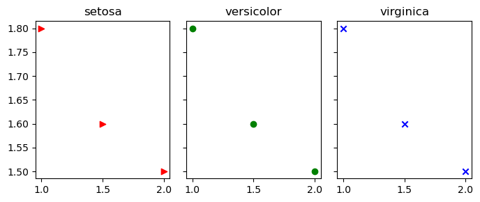
When we plot individual points below, we’ll use the plotting function
scatter and we’ll distinguish species and by color and marker shape.
Here’s how that works.
In the plot below: the the red point uses marker shape “>”, the green point uses marker shape “o” and the blue point uses “x”.
from matplotlib import pyplot as plt

fig,axes = plt.subplots(1,3,figsize=(7,3),sharey=True)
markers, colors  = ">ox", "rgb"
X = [1,1.5,2]
Y = [1.8,1.6,1.5]
# Scattering  points different marker, different colors
for i in range(3):
    axes[i].scatter(X,Y,marker=markers[i],c=colors[i])
    axes[i].set_title(f"{target_names[i]}")
fig.tight_layout()
8.3.2. Plotting attributes
One way to get a feel of the how the attributes vary among the 3 species is to do histograms for each of the 4 attributes and each of the 3 species.
# We are doing a figure with 12 subplots (each subplot is called an axis).  Each is a histogram.
# We're arranging the histograms in 4 rows and 3 columns
(fig,axes) = plt.subplots(4,3,figsize=(10,10),sharex=True)

colors= ["r","g","b"]
# bar widths for the histograms, one for each soecies
widths = [.11,.17,.22]

# row refers to a row of histograms in the figure.
# For example The Sepal length histograms for the 3 species are in the first row of histograms
# Sepal length is an iris attribute, Those values are in column 0 in the iris `features` array
for row in range(4):
    # col is the display col; also the species
    for col in range(3):
        if row == 0:
            # For purposes of the legend, get the species name
            # We do this only for the first row, to prevent duplicate legends
            label=data['target_names'][col]
        else:
            label=None
        # one iris attribute in each display row.  Each iris attribute is a column in features
        # one species in each display col.  Each species is a subset of rows (target==col) in features
        axes[row,col].hist(features[target==col,row],width=widths[col],label=label,color=colors[col])
        if col == 0:
            # Display the attribute label on the x-axis only in the first column, to prevent clutter
            row_label= feature_names[row].capitalize()
            axes[row,col].set_xlabel(row_label)

fig.legend()
# No room for main title with tight layout
#fig.tight_layout()
fig.suptitle(f"Attribute distributions for the three species")
Text(0.5, 0.98, 'Attribute distributions for the three species')
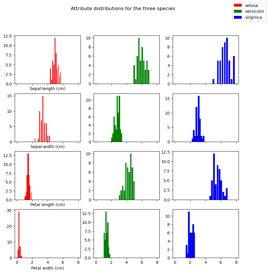
This conveys the fact that the same attribute can have differing distributions for the three specifies (contrasting the 3 histograms in each row) but it doesn’t visually convey the idea that each plant (row in the features table) is a point in a 4-dimensional space. The problem with that idea is that it’s impossible to visualize.
8.3.3. Plotting 2D Projections of the data
Let’s try to approximate that by doing many pictures. Study the pictures created by the code below.
Each of the 6 subplots features a pair of attributes. For example, we pick sepal length amd sepal width in the first subplot. We then represent each iris as a point out on the 2D xy plane, using the sepal length as the x coordinate and sepal width as the y-coordinate, and we color it according to its class. Each plot is a scatter plot of all 150 data points using different 2D projections. The 3 classes of iris are rendered as blue, green, and red points of different shapes. The idea is to see if irises of of the same class cluster together based on the attributes we’re looking at.
The point is: each plot looks different from the others because each is a different projection of the same 4-dimensional data, To help emphasize that point, we’ve distinguished the example point P discussed above, so that you can see how its representation changes from subplot to subplot. Since P is of class 1, it has been drawn as a filled in green circle, but it is much larger than the other green circles. The contrasting views of the data given in each projection can be observed in the way P jumps around from plot to plot.
%matplotlib inline

import pylab
import numpy as np
from matplotlib import pyplot as plt

markers, colors  = ">ox", "rgb"

# Display: We're doing 6 subplots arranged in a 2x3 grid.  Each subplot is called an axis.
# So: two rows axes, three axes in each row.
# We chose 6 subplots we could do all 6 possible pairings of of the 4 cols in features.
# To we define a 3D numpy array. pairs[i,j] is a pair (a 1D array of shape (2,))
# for example, pairs[1,2]  is np.array([2,3])
# np.array([2,3]) represents the two attributes we'll plot at axes[1,2] of our display (2nd row, 3rd col)
pairs = np.array([(0,1),(0,2),(0,3),(1,2),(1,3),(2,3)]).reshape((2,3,2))
fig,axes = plt.subplots(2,3,figsize=(12,9))

# Let's keep track of a single point  P with attention-getting large SIZE.
# Row for point P, Class for point P
p_features,p_cls  = features[-90],target[-90]
# marker-shape and marker-color for P
p_marker,p_clr = markers[p_cls], colors[p_cls]

# 6 subplots in 2x3 configuration. Each subplot pairs two iris
# attributes we call x and y.
for i,display_row in enumerate(pairs):
    for j,(x,y) in enumerate(display_row):
        # Get the axis object for this subplot.
        ax = axes[i,j]
        # On each subplot we're doing 3 sets of points, each belonging to a different iris class
        # with a different color and shape used to draw the points.  To do all 3 sets, use a loop.
        # To loop through 3 sequences at once, zip them together first
        for cls,marker,clr in zip(range(3),markers,colors):
            ax.scatter(features[target == cls,x], features[target == cls,y], marker=marker, c=clr)
        # Use large size marker (s=100) for the distinguished point P
        ax.scatter(p_features[x],p_features[y],marker=p_marker,c=p_clr,s=100)
        # Done with P

        # Label this subplot with the names of the two features being studied.
        ax.set_xlabel(feature_names[x])
        ax.set_ylabel(feature_names[y])
        # To make it prettier, uncomment the following & remove ticks on the x and y axis.
        #ax.set_xticks([])
        #ax.set_yticks([])

plt.savefig('iris_datasets_separations.png')
8.3.4. Linear separation
Since this notebook as about classification, in particular, linear classification, we’re going to consider the problem of drawing straight lines to separate the classes. First off the plots above clearly show that it’s much easier to separate the red points from the blue and green points than it is to separate the blue points from the green points. As an example let’s draw a pretty good line for separating the red points from the others for the second plot in the first row. This is the one that plots sepal length (x-axis) against petal length (y axis). Note that I found the line by eyeballing the plot and using trial and error.
# After some trial & error, I decided on a line specified by the following 2 numbers worked.
# m is the slope, b is where the line intercepts the y axis (not seen in the figure)
(m,b) = (.9,-2)
# The indexes for the two iris features we're using for this plot.
(p0,p1) = (0,2)

fig,ax = plt.subplots(1,1,figsize=(9,6))
# Scatter the data points
for t,marker,c in zip(list(range(3)),">ox","rgb"):
    ax.scatter(features[target == t,p0], features[target == t,p1],
                marker=marker, c=c,s=60)

# Let's draw our point P with extra special attention getting large SIZE.
p_features,p_target  = features[-90],target[-90]
p_marker,p_clr = ">ox"[p_target], "rgb"[p_target]
plt.scatter(p_features[p0],p_features[p1],marker=p_marker,c=p_clr,s=180)

# Draw our classifier line
# We'll only draw the portion of the line relevant to the current figure.
(xmin,xmax) = (3.,9.)
# tighten the boundaries on the drawing to the same limits
#plt.gca().set_xlim(xmin,xmax)
ax.set_xlim(xmin,xmax)
#Between xmin and xmax, mark off a set of points on the x-axis .1 apart
xvec = np.arange(xmin,xmax,.1)
# Plot a stright line with the chosen slope & intercept
ax.plot(xvec,m*xvec+b)
ax.set_xlabel(feature_names[p0])
ax.set_ylabel(feature_names[p1])
Text(0, 0.5, 'petal length (cm)')
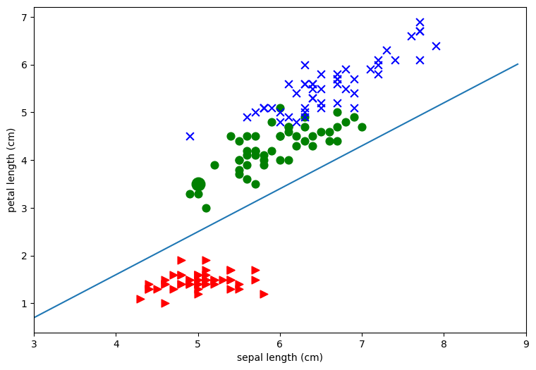
To see what this line does, consider our example iris P, which is the green class.
Let’s pretend we don’t know the class of P, but we do know its
attributes. So we know  has sepal length 5 and petal length
3.5.
has sepal length 5 and petal length
3.5.
Let’s plot it and use our line as a classifier.
import numpy as np

# Our sample point
P = features[-90]
(xPrime,yPrime) = (P[0],P[2])
# Boundaries of what we'll draw.
(xmin,xmax) = (4.0,6.0)
# Ticks at which to place points on x- axis
xvec = np.arange(xmin,xmax,.1)
# our classifier line slope and intercept
(m,b) = (.9,-2)
#  Use (m,b) for the EQUATION of the classifier line.
yvec = m*xvec+b

# Alternative way to set figsize
# pylab.rcParams['figure.figsize'] = (8.0, 6.0)
fig,ax = plt.subplots(1,1,figsize=(9,6))
# Plot the classifier line
ax.plot(xvec,yvec)

# Plot P at xPrime, yPrime
ax.scatter(xPrime,yPrime , marker='o', c='g',s=60)
# y-value for the point on the line below P
yHat = m*xPrime + b

# Plot a point X below P, directly on the classifier line
plt.scatter([xPrime],[yHat] , marker='x', c='r',s=60)
xvec2,yvec2 =np.array([xPrime,xPrime]),np.array([yHat,yPrime])
# Plot the dashed line from X to P
ax.plot(xvec2,yvec2,linestyle='--')
# Draw the frame around the plots TIGHT
ax.axis('tight')
ax.set_xlabel(feature_names[p0])
ax.set_ylabel(feature_names[p1])
Text(0, 0.5, 'petal length (cm)')
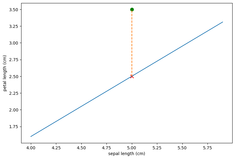
The representation of the iris in this plotting system is
shown as the green dot. Since the redpoints all fall below our lone and
iris falls above it we would classify as a non-red
class iris. Also shown (as a red X) is what the petal of length of
would have to be for it to fall directly in the line.
Here is that point:
xPrime,yHat
(5.0, 2.5)
Basically for any iris with sepal length 5, if it’s petal length is greater than 2.5 we classify it as non-red; if it’s less than 2.5 we classify it as red. The line defines a classification rule.
Moreover we can easily extend the rule to any sepal length. In fact, we
can write a classification rule, using the equation for the line. Let
(x',y') be the point to classify: We want to write a function that
returns True whenever (x',y') falls below the line and False
otherwise.
To do this we’ll the definition of yvec (which determines the
y-coordinates of the blue line in the code above):
yvec = m*xvec+b
To get a point above the line y' to be greater than m * x' + b.
The numerical values of m and b set in the code above are:
m,b
(0.9, -2)
So to classify a point as red, we want the following quantity to be negative:
y' - (.9x' - 2) = y' -.9x' + 2
Taking our example point :
xPrime, yPrime,
(5.0, 3.5)
yPrime - .9* xPrime + 2
1.0
This is positive, which tells us the point falls above the line and should be classified as non-red.
We have just applied a classification rule. Next we write a function that implements our rule.
def is_red (P):
    """
    P is a data point, all 4 attributes.

    Return True if P is red.
    """
    return (P[2] - .9*P[0] + 2) < 0

P = features[-90]
print('P is red: {0}'.format(is_red(P)))
P is red: False
8.3.5. Relationship to regression
How is what we’ve done related to regression, especially linear regression?
Well, first of all, in both the linear regression case and the linear discriminant case, we are using numerical data (a scattering of points) to try to determine a line.
We are defining the line in different ways. In the linear regression case, we looked for the best line to represent the scattering of points we saw. In the linear discrimination case, we are looking for the best line to separate two classes.
Just as it wasn’t always possible to find a line that was a good fit to our scattering of data, so it isn’t always possible separate a scattering of points with a line.
What we’re seeing in the plots above is that, taking the features by pairs, we can’t see a good way to separate all 3 classes.
We’ll validate this intuition in the next section. We’ll use a program that does a kind of linear discrimination; that is, it tries to find linear separations between classes. Instead of using Fisher’s method, which is called Linear Discriminant Analysis (LDA), we’ll use something called Logistic regression, which has become far more popular in many applications. The differences don’t matter for our purposes, but logistic regression is much more likely to be the method of choice in linguistic applications.
Note: Scikit learn does have an implementation of linear discriminant
analysis, should you want to try Fisher’s method. It’s called
LinearDiscriminantAnalysis, and it is in in
sklearn.discriminant_analysis.
8.3.6. Linear classifier results
We’re going to use sklearn to build a linear classifier to to
separate all three classes. We’re first going to use just the sepal
features, to keep it visualizable. We’ll use a type of linear classifier
called a Logistic Regression classifier.
Some code for plotting our results:
from sklearn import linear_model
from sklearn.discriminant_analysis import LinearDiscriminantAnalysis
import numpy as np

def make_meshgrid(x, y, h=.02):
    """Create a mesh of points to plot in

    Parameters
    ----------
    x: data to base x-axis meshgrid on
    y: data to base y-axis meshgrid on
    h: stepsize for meshgrid, optional

    Returns
    -------
    xx, yy : ndarray

    Dont worry too  much about this part of the code.  Meshes
    are a mesh-y topic.  They are the 2D version of aranges.
    xx and yy define a mesh: a rectangular region covering  all of
    the training data X.  xx contains the x coords, yy the y coords.
    xx[0,:] is the x coords of the first row of the rectangle.
    """
    x_min, x_max = x.min() - 1, x.max() + 1
    y_min, y_max = y.min() - 1, y.max() + 1
    xx, yy = np.meshgrid(np.arange(x_min, x_max, h),
                         np.arange(y_min, y_max, h))
    return xx, yy


def show_classifier_separators (clf,X,y,xlabel=None,ylabel=None,title="Classifier separators",
                                figsize=(6,4),s=25, alpha=0.8, h=.02, ax=None,cmap=plt.cm.coolwarm):
    """
    Assuming classifier is trained on X and X is 2D.
    """
    if ax is None:
        fig, ax = plt.subplots(1, 1,figsize=figsize)
    X0, X1 = X[:, 0], X[:, 1]
    xx, yy = make_meshgrid(X0, X1, h=h)
    # Classify ALL the points in the meshgrid
    Z = clf.predict(np.c_[xx.ravel(), yy.ravel()])
    Z = Z.reshape(xx.shape)
    ax.contourf(xx, yy, Z, cmap=cmap, alpha=alpha)
    # Note that the classes y are used as the color and will be interpreted
    # relative to the colormap.
    ax.scatter(X0, X1, c=y, cmap=cmap, s=s, edgecolors='k')
    ax.set_xlim(xx.min(), xx.max())
    ax.set_ylim(yy.min(), yy.max())

    if xlabel is not None:
        ax.set_xlabel(xlabel)
    if ylabel is not None:
        ax.set_ylabel(ylabel)

    # The numbers on the axes generally wont  mean much to us.
    ax.set_xticks(())
    ax.set_yticks(())
    title_obj = ax.set_title(title)
#  Use just the first 2 columns as predictors
#  Why?  So we can draw this!
X = features[:,:2]
Y = target


# we create an instance of a Logistic Regression Classifier.
lin = linear_model.LogisticRegression(C=1e5,solver='lbfgs',multi_class='auto')

# To try Fisher's method. You would need comment out the line above and uncomment this line.
#lin = LinearDiscriminantAnalysis()

# we fit the data.
lin.fit(X, Y)

show_classifier_separators (lin,X,Y,xlabel='Sepal length',ylabel='Sepal width')
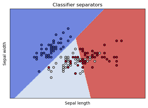
The differently colored regions represent the areas the classifier has reserved for particular classes, and the dots are our training data, colored by species. We see that all our worries are validated. The classifier separates the class in the dark blue region nicely, and has trouble discriminating the points in the lightblue and red regions.
This coloring also makes it clear that it’s not really the classifier’s problem: These two dimensions are insufficient to discriminate the three species. In the light blue and red regions, the light colored dots and the red colored dots are thoroughly intermingled. These are points from our training data, belonging to two different species, but which nearly the same coordinates in these 2 dimensions. In other words, given just the sepal length and sepal width, there is no way to tell these irises species apart.
Can we quantify what’s going on? Certainly.
Here’s how to find out our score.
logreg.coef_
array([[-36.45485413,  30.74790441],
       [ 17.27627094, -15.57630128],
       [ 19.17858319, -15.17160313]])
from sklearn.metrics import accuracy_score
# Rerun prediction on just the training data.
X = features[:,:2]
Y = target
# we create an instance of a Logistic Regression Classifier.
logreg = linear_model.LogisticRegression(C=1e5,solver='lbfgs',multi_class='auto')
logreg.fit(X, Y)
predicted = logreg.predict(X)
# Y has the right answers.
print(f"{accuracy_score(Y,predicted):.1%}")
83.3%
8.3.6.1. We didn’t do very well
Well, we went and cheated by evaluating our score on just the training data, just as we said we shouldn’t do in the Simple Regression notebook, and we still didn’t do very well. Only 80% correct!
Maybe our problem is that we keep using only two features at a time. What if we use all the features at once? Please note how simple the change in following code is.
Let’s use all 4 features. Compare the definition of X used in the cell above.
X = features[:,:2]
X = features
y = target
lin = linear_model.LogisticRegression(C=1e5, solver='lbfgs',multi_class='auto')
#Uncomment to try Fisher's method
#lin = LinearDiscriminantAnalysis()
lin.fit(X, Y)
predicted = lin.predict(X)
accuracy_score(Y,predicted)
0.9866666666666667
Yep, that was our problem. Our accuracy is now 98%!
And so we pause for a moment to take in one of the central lessons of multivariate statistics. Using more variables can help. Bigtime. As we saw in the simple regression notebook, it doesn’t always help; but as long as we’re getting new independent information that isn’t just noise from the new features, it’s worth trying.
We started out essentially asking the question, what linear function of two of these variables can best separate these classes? And we tried all possible systems using two features and didn’t do very well. But then we switched to asking what linear function of all 4 variables can best separate these variables? And we did much better.
So why didn’t we do this to start with? And why did the code get so much simpler?
Second question, first, because the two answers are related. The code got much simpler because we threw out the visualization code. And we threw out the visualization code because we switched to a system that was much harder to visualize. We essentially went from representing our code in 2 dimensions (so that we could plot every point on an the xy plane) to representing it in 4 dimensions. Try and visualize 4 dimensions! Pretty hard. And that’s the answer to the first question. We didn’t do it this way to start with because we wanted something we could visualize, and that proved helpful, because there were insights the visualizations gave us, especially about the red class.
And therein lies one problem with switching to 4 dimensions. We’ve lost our capacity to glean insights from the data, at least with the tools we’ve looked at till now. We don’t really know what relationships got us over the hump in classifying irises.
So lesson number one is that more variables can help. And lesson number two is that there are perils involved in using more variables. Actually we haven’t even scratched the surface of the many perils involved in higher-dimensional data, but we’ve identified an important one. Using more variables makes things more complicated, and that makes it harder to understand what’s going on. At some point we are going to have turn around and explain our results to an audience waiting with baited breath, and you have be very careful when explaining multivariate results. Visualization is a big help at explaining complicated relationships, so losing the ability to visualize is not a small loss, especially since what real life problems often involve is not yes/no classifications, but insight. More on the problem of visualizing higher-dimensional data later in the course.
In the meantime, to try to recover a little insight into what is going on with a completely visualizable representation of the iris data, have a look at the appendix.
8.3.7. Evaluating a classifier: General ideas
There is a problem in what we’ve done so far. The classifier is doing a good job at identifying species, but what if it’s succeeding by identifying accidental features of particular irises? In other words, suppose it’s learning something like this: An iris with these measurements:
X[0,:]
array([5.1, 3.5, 1.4, 0.2])
belongs to species 0?
target[0]
0
We know it’s not doing exactly that because we’ve restricted it to a linear model, but the general form of the worry remains. In general, after training a classifier, we want to know how well it’s done at learning useful generalizations about the class or classes of interest, and we can’t really evaluate how well a classifier has learned the generalizations that distinguish iris species until we test it on data it hasn’t seen during training.
8.3.8. Training/test split
That leads us to the idea of a training/test split. Let’s re-evaluate our 4-feature classifier by training it on part of the data and testing it on entirely unseen data; scikit learn makes this pretty easy:
from sklearn.model_selection import train_test_split

X_train, X_test, y_train, y_test = train_test_split(X, y, test_size=.2, random_state=47)
lin = linear_model.LogisticRegression(C=1e5, solver='liblinear',multi_class='auto')
#Uncomment to try Fisher's method
#lin = LinearDiscriminantAnalysis()
lin.fit(X_train, y_train)
predicted = lin.predict(X_test)

# Evaluate
accuracy_score(y_test,predicted)
0.9333333333333333
The results actually improved!
How is that possible? Well, possibly the test set did not include any of the difficult examples that reduced the score when evaluating on the entire data set.
One way to fix this is to evaluate multiple times; if we remove the random state argument, each time we execute the training/test split we get a different random split of the entire data set into training and test subsets. So let’s do that multiple times, and train and test multiple times, and look at the results:
for i in range(10):

    X_train, X_test, y_train, y_test = train_test_split(X, y, test_size=.2)
    lin = linear_model.LogisticRegression(C=1e5, solver='liblinear',multi_class='auto')
    lin.fit(X_train, y_train)
    predicted = lin.predict(X_test)

    # Evaluate
    print(f"{accuracy_score(y_test,predicted):>6.1%}",
          )
 86.7%
 90.0%
 96.7%
 93.3%
100.0%
100.0%
 90.0%
100.0%
 96.7%
 93.3%
On the assignment you may be asked to do a training test split when
evaluating a classifier. That means you should use scikit learn’s
train_test_split function called in line 3 of the code above. If
asked to do multiple train/test splits, you should write a loop like the
one above that does a complete evaluation in the body of the loop, so
that multiple train/test splits are evaluated.
Ultimately, of course, you will want to boil the results down to single numbers for each evaluation measure. That means computing the average accuracy over the 10 runs, and the average precision and recall, when using those evaluation measures. That has not been done here.
8.3.9. PCA as classifier
Here is a different version of the same picture we drew in Section 3 of this notebook, the Iris data projected onto its first two dimensions:
from sklearn.datasets import load_iris
import matplotlib.pyplot as plt
from sklearn import linear_model
from sklearn.svm import LinearSVC

data = load_iris()
X = data['data']
feature_names = data['feature_names']
y = data['target']
fig, ax = plt.subplots(1, 1, figsize=(6, 4))
ax.scatter(X[:, 0], X[:, 1], c=y,
       s=30, cmap=plt.cm.coolwarm)
<matplotlib.collections.PathCollection at 0x7fa501052e90>
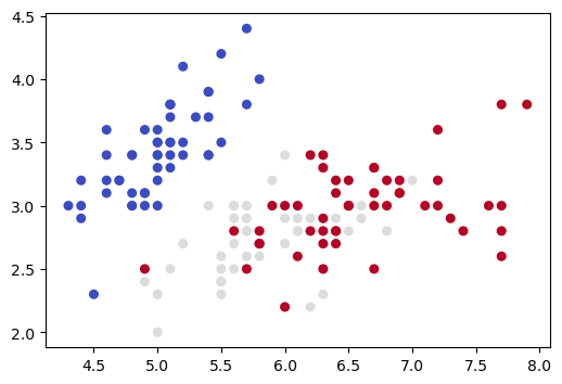
Now we apply PCA dimensionality reduction, yielding another 2D representation, and draw a picture of that.
from sklearn import decomposition as dec

reducer = dec.PCA(n_components=2)
X_reduced = reducer.fit_transform(X)

fig, ax = plt.subplots(1, 1, figsize=(6, 4))
ax.scatter(X_reduced[:, 0], X_reduced[:, 1], c=y,
       s=30, cmap=plt.cm.coolwarm)
<matplotlib.collections.PathCollection at 0x7fa5010020b0>
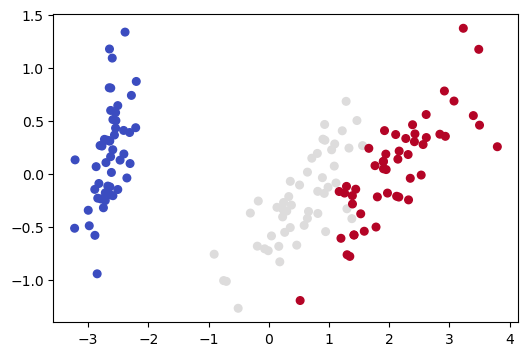
Note that this 2D picture looks quite different from the previous 2D picture (and the other pictures we drew in Section 3 of this notebook).
The previous 2D picture only uses information from 2 of the 4 dimensions, so what it represents is a projection of the 4D data into 2 of the given dimensions. As we saw in Section 3 of this notebook, the distance relationships for our 4D data can change dramatically depending on which 2D projection we use.
What distinguishes the PCA representation is that it is not a projection onto previously existing axes. Instead we have created two new orthogonal axes which define a new latent space and do the the best job of explaining the variance. The picture above is drawn in the latent space.
Note the data in the latent space won’t always heighten the contrast between classes. PCA loses information and, since it is trained without labels, it has no way of knowing which information is relevant to a particular classififcation task. But it is worth trying with when little information is lost and there is good reason to suspect the classes are linearly separable.
Now what shall we do next?
Build a classifier, of course, using our “Principled” 2D representation.
Note: This is not a new classification method. We’re using the same same classifier we used before, just training it on a different representation of the data.
lin_pca = linear_model.LogisticRegression(C=1e5, solver='lbfgs',multi_class='auto')
lin_pca.fit(X_reduced, y)
predicted = lin_pca.predict(X_reduced)
accuracy_score(y,predicted)
0.9733333333333334
So based on this evaluation over all the training data, the accuracy is not quite as good as our full 4-feature model but still a lot better than the 83.3% accuracy we got with the 2-feature model in Section 6 of this notebook, where we trained a classifer on the first two columns of the data (for a fuller picture, computing correct evaluation results for all 6 2-feature projections, follow the instructions in the assignment notebook).
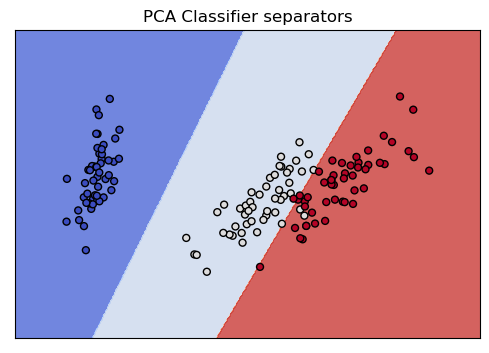
Here is the same kind of picture we drew for the Section 6 classifier. With that 2D representation, we saw two of the classes were thoroughly intermingled. With the PCA 2D representation, in contrast, as we just saw, the classes have a great deal of separation, and this picture shows how easily the classifier finds linear separators that partition all three classes, which is what lies behind its 97% accuracy score.
cmap= plt.cm.coolwarm
show_classifier_separators (lin_pca,X_reduced,y,title="PCA Classifier separators",cmap=cmap)
Let’s confirm this preliminary PCA result using multiple train/test runs:
from sklearn.model_selection import train_test_split

def multiple_runs_reducer(X,y,num_runs,reducer):
    accs = np.zeros(num_runs)
    for i in range(num_runs):
        X_train, X_test, y_train, y_test = train_test_split(X, y, test_size=.2,random_state=i)
        #reducer = dec.PCA(n_components=2)
        X_train_reduced = reducer.fit_transform(X_train)
        # Use the transform method of the trained reducer on the test data
        # No fitting allowed on test data
        X_test_reduced = reducer.transform(X_test)
        lin = linear_model.LogisticRegression(C=1e5, solver='liblinear',multi_class='auto')
        lin.fit(X_train_reduced, y_train)
        predicted = lin.predict(X_test_reduced)
        acc = accuracy_score(y_test,predicted)
        accs[i] = acc
        # Evaluate
        print(f"{acc:>6.1%}")
    return accs


accs_pca = multiple_runs_reducer(X,y,10,reducer=dec.PCA(n_components=2))
63.3%
76.7%
80.0%
80.0%
83.3%
83.3%
83.3%
63.3%
66.7%
93.3%
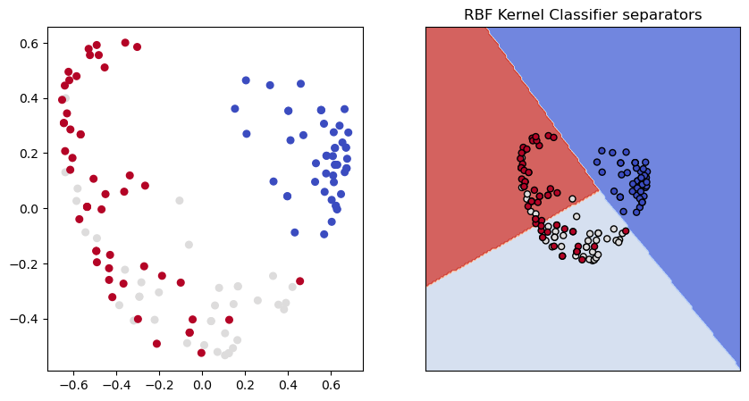
Just for fun here’s another dimensionality reduction technique, kernel reduction using an RBF kernel.
For this one, if you want to be able to invert the transformation, you have to sign up for that from the outset:
ker_reducer = dec.KernelPCA(kernel='rbf',n_components=2,fit_inverse_transform=True)
X_ker = ker_reducer.fit_transform(X)
lin_ker = linear_model.LogisticRegression(C=1e5, solver='liblinear',multi_class='auto')
lin_ker.fit(X_ker, y)
(fig, (ax1,ax2)) = plt.subplots(1,2,figsize=(10,5))
cmap=plt.cm.coolwarm
#fig, ax = plt.subplots(1, 1, figsize=(6, 4))
ax1.scatter(X_ker[:, 0], X_ker[:, 1], c=y, s=30, cmap=cmap)
show_classifier_separators (lin_ker,X_ker,y,title="RBF Kernel Classifier separators",ax=ax2,cmap=cmap)
accs_rbf = multiple_runs_reducer(X,y,10,reducer=dec.KernelPCA(kernel='rbf'))
60.0%
66.7%
73.3%
80.0%
80.0%
80.0%
80.0%
60.0%
63.3%
90.0%
Not bad! So the RBF kernel reduction is quite competitive with PCA reduction in the classification task. To quantify the difference of course you would want to take the mean of the accuracies over the 10 train/test splits. That’s not done here, but will arise in the assignment.
Despite the good classifier performance, the RBF reduction certainly looks like a very different picture of the data from the PCA model. Perhaps more information was lost?
import scipy

def information_lost(X, X_reduced, transformer):
    """
    Meaasure the amount of information lost by the transformer.

    Reverse the transformation and look at the difference matrix gotten
    by subtracting X_reduced reverse-transformed from X. In the ideal
    case of no information lost this difference should be 0.

    Compare the frobenius norm  (a kind of length
    measure for matrices) of the difference matrix to the frobenius norm of X.
    """
    return scipy.linalg.norm(X - transformer.inverse_transform(X_reduced),ord="fro")

information_lost(X, X_ker, ker_reducer)
4.3295474702388805
Yes, but not much more. Way better than our two random axes. The RBF reducer reverse transforms almost as well as the PCA reducer does.
A final note on PCA. Using PCA to aid with classification tasks is a classic application. In doing that, we are usually less interested in the component vectors themselves than in how well the representations they produce perform in the classification task. Obviously, as suggested by the pictures above, visualization is another application of that sort. A third example would be Principle Component Regression (PCR), where regression is done on the principle components instead of the original variables to help with issues like multicollinearity.
In other applications of PCA, such as financial analysis, the weights in the component vectors themselves may be of interest, because they help us take further analytical steps to find predictive patterns in the original data.
8.3.10. Classification example: Recognizing adjectives
This appendix is an end to end example of training and evaluating a classifier, from collecting and preparing data to training the classifier to evaluating it.
The succeeding appendices continue continue to use this example, discussing various ways to evaluate classifiers.
We train a classifier to recognize adjectives just by their word shape, inspired by little word clusters like the following:
curious
odious
ruinous
heinous
or
possible
miserable
doable
bankable
visible
or
baggy
squishy
funky
briny
spikey
or
salient
extant
constant
divergent
urgent
important
Our goal is to build a classifier that can recognize a word as an adjective without ever having seen it before.
The idea is that there are recognizable patterns in the word shapes of adjectives, and this example demonstrates that some very simple models can learn them.
We will need to train our classifier on a large word set, and test it on unseen words.
from sklearn.feature_extraction.text import CountVectorizer,TfidfVectorizer
from sklearn.model_selection import train_test_split
from sklearn.naive_bayes import MultinomialNB
from sklearn.linear_model import RidgeClassifier
from sklearn.linear_model import LogisticRegression
from sklearn.linear_model import PassiveAggressiveClassifier
from sklearn.metrics import recall_score, precision_score
from sklearn.metrics import accuracy_score
from sklearn.metrics import f1_score
from sklearn.metrics import confusion_matrix
import numpy as np
import pandas as pd
Import some word data containing part of speech information:
Adam Kilgariff’s British National Corpus (BNC) word list, which is tagged with parts of speech.
fn="https://www.kilgarriff.co.uk/BNClists/all.num.o5"
#word_df = pd.read_csv(fn,index_col=1,sep=" ", names=["Freq","POS", "DocFreq"])
word_df = pd.read_csv(fn,sep=" ", names=["Freq","Word", "POS", "DocFreq"])
punct = "?+_!.@$%^&*()=[]{}#<>`~'\",/\|~:;"
digits = "01234567890"


def isword (wd):
    """
    Let's filter out a host of nonwords.
    """
    if not isinstance(wd,str):
        return False
    if wd.startswith("-"):
        return False
    for char in punct:
        if char in wd:
            return False
    for char in digits:
        if char in wd:
            return False
    return True

print(len(word_df))
word_df = word_df[word_df["Word"].apply(isword)]
#ni = word_df.index.intersection([wd for wd in word_df.index if isword(wd)])
print(len(word_df))
#word_df = word_df.loc[ni]
#print(len(word_df))
208657
190245
# word_df is already sorted by freq.
# By default Drop duplicate keep the first entry, meaning the most frequent
# pos entry
word_df_filtered  = word_df.drop_duplicates(subset=['Word'])
len(word_df),len(word_df_filtered)
(190245, 113982)
With dupes removed this will be convenient
word_df_filtered = word_df_filtered.set_index("Word")
Compare original and filtered dfs.
word_df[word_df["Word"]=="right"]
| Freq | Word | POS | DocFreq | |
|---|---|---|---|---|
| 277 | 31638 | right | av0 | 2785 |
| 398 | 22835 | right | aj0 | 2758 |
| 792 | 11946 | right | aj0-nn1 | 2390 |
| 965 | 9981 | right | nn1 | 2255 |
| 1811 | 5645 | right | aj0-av0 | 1599 |
| 3348 | 2952 | right | nn0 | 1301 |
| 3775 | 2562 | right | itj | 632 |
| 47219 | 72 | right | np0 | 34 |
word_df_filtered.loc["right"]
Freq       31638
POS          av0
DocFreq     2785
Name: right, dtype: object
Separate adjectives from non adjctives
adj_pos_list = ["aj0",'ajc','ajs']
adj_bool = word_df_filtered["POS"].isin(adj_pos_list)
adj_vocab = list(word_df_filtered[adj_bool].index)
adj_vocab = [(a,1) for a in adj_vocab if isword(a)]
other_vocab = list(word_df_filtered[~adj_bool].index)
other_vocab = [(x,0) for x in other_vocab if isword(x)]
len(adj_vocab),len(other_vocab)
(16844, 97138)
adj_vocab[:15]
[('other', 1),
 ('new', 1),
 ('good', 1),
 ('old', 1),
 ('different', 1),
 ('local', 1),
 ('small', 1),
 ('great', 1),
 ('social', 1),
 ('important', 1),
 ('national', 1),
 ('british', 1),
 ('possible', 1),
 ('large', 1),
 ('young', 1)]
other_vocab[:15]
[('the', 0),
 ('of', 0),
 ('and', 0),
 ('a', 0),
 ('in', 0),
 ('to', 0),
 ('it', 0),
 ('is', 0),
 ('was', 0),
 ('i', 0),
 ('for', 0),
 ('you', 0),
 ('he', 0),
 ('be', 0),
 ('with', 0)]
8.3.10.1. Represent the data numerically
# CountVectorizer:  Read the CountVectorizer docs to learn about the diff between analyzer char and char_wb.
# As an example, with bigram features: analyzer char_wb given "Mark" will yield "k "
# as a feat and for analyzer char the corresponding feature will be "k".  Essentially
# char_wb pads peripheral chars, thereby introducing word boundary information.
# Since feat "a " means "a" as the last letter, this representation allows the clf to learn
# last letter "a" as a part-of-speech cue.

#cv = CountVectorizer(ngram_range=(1,2),analyzer='char_wb')
#cv = CountVectorizer(ngram_range=(2,3),analyzer='char_wb')
cv = CountVectorizer(ngram_range=(2,4),analyzer='char_wb')
#cv = TfidfVectorizer(ngram_range=(2,4),analyzer='char_wb')

data = adj_vocab + other_vocab
# A sequence of strings; a sequence of labels
words, tags = zip(*data)

X_train, X_test, y_train, y_test = \
  train_test_split(words, tags, test_size=0.05, random_state=42)

##  Train it to learn a fixed set of features
X_train_m = cv.fit_transform(X_train)

## Now useonly those features on the test set (no more fitting)
X_test_m = cv.transform(X_test)
The count vectorizer after training:
len(cv.get_feature_names_out())
78696
Some sample features:
for ft in cv.get_feature_names_out()[2000:2005]:
    print(ft)
fhi
fhs
fi
fi
fia
We show the feature names and feature values for the word "alfalfa":
from collections import Counter

idx2wd = cv.get_feature_names_out()

def get_word_features(wd,ct_dict=False):
    m = cv.transform([wd])
    w_vec = np.array(m.todense()[0,:][0])[0]
    feats = w_vec.argsort()
    i = -1
    # after this loop, i is the number of feats turned on.
    while w_vec[feats[i]]:
        i-=1
    if ct_dict:
        return {idx2wd[ft]:w_vec[ft] for ft in feats[i+1:]}
    else:
        return sorted(idx2wd[feats[i+1:]])
get_word_features("alfalfa",ct_dict=True)
{'lfal': 1,
 'a ': 1,
 'lfa ': 1,
 ' a': 1,
 ' alf': 1,
 'fal': 1,
 'fa ': 1,
 'falf': 1,
 ' al': 1,
 'lfa': 2,
 'al': 2,
 'alfa': 2,
 'fa': 2,
 'alf': 2,
 'lf': 2}
The training set (X_train) has this many “documents” (= words).
len(X_train)
108282
The transformed document set (X_train_m) is a 2D numpy array:
num_training_words x num_features.
X_train_m.shape
(108282, 78696)
The first “document” (=word):
X_train_array = X_train_m.todense()
first_doc=X_train_array[0,:]
first_doc.max(),first_doc.min()
(1, 0)
How many “features” (out of the 78K features) are turned on in the first document?
first_doc.sum()
21
#clf = MultinomialNB()
#clf = RidgeClassifier()
clf = LogisticRegression(solver='liblinear')
clf.fit(X_train_m, y_train)

# Test
y_predicted = clf.predict(X_test_m)

# Optional but convenient below
y_test = np.array(y_test)
accuracy_score(y_predicted,y_test)
0.9329824561403509
This Accuracy score is not as impressive as it looks at first.
Note the percentage of non adjectives is:
1- (sum(y_train)/len(y_train))
0.8524131434587466
And slightly lower in the test set:
1- sum(y_test)/len(y_test)
0.8485964912280701
which means one can acheive an accuracy of nearly 85% by always guessing nonAdj.
The following principle is quite general:
Accuracy is an unreliable measure of classifier performance when the classes are unbalanced.
Our classes are unbalanced here because only about 15% of the words are adjectives. A somewhat more informative evaluation is the following informal one, which cherry picks a number of tricky and not so tricky words from the test set.
endings = ["ous","est","y","ant","ous","ary"]

def has_a_ending (wd):
    if wd.endswith("ly"):
        return False
    for ed in endings:
        if wd.endswith(ed):
            return True
    return False

#ticklers = ['onerous','wettest', 'disinterest','salient', 'farmable','kinky','exultant','sextant','plangent',
#           "mucous","resurgent"]
#check = [x for x in X_test if x not in X_train]
#len(check),len(X_test)  Check!

# Not so tricky.  Has known adj ending and is an adj
interesting_test_0 = [x  for (i,x) in enumerate(X_test) if has_a_ending(x) and y_test[i]==1]
# tricky.  Has known adj ending and is not an adj
interesting_test_1 = [x  for (i,x) in enumerate(X_test) if has_a_ending(x) and y_test[i]==0]
test2 = cv.transform(interesting_test_0[:25])
test3 = cv.transform(interesting_test_0[:25])
ps2 = clf.predict(test2)
ps3 = clf.predict(test3)
print(accuracy_score(ps2,[True for i in range(25)]))
print(accuracy_score(ps3,[False for i in range(25)]))
0.6
0.4
Here are the ones we got wrong on each test:
[interesting_test_0[i] for i in range(25) if ps2[i]==0]
['migrant',
 'comfy',
 'breezy',
 'sorry',
 'mercenary',
 'biliary',
 'nosy',
 'praiseworthy',
 'antislavery',
 'itinerant']
[interesting_test_1[i] for i in range(25) if ps3[i]==1]
['shklovsky',
 'palaeontology',
 'oadby',
 'bramley',
 'farrant',
 'contaminant',
 'west',
 'serfaty',
 'rheumatology',
 'two-fifty',
 'scientology',
 'lansley',
 'jed-forest',
 'myelography',
 'covey']
8.3.11. Accuracy, Precision, and Recall
This next section takes the first few steps toward evaluatng a classifier a little more seriously. It uses some standard evaluation metrics for classifier output. The evaluation metrics defined are precision, recall, and accuracy. Call the examples the system predicts to be positive (whether correctly or not) ppos and and the examples it predicts to be negative pneg; consider the following performance on 100 examples:
![\begin{array}[t]{ccc} & pos &neg\\ ppos& 31 & 5\\ pneg & 14 & 50 \end{array}](../../../_images/math/4780da88c7e212e10e0ca5693477391899f77059.png)
This kind of breakdown of a classier’s performance on test data is called a confusion matrix. In a 2-class confusion matrix, a classifier’s results are sorted into 4 groups:
![\begin{array}[t]{ccc} & pos &neg\\ ppos& tp & fp\\ pneg & fn & tn \end{array}](../../../_images/math/999e3226c462df22818f5b70645ab81a1c6adc14.png)
The  and
and  examples (true positive and true negative)
are those the system labeled correctly, while
examples (true positive and true negative)
are those the system labeled correctly, while  and
and  (false positive and false negative) are those labeled incorrectly. Let N
stand for the total number of examples, 100 in our case.
(false positive and false negative) are those labeled incorrectly. Let N
stand for the total number of examples, 100 in our case.
The three most important measures of system performance are:
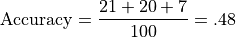
Accuracy: Accuracy is the percentage of correctly classified examples out of the total corpus
This is .81 in our case.
Precision: Precision is the percentage of true positives out of all positive predictions the system made
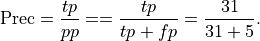
This is .86 in our case. Precision is sometimes called positive predictive value.
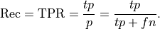
Recall: Recall is the percentage of the actual positives that were identified by the system (often called the True Positive Rate):
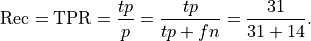
This is .69 in our case. Recall is sometimes called sensitivity or hit rate. It can be described as the probability that a relevant instance will be tagged as relevant.
A major motivation for defining Precision and Recall is that they give us useful measures of classifier performance when the data is unbalanced, as it is for adjetive recognition.
Precision and Recall were just defined with respect to the positive class; they can just as usefully be defined for the negative class. Precision for the negative class means: what proportion of the time that the system predicts something to be negative is it truly negative. That is:
Precision for Negative class: Precision for the negative class is the percentage of true negatives out of all negative predictions the system made
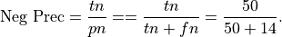
This is .78 in our case. Precision for the negative class is sometimes called negative predictive value.
Recall for the Negative class: Recall for the negative class is the percentage of the total number of negatives that were identified by the system:
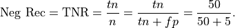
This is .91 in our case. Recall for the negative class can be described as the probability that a negative instance will be tagged as negative.
There are also important evaluation metrics that measure how bad a system is (higher is worse):
False Negative Rate:

False Positive Rate (used in computing AUC score below)

Finally, accuracy, precision and recall can all be defined meaningfully in a multiclass setting (like the 3-class problem posed by the iris data). Accuracy is still the number right divided by the total number of examples; for precision and recall, there are 3 different recall scores and 3 different precision scores. It simply needs to be made clear which class precision and recall are being measured for, as we did, for example, when we defined precision for the negative class.
Here for illustration purposes is an example of a 3-class confusion matrix:
![\begin{array}[t]{cccc}
& \text{Class A} & \text{Class B}& \text{Class C}\\
\text{predicted A} & 21 & 5 & 10 \\
\text{predicted B} & 9 & 20 & 13 \\
\text{predicted C} & 5 & 10 & 7 \\
\end{array}](../../../_images/math/8ceffa94d5ced5c3065cc0fac10b63a86c8f9afb.png)
The Accuracy of this system is the number correct divided by the total number of examples:
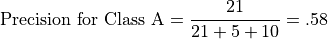
Let’s illustrate class-relative precison and accuracy with respect to Class A. For example, precision for Class A is the number of correct predictions for Class A divided by the total number of class A predictions:
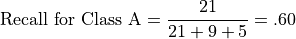
Recall for Class A is the number of correct predictions for Class A divided by the total number of class A instances:
from sklearn.metrics import precision_score, accuracy_score, f1_score

# Eval metrics
precision_a = precision_score(y_test,y_predicted)
recall_a = recall_score(y_test,y_predicted)
precision_o = precision_score(y_test,y_predicted,pos_label=0)
recall_o = recall_score(y_test,y_predicted,pos_label=0)

print(f"Precision(adj): {precision_a:.2f} Recall(adj): {recall_a:.2f}")
print(f"Precision(non): {precision_o:.2f} Recall(non): {recall_o:.2f}")
Precision(adj): 0.83 Recall(adj): 0.70
Precision(non): 0.95 Recall(non): 0.97
Multinomial NB
Precision(adj): 0.58 Recall(adj): 0.61
Precision(non): 0.95 Recall(non): 0.94
Ridge
Precision(adj): 0.71 Recall(adj): 0.62
Precision(non): 0.95 Recall(non): 0.96
Log. Regr:
Precision(adj): 0.83 Recall(adj): 0.70
Precision(non): 0.95 Recall(non): 0.97
Using the results from Logistic Regression:
###         | ppos    pneg
### ------------------------------
###   pos   |  tp       fn
###   neg   |  fp       tn

#array([[ 182,  122],
#     [  56, 2140]])

cm = confusion_matrix(y_test,y_predicted,labels=[1,0])
cm
array([[ 605,  258],
       [ 124, 4713]])
Display can be facilitated using pandas, with color optionally added (you may need to re-execute the code cell below to get the colors to display properly).
import pandas as pd
cm_df = pd.DataFrame(cm,columns = ('ppos','pneg'),index=('pos','neg'))
cm_df.style.background_gradient(cmap='Blues')
| ppos | pneg | |
|---|---|---|
| pos | 605 | 258 |
| neg | 124 | 4713 |
Also of use are the two normalized confusion matrices:
Normalizing by row, so is the value in the pos row,ppos column recall or precision?

What percentage of the positives did we predict to be positive.
605/(605+258)
0.7010428736964078
cm_n = confusion_matrix(y_test,y_predicted,normalize='true',labels=[1,0])
cm_n_df = pd.DataFrame(cm_n,columns = ('ppos','pneg'),index=('pos','neg'))
#cmap=plt.cm.Blues,
cm_n_df.style.background_gradient(cmap='Blues')
| ppos | pneg | |
|---|---|---|
| pos | 0.701043 | 0.298957 |
| neg | 0.025636 | 0.974364 |
Normalizing by column, so is the value in the pos row,ppos columm recall or precision?

What percentage of our positive predictions were true positives?
605/(605+124)
0.8299039780521262
This of course is precision.
from sklearn.metrics import confusion_matrix
cm_n = confusion_matrix(y_test,y_predicted,normalize='pred',labels=[1,0])
cm_n_df = pd.DataFrame(cm_n,columns = ('ppos','pneg'),index=('pos','neg'))
cm_n_df.style.background_gradient(cmap='Blues')
---------------------------------------------------------------------------

NameError                                 Traceback (most recent call last)

/var/folders/w9/bx4mylnd27g_kqqgn5hrn2x40000gr/T/ipykernel_10845/1396409437.py in <module>
----> 1 cm_n = confusion_matrix(y_test,y_predicted,normalize='pred',labels=[1,0])
      2 cm_n_df = pd.DataFrame(cm_n,columns = ('ppos','pneg'),index=('pos','neg'))
      3 cm_n_df.style.background_gradient(cmap='Blues')


NameError: name 'confusion_matrix' is not defined
8.3.12. Precision-Recall Trade-off: Adjective Example
The classifier we’ve been mostly using up till now, Logistic Regression, is a probabilistic classifier. That means it makes all its classification decisions by assigning a probability for each class to each test instance.
The default decision rule for logistic regression: if the
probability of the positive class is greater than .5 for test instance
 , classify as positive.
We call .5 the discrimination threshhold value or just the threshhold value
We illustrate the idea using our adjective classifier. Here are the probabilities for 10 est examples:
##  Set print to ffloat format precision = 3
np.set_printoptions(precision=3)
np.set_printoptions(suppress=True)

y_prob = clf.predict_proba(X_test_m)
y_prob[40:50,1]
array([0.052, 0.001, 0.019, 0.001, 0.   , 0.976, 0.   , 0.504, 0.   ,
       0.857])
And here are the corresponding classifications (the 3 cases with probabilities greater than .5 have been classified as adjectives).
y_predicted = clf.predict(X_test_m)
y_predicted[40:50]
array([0, 0, 0, 0, 0, 1, 0, 1, 0, 1])
Now let’s try implementing a new decision rule. We’ll lower the discrimination threshhold.
def predict_with_prob_threshhold(clf, threshhold=.5):
    y_prob = clf.predict_proba(X_test_m)
    return y_prob[:,1] >= threshhold
If we lower the threshhold to .4, more instances classified as positive.
y_predicted1 = predict_with_prob_threshhold(clf, threshhold=.4)

print(y_predicted.sum(), y_predicted1.sum())
print(y_predicted1.sum() - y_predicted.sum())
729 814
85
With the default threshhold, 729 instances are classified as adjectives; with the lowered threshhold 814 test words are declared adjectives, a difference of 85.
So the number of instances classified as positive went up.
With more instances classified as positive, what happens to recall (true positive rate)?
Recall
a. must go up.
b. may go up.
c. must remain the same.
d. must go down.
e. may go down.
Answer below
The answer is [b]; recall may go up.
The denominator is going to remain constant (we didn’t change
y_test); the numerator can’t go down (all the previous positive
predictions remained positive, so [d] and [e] are out), but it might go
up, since we might hit on a few more true positives as we’re letting
more positives in. Since the numerator might go up, recall might go up,
so [a] AND [c] are out.
What happens to recall for the adjective classifier when we lower the threshhold?
recall1_a = recall_score(y_test,y_predicted1)

print(f"Recall(adj): {recall_a:.2f}; Recall with .4 threshhold: {recall1_a:.2f}")
Recall(adj): 0.60; Recall with .4 threshhold: 0.65
It goes up, even though it didn’t have to. That means we lowered the trheshhold enough to let some new true positives in.
What happens to precision in general when the threshhold is lowered?
We’re very likely to change  ; that could involve increasing
but in general there will also be a risk of increasing
, so both the numerator and denominator could increase.
; that could involve increasing
but in general there will also be a risk of increasing
, so both the numerator and denominator could increase.
The change in precision depends on the specific numbers, and very specifically on how much the false positive rate goes up.
In our system
# Original scores
precision_a = precision_score(y_test,y_predicted)
recall_a = recall_score(y_test,y_predicted)

print(f"Precision(adj): {precision_a:.2f} Recall(adj): {recall_a:.2f}")
Precision(adj): 0.83 Recall(adj): 0.70
precision1_a = precision_score(y_test,y_predicted1)
recall1_a = recall_score(y_test,y_predicted1)
precision1_a = precision_score(y_test,y_predicted1)
print(f"Precision(adj): {precision_a:.2f}; Precision with .4 threshhold: {precision1_a:.2f}")
Precision(adj): 0.83; Precision with .4 threshhold: 0.79
So precision went down.
Let’s look at different hypothetical cases:
No fp increase (every additional pp is a tp)  Precision goes up:
1/4, 2/5,3/6,4/7
(0.25, 0.4, 0.5, 0.5714285714285714)
But mostly this is what happens. We gain tps at the cost of more fps. Precision goes down.
1/4, 2/8,2/9,2/10
(0.25, 0.25, 0.2222222222222222, 0.2)
Mathematically, precision may go up, may stay the same, or may go down as the threshhold lowers, but in practice, lowering the threshhold will sooner or later run out of true positives, and as the number of false positives increases with little or no increase in true positives, precision goes down.
In the plot below we plot the effect of changing the probability threshhold for both precision and recall on our adjective classifier.
The picture produced is a classic case of the precision recall trade-off: in general as we lower the threshhold for being called an adjective, reacll will increase and precision will go down.
def precision_recall_tradeoff(add_f1_score=False,figsize=(7,4),verbose=False):
    threshholds = np.linspace(0.01, .90, 100)
    predictions = np.array([predict_with_prob_threshhold(clf, threshhold=threshhold)
                            for threshhold in threshholds])
    if verbose:
        print(y_test.shape)
    # E.G., 100 threshhold values, 5700 predictions for each
    if verbose:
        print(predictions.shape)
    prec_scores =\
        np.apply_along_axis(lambda y_pred:precision_score(y_test, y_pred), 1, predictions)
    rec_scores =\
        np.apply_along_axis(lambda y_pred:recall_score(y_test, y_pred), 1, predictions)
    fig, ax = plt.subplots(1,1,figsize=figsize)
    ax.plot(threshholds, prec_scores, label="precision")
    ax.plot(threshholds, rec_scores, label="recall")
    if add_f1_score:
        f1_scores= np.apply_along_axis(lambda y_pred:f1_score(y_test, y_pred), 1, predictions)
        ax.plot(threshholds, f1_scores, label="f1")
        f1_str = "F1 score"
    else:
        f1_str = ""
    ax.set_title(f"Precision Recall {f1_str} for Adj Detection")
    ax.set_xlabel("P-threshhold")
    plt.legend(loc="lower center")
precision_recall_tradeoff(verbose=True)
(5700,)
(100, 5700)
8.3.13. F1-Score: A single number combining precision and recall
The picture above is captioned “Precision Recall Tradeoff”, the idea
being that we can increase precision at the expense of recall, or vice
versa. From this viewpoint classifier performance is inherently two
dimensional. We decide which dimension we want to favor based on the
application, and optimize that, or we decide both are equally important.
If we believe that, then it’s possible to combine the two into a single
score which is penalized whenever either precision or recall suffers,
and which is at its maximum at the crossing point in the picture above.
The most natural way to define such a combined score is called
f1_score, which is the harmonic mean of precision and recall
(harmonic means are appropriate for taking averages of rates).
Adding that to our picture, we get the green arch, which peaks at the point which best honors both precision and recall. For our classifier that’s achieved by setting the probability threshhold to around .35.
precision_recall_tradeoff(add_f1_score=True)
8.3.14. Appendix C: AUC score
We are going to try take advantage of the following idea. Lowering the threshhold increases the number of positive predictions. In general, more true positives comes only at the cost of more false positives. But the lower the cost for a given number of true positives, the better the classifier. Of course a classifier may perform poorly at low threshholds and then make up for that at high threshholds, so we want a methodology that lets us look at the entire range of threshholds. This leads us to something called AUC score. AUC stands for area under the curve.
In this section we’ll do some comparisons between systems. So let’s start out by defining the plotting function we need and a dictionary containing instances of various classifier types.
import matplotlib.pyplot as plt
from sklearn.metrics import RocCurveDisplay
from sklearn.metrics import roc_auc_score
from sklearn.model_selection import train_test_split
from sklearn.naive_bayes import MultinomialNB
from sklearn.linear_model import RidgeClassifier
from sklearn.linear_model import LogisticRegression
from sklearn.linear_model import PassiveAggressiveClassifier
from sklearn.metrics import accuracy_score,recall_score, precision_score,f1_score
#from sklearn.metrics import accuracy_score
#from sklearn.metrics import f1_score
from sklearn.metrics import confusion_matrix
import numpy as np
import pandas as pd

clfs = {"Logistic Regression": LogisticRegression(solver='liblinear'),
        "Ridge Classifier":   RidgeClassifier(solver='sparse_cg'),
        "Multinomial NB" : MultinomialNB(),
        #"Passive Aggressive Classifier": PassiveAggressiveClassifier(loss="squared_hinge")
        "Passive Aggressive Classifier": PassiveAggressiveClassifier(loss="hinge")
       }


class_of_interest, pos_lbl = 'Adj',1

def do_auc_plot (classifier, y_test, y_scores, pos_lbl, class_of_interest, color="darkorange"):

    RocCurveDisplay.from_predictions(
        y_test,
        y_scores, # probs for the class of interest
        name=f"{class_of_interest}",
        color=color
    )
    plt.plot([0, 1], [0, 1], "k--", label="chance level (AUC = 0.5)")
    plt.axis("square")
    plt.xlabel("False Positive Rate")
    plt.ylabel("True Positive Rate")
    #score_str = f"AUC: {roc_auc_score(y_test, y_scores_1D):.3f}"
    #plt.title(f"ROC curve {clf_name}: {score_str}")
    plt.title(f"ROC curve {clf_name}")
    plt.legend()
Initialize the dictionary that will hold our evaluation results.
auc_scores = {clf:0 for clf in clfs.keys()}
For purposes of this discussion, let’s call recall by the other name it has in the literature, the true positive rate (the number of true positives relative to the number of positives). So a true positive rate (or recall) of 1.0 means detecting all the positives that there are out there. Contrasting with that we’ll look at the false positive rate, which is the rate of fale positives relative to the number of negatives. Here lower is good, and more false negatives are okay as long as there are a lot of negatives out there.
To drill down and look at the precision recall trade-off a little more closely we’re going to look at the underlying cause: how increasing the true positive rate affects the false positive rate.
In particular, we’ll look at what’s called the ROC. ROC stands for Receiver Operating Characteristic (understanding the name involves a little historical context we’ll skip for now).
ROC is a classifier-specific function which returns the true positive
rate  a classifier achieves for any given level of false
positive rate (FPR)
a classifier achieves for any given level of false
positive rate (FPR)  . Generally, adjusting the threshhold to
tolerate a higher level of earns a higher rate of
. Generally, adjusting the threshhold to
tolerate a higher level of earns a higher rate of  in
return, so plotting the function, we get something like the plot below,
which arcs above the line
in
return, so plotting the function, we get something like the plot below,
which arcs above the line  , which has also been drawn. The
plot is for Logistic Regression’s performance on the adjective detection
problem.
, which has also been drawn. The
plot is for Logistic Regression’s performance on the adjective detection
problem.
The line defines random performance. A classifier that can
add one true positive only at the cost of one false positive has no
power to discriminate among the new predicted-positive instances. On the
other hand an FPR of zero, and a TPR of one (the top left corner of the
plot) means perfect recall with perfect precision: ideal performance. In
practice, no classifier acheives that performance; but the closer the
curve of the ROC function gets to passing through that point, the better
the classifier. More mathematically, the greater the area of the
curve under the ROC function, the better the classifier.
-line, which
signals random performance. and
and  , which signals perfect performance.
clf_name = 'Logistic Regression'
classifier = clfs[clf_name]
y_scores = classifier.fit(X_train_m, y_train).predict_proba(X_test_m)[:,1]
#  This gives log probs
#y_scores0 = classifier.fit(X_train_m, y_train).decision_function(X_test_m)#[:,1]
auc_scores[clf_name] = (classifier.predict(X_test_m),roc_auc_score(y_test, y_scores))
do_auc_plot (classifier, y_test, y_scores, 1, 'Adj')
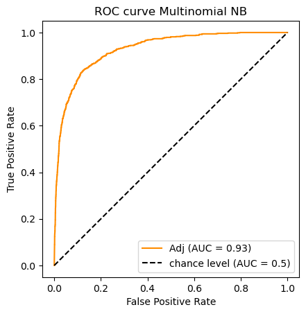
clf_name = 'Multinomial NB'
classifier = clfs[clf_name]
y_scores = classifier.fit(X_train_m, y_train).predict_proba(X_test_m)[:,1]
auc_scores[clf_name] = (classifier.predict(X_test_m),roc_auc_score(y_test, y_scores))
do_auc_plot (classifier, y_test, y_scores, 1, 'Adj')
Note that not all classifiers are probability-based; therefore not all
will have a predict_proba method.
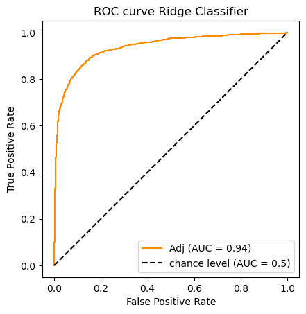
The Ridge Classifier is a variety of Support Vector Machine (SVM); the
learning objective is to find a hyperplane separating positive from
negative examples that maximizes the margin (the distance between
the plane and the nearest examples). In place of predict_proba the
Ridge Classifier has a decision_function method which returns
confidence scores for each sample:
The confidence score for a sample is proportional to the signed distance of that sample to the hyperplane.
In other words, the further a point is away from the separating plane, the more confident the classifier is about a positive/negative decision. The AUC score can be just as easily computed with a sequence of confidence scores as it is with a sequence of probabilities.
clf_name = 'Ridge Classifier'
classifier = clfs[clf_name]
#  Note The ridge classifier does not assign probabilities.
#  But it does compute scores available from its decision function
y_scores = classifier.fit(X_train_m, y_train).decision_function(X_test_m)
# For each classifier we store its predictions as well as its AUC score
auc_scores[clf_name] = (classifier.predict(X_test_m),roc_auc_score(y_test, y_scores))
# A picture is worth 1_000 words
do_auc_plot (classifier, y_test, y_scores, 1, 'Adj')
clf_name = 'Passive Aggressive Classifier'
classifier = clfs[clf_name]
y_scores = classifier.fit(X_train_m, y_train).decision_function(X_test_m)#[:,1]
auc_scores[clf_name] = (classifier.predict(X_test_m),roc_auc_score(y_test, y_scores))
do_auc_plot (classifier, y_test, y_scores, 1, 'Adj')
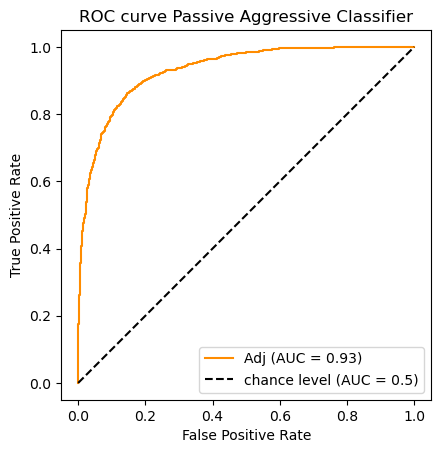
Reviewing the AUC numbers we got:
auc_scores.keys()
dict_keys(['Logistic Regression', 'Ridge Classifier', 'Multinomial NB', 'Passive Aggressive Classifier'])
[auc_scores[k][1] for k in auc_scores]
[0.9594033151659511, 0.9374223079099382, 0.928727980603359, 0.9315689148752219]
So according to the AUC metric the classifiers rank as follows:
![\begin{array}[t]{llc}
& \text{Classifier} & \text{AUC}\\
\hline
1. & \text{Logistic Regression} & .959\\
2. & \text{Ridge Classifier} & .937 \\
3. & \text{Passive Aggressive Classifier} & .932 \\
3. & \text{Multinomial Naive Bayes}& .929
\end{array}](../../../_images/math/2349a40a4c93512bfc61fd1de775f7cf69198a1e.png)
8.3.15. Appendix D: An evaluation experiment
Another evaluation loop. There are actually a lot of classifiers
concealed under the name SGDClassifier. SGD refers to a learning
method (Stochastic Gradient Descent). By folding different “loss”
functions (learner scoring functions) into the algorithm you get
different kinds of linear learners; log_loss gets you a logistic
regression classifier; hinge gets you a classic SVM; perceptron
is another loss function defining a different kind of linear learner
called a perceptron. Say the docs
The other losses, ‘squared_error’, ‘huber’, ‘epsilon_insensitive’ and ‘squared_epsilon_insensitive’ are designed for regression but can be useful in classification as well; see SGDRegressor a description.
The brief experiment below illustrates the idea of evaluating multiple learners on a fixed problem, alhough we are completely avoiding the important issue of cross-validation, which will be discussed when we get to text classification.
You can see “squared error” does the worst, but it also fails to
converge on a model. As for the best, it depends on your criteria. If
recall is the most important thing, the regression method modifed huber
does best, if it’s precision, you want logistic regression. Note that
the recall score on this logistic regression classifier is not as good
as the one we got above with sklearn’s LogisticRegression classifier
(.70), which used the liblinear learner. It’s not at all clear why,
since this is the same training and test set.
from  sklearn.linear_model import SGDClassifier

loss_fns = ("hinge", "log_loss",  "modified_huber",
            "perceptron", "huber", "epsilon_insensitive",
            "squared_error", )

auc_scores2 = dict()

for fn in loss_fns:
    clf_name = f'SGD Classifier {fn}'
    print(clf_name)
    classifier = SGDClassifier(loss=fn)
    y_scores = classifier.fit(X_train_m, y_train).decision_function(X_test_m)
    y_predicted = classifier.predict(X_test_m)
    auc = roc_auc_score(y_test, y_scores)
    rec =  recall_score(y_test,y_predicted)
    prec =  precision_score(y_test,y_predicted)
    auc_scores2[clf_name] = (y_scores,auc,rec,prec)
    #do_auc_plot (classifier, y_test, y_scores, 1, 'Adj')
SGD Classifier hinge
SGD Classifier log_loss
SGD Classifier modified_huber
SGD Classifier perceptron
SGD Classifier huber
SGD Classifier epsilon_insensitive
SGD Classifier squared_error
/Users/gawron/opt/anaconda3/envs/p310/lib/python3.10/site-packages/sklearn/linear_model/_stochastic_gradient.py:702: ConvergenceWarning: Maximum number of iteration reached before convergence. Consider increasing max_iter to improve the fit.
  warnings.warn(
banner = f"{'Classifier':<31}  AUC    Rec   Prec"
print(banner)
print("="* len(banner))

il = list(auc_scores2.items())
il.sort(key = lambda x:x[1][1], reverse=True)

for (clf, (y_scores, auc,rec,prec)) in il:
    print(f"{clf[15:]:<30} {auc:.3f}  {rec:.3f}  {prec:.3f}")
Classifier                       AUC    Rec   Prec
==================================================
log_loss                       0.959  0.670  0.856
hinge                          0.953  0.692  0.853
modified_huber                 0.952  0.717  0.809
perceptron                     0.943  0.720  0.738
huber                          0.925  0.470  0.860
epsilon_insensitive            0.919  0.597  0.842
squared_error                  0.563  0.459  0.168
Alternatively we may fill out the evaluation with F1-score instead of AUC score:
banner = f"{'Classifier':<40}   Rec    Prec  F1-Sc"
print(banner)
print("="* len(banner))

for (clf,(y_predicted,_auc)) in auc_scores.items():
    rec = recall_score(y_test,y_predicted)
    prec = precision_score(y_test,y_predicted)
    f_sc = f1_score(y_test,y_predicted)
    print(f"{clf:<40}  {rec:.3f}  {prec:.3f}  {f_sc:.3f}")
Classifier                                 Rec    Prec  F1-Sc
=============================================================
Logistic Regression                       0.701  0.830  0.760
Ridge Classifier                          0.687  0.809  0.743
Multinomial NB                            0.771  0.611  0.682
Passive Aggressive Classifier             0.663  0.753  0.705
What is the winner on each evaluation?
8.3.16. Appendix E: Working with confusion matrixes
The confusion matrix we used in the section entitled of Precision, Recall and Accuracy was displaying classifier decisions in a two-class problem. The kiond of information displayed can be even more illuminating on a multiclass problem, and scikit learn provides some helpful tools to do that. We illustrate with the Iris data using this scikit learn demonstration.
By the way, this sort of color-enhanced numerical table display can also
be done via pandas using df.style.background_gradient(cmap=cmap), as
we did in Precision, Recall and Accuracy section.
import numpy as np
import matplotlib.pyplot as plt

from sklearn import svm, datasets
from sklearn.model_selection import train_test_split
from sklearn.metrics import ConfusionMatrixDisplay

# import some data to play with
iris = datasets.load_iris()
X = iris.data
y = iris.target
class_names = iris.target_names

# Split the data into a training set and a test set
X_train, X_test, y_train, y_test = train_test_split(X, y, random_state=0)

# Run classifier, using a model that is too regularized (C too low) to see
# the impact on the results
classifier = svm.SVC(kernel="linear", C=0.01).fit(X_train, y_train)

np.set_printoptions(precision=2)

# Plot non-normalized confusion matrix
titles_options = [
    ("Confusion matrix, without normalization", None),
    ("Normalized confusion matrix", "true"),
]

for title, normalize in titles_options:
    disp = ConfusionMatrixDisplay.from_estimator(
        classifier,
        X_test,
        y_test,
        display_labels=class_names,
        cmap=plt.cm.Blues,
        normalize=normalize,
    )
    disp.ax_.set_title(title)

    print(title)
    print(disp.confusion_matrix)
Confusion matrix, without normalization
[[13  0  0]
 [ 0 10  6]
 [ 0  0  9]]
Normalized confusion matrix
[[1.   0.   0.  ]
 [0.   0.62 0.38]
 [0.   0.   1.  ]]
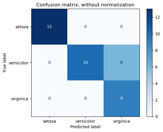
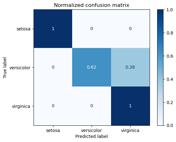
It can be seen that the difficulty is in discriminating versicolor from virginica; moreover if the system predicts versicolor it is always right; the problems are that it is somewhat over-predicting virginica.
A less graphically snazzy way to do the 3 class confusion matrix:
from sklearn.metrics import multilabel_confusion_matrix

y_predicted = classifier.predict(X_test)
M = multilabel_confusion_matrix(y_test,y_predicted)
M
array([[[25,  0],
        [ 0, 13]],

       [[22,  0],
        [ 6, 10]],

       [[23,  6],
        [ 0,  9]]])
M.shape
(3, 2, 2)
8.3.17. Appendix F: Using different types of Classifiers
Up until now every attempt we’ve made at classifying the iris data has used the same classifier, Logistic Regression. In this section we visualize the results of using other classifiers. Actual evaluation of the classifiers is left as an exercise.
The plot below show 4 different Support Vector Machine (SVM) models
trained on the first two dimensions of the iris data. We do a deeper
dive into the consequences of using different types of Support Vector
Machines (SVMs) in another notebook (linear_classifier_svm).
Here our chief goal is to provide some sample code for how to explore
the behavior of different classifiers in scikit_learn.
Note: In the figure below, there are two plots labeled SVC with Linear Kernal and Linear SVC (Linear kernel). I believe these are just two different implementations of what is mathematically the same model. The similarities in the plots support this view. The SVC with RBF kernel and the SVC with polynomial kernel are mathematically different from Linear SVC and from each other, and you can see that in the kinds of separators they learn.
from sklearn import svm, datasets

def compare_classifiers(X,y, models, titles, xlabel="", ylabel=""):
    """
    Assumption.  X is 2D.
    """

    predictions = (clf.fit(X, y) for clf in models)

    # Set-up 2x2 grid for plotting.
    fig, sub = plt.subplots(2, 2, figsize=(12,8))
    plt.subplots_adjust(wspace=0.4, hspace=0.4)

    for clf, title, ax in zip(predictions, titles, sub.flatten()):
        show_classifier_separators (clf,X, y, title=title, ax=ax,xlabel=xlabel,ylabel=ylabel)

# import some data to play with
iris = datasets.load_iris()
# Take the first twofeatures.
X = iris.data[:, :2]
xlabel, ylabel = iris.feature_names[:2]
y = iris.target

C = 1.0  # SVM regularization parameter

models = (svm.SVC(kernel='linear', C=C),
          svm.LinearSVC(C=C, max_iter=10000),
          svm.SVC(kernel='rbf', gamma=0.7, C=C),
          svm.SVC(kernel='poly', degree=3, gamma='auto', C=C))

titles = ('SVC with linear kernel',
          'LinearSVC (linear kernel)',
          'SVC with RBF kernel',
          'SVC with polynomial (degree 3) kernel')
compare_classifiers(X,y, models, titles, xlabel=xlabel, ylabel=ylabel)
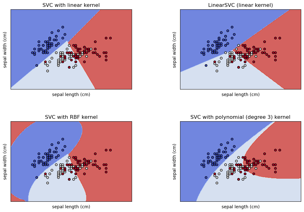
The same classifiers trained on an RBF Kernel reduction:
ker_reducer = dec.KernelPCA(kernel='rbf',n_components=2,fit_inverse_transform=True)
X_ker = ker_reducer.fit_transform(X)

compare_classifiers(X_ker,y, models, titles)